Skip to product information
1 of 4

Vintage and Antique Gifts

Vintage 1930s Domaine de Laroche Spiritueux Fine SupĂ©rieure Label 🏰 Pink Castle Spirit NOS đŸ„ƒ

Vintage 1930s Domaine de Laroche Spiritueux Fine SupĂ©rieure Label 🏰 Pink Castle Spirit NOS đŸ„ƒ

Regular price 7.00 USD
Regular price Sale price 7.00 USD
Sale Sold out
Shipping calculated at checkout.
Quantity

Size: 4.5 x 4.5 inches

🏰 Vintage Domaine de Laroche Spiritueux Fine SupĂ©rieure Label — Elegant Castle Illustration — New Old Stock (NOS)

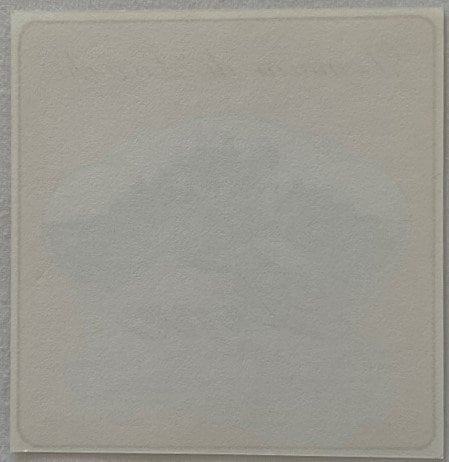
This is a vintage spirits bottle label produced for Domaine de Laroche of Menin, Belgium, a spiritueux house whose roots in the fine trade stretch back to its founding in 1899 — a fact printed directly on the label itself. The label identifies the product as a Fine SupĂ©rieure, a designation applied to high-quality grape-distilled brandy-style spirits, and carries the registration number R.C. Courtrai 78.466 along with the bottler notation "Anc. Ets. Rob. Dewaegenare, 8600 Menin" — a Belgian commercial address in the West Flanders city of Menin. The salmon-pink ground, the engraved chĂąteau vignette, and the Dutch-language text block place this label squarely in the interwar Belgian spirits trade, almost certainly printed in the 1930s. It is New Old Stock (NOS), pulled from warehouse stock exactly as it left the press — never glued to a bottle, never lost in a cellar.

đŸ„ƒ There is something quietly remarkable about holding a piece of commercial printing this old and finding it this clean. Most labels from the Belgian spirits trade of the 1930s never made it off the bottles they dressed — and the bottles, once emptied, were washed, and the labels went with them. The ones that survived did so only because a case of unglued stock sat in a warehouse somewhere and was eventually discovered rather than discarded. That is the story of New Old Stock, and it is the only reason a label this age can still show you exactly what a Belgian printer put down on paper nearly a century ago.

🏰 The chñteau illustration at the center of the label is the first thing that holds the eye. A grand turreted castle — multi-towered, Gothic in silhouette, surrounded by what reads as a vineyard landscape rolling toward the foreground — sits inside a cloud-shaped vignette that frames the image with a soft, almost romantic border. The engraving style is the fine-line crosshatch work of period commercial illustration: meticulous, slightly formal, the kind of castle image that a Belgian printer in the 1930s would have pulled from a stock engraving house or commissioned to signal aristocratic legitimacy for a spirits product aimed at the prosperous middle-class table. Whether or not a specific chñteau was meant to be depicted, the image does its intended work perfectly — it makes the bottle it dressed look like it came from somewhere old, somewhere with stone cellars and centuries of tradition behind it.

✹ The ground color is a warm salmon-pink, and against it the printed elements read in a combination of deep brown, gold, and cream. At the top, the name Domaine de Laroche runs in flowing copperplate script — the kind of letterform that Belgian and French printers of the era associated with fine wines and quality spirits, a deliberate visual link to the world of chĂąteau-bottled Bordeaux and Burgundy even when the product was a commercially produced brandy. Beneath the chĂąteau vignette, the word Fine runs in large, elegant cursive letterforms that curve with genuine elegance across the lower half of the image. Below that, in smaller spaced capitals, SupĂ©rieure completes the product declaration.

🌿 The text block at the bottom of the label is printed in Dutch, and it is worth pausing on what it says — because in the 1930s, this kind of language on a spirits label was not boilerplate, it was a sales argument. The text warrants the natural strength of the spirit and affirms that it contains no artificial fortifying agent. It goes on to claim that by reason of its origin, it does not harm the health, causes no stomach or other pains, is easily digestible, and is an effective remedy for many ailments. That last line — spirits marketed as a medicinal product, a digestive aid, a health tonic — was entirely normal for the Belgian and French spirits trade in this era, and it would not survive the post-war regulatory environment that eventually forced a much harder line between medicine and alcohol. Finding it printed plainly on a label like this is a small window into the way a different era thought about what a glass of fine brandy was actually for.

🇧đŸ‡Ș The city of Menin — Menen in Flemish — sits on the Lys River at the French border, and in the first half of the twentieth century it was a commercial hub with a functioning spirits and wine trade that served the textile and manufacturing towns of Belgian Flanders. The registration number R.C. Courtrai 78.466 is a Belgian commercial court registration — Courtrai being Kortrijk, the regional commercial center — and it pins this label to a documented, registered business rather than a fly-by-night bottler. Rob. Dewaegenare, listed as the originating house under the "Anc. Ets." designation (Anciens Établissements — the standard Belgian notation for a firm trading under the name of its founder), was an established operation.

đŸ„‚ The Fine SupĂ©rieure designation itself deserves a word for those unfamiliar with how the Belgian and French spirits trade graded its products. A fine in this context is a grape brandy — distilled from wine or grape pomace rather than grain — and the supĂ©rieure grade was a commercial quality claim intended to distinguish the product from the cheaper, more industrially produced spirits that crowded the lower shelves. Belgian bottlers in the 1930s operated in a market that was intensely competitive at the mid-range price point, and a label like this one — with its chĂąteau illustration, its copperplate script, its warm salmon ground, and its health-claim text block — was a carefully assembled argument for the bottle's quality and the drinker's good taste.

🎹 The printing itself reflects the era's commercial lithography at a functional, competent level. This is not the embossed, multi-pass stone chromolithography of the great Victorian label houses — by the 1930s, that tradition was already yielding to offset printing, which was faster, cheaper, and more than adequate for the middle tier of the spirits market. What this label shows instead is the clean, flat-color offset work of a Belgian commercial printer who knew the conventions of the trade: the cloud-vignette framing, the chñteau subject, the script typefaces, the pastel ground. Every element was chosen because it signaled quality to a buyer who would have seen dozens of similar labels on spirits shelves, and chosen this bottle over its neighbors because the label said the right things in the right visual language.

📜 The label carries the content notation "Cont. 98 cl. 48" — a Belgian-format declaration of volume and alcohol content. 98 centiliters is just under a full liter, and 48 degrees indicates an alcohol strength of 48 percent by volume, which is a robust proof level for a commercial brandy of the period. These details anchor the label to a specific regulatory moment — the Belgian spirits trade of the interwar years operated under its own labeling requirements, and a label that includes both volume and strength in this format is a period-accurate document of how that market worked.

đŸ›ïž A lore note worth passing along: collectors in the French and Belgian paper ephemera world have long observed that chĂąteau-vignette labels from this era were not always portraits of real estates. The convention of placing a romantic castle illustration on a spirits or wine label was so widespread in the 1930s that a whole genre of generic chĂąteau engravings circulated among Belgian and French printing houses — stock images available for licensing that allowed any bottler, regardless of whether it owned a vineyard or a chĂąteau, to dress its product in aristocratic visual language. Whether the castle on this label depicts a real Flemish or French estate, or whether it is one of those stock engravings doing the work it was always meant to do, is one of the small mysteries that makes a label like this genuinely interesting to sit with. The image is compelling either way.

đŸ–Œïž New Old Stock (NOS) condition means the label is flat, clean, and fully intact. The salmon-pink ground holds its color. The chĂąteau illustration is sharp. The text is fully legible. The label is exactly what it looks like: a piece of 1930s Belgian commercial printing that came out of stock rather than off a bottle, and has arrived in the present in the condition it left the printer.

🔍 Whether it goes into an archival sleeve alongside other interwar spirits ephemera, gets framed as a period piece of Belgian commercial art, or finds its way into a scrapbook or junk journal project built around European vintage printing — this label holds its own. The salmon ground is distinctive. The chñteau is genuinely beautiful in the manner of 1930s engraved illustration. And the story behind it — a Belgian spirits house, a West Flanders commercial registration, a health claim that would never survive modern regulation, a founding year of 1899 — is the kind of story that gets more interesting the longer you look.


đŸ·ïž Item Details at a Glance

  • 🏰 Item: Vintage spirits bottle label — Domaine de Laroche, Fine SupĂ©rieure
  • 🇧đŸ‡Ș Producer: Anc. Ets. Rob. Dewaegenare, 8600 Menin, Belgium
  • 📅 Era: 1930s — consistent with interwar Belgian spirits trade printing conventions
  • đŸ›ïž House Founded: 1899, per label notation "Maison fondĂ©e 1899"
  • 📋 Registration: R.C. Courtrai 78.466 — Belgian commercial court, Kortrijk region
  • đŸ„ƒ Product Type: Fine SupĂ©rieure — grape brandy / spiritueux
  • 📏 Volume / Strength: 98 cl. / 48 degrees alcohol by volume
  • 🎹 Ground Color: Warm salmon-pink
  • đŸ–Œïž Central Illustration: Engraved chĂąteau/castle vignette in cloud-shaped frame
  • 🌿 Text Language: Dutch (Flemish)
  • ✅ Condition: New Old Stock (NOS) — never applied to a bottle

❓ Questions Collectors Ask

What exactly is a "Fine Supérieure" and why does it appear on a Belgian label?

In the Belgian and French spirits trade, a fine is a grape-distilled brandy — made from wine or grape pomace rather than grain — as distinct from jenever or other grain spirits common in Flanders. The supĂ©rieure grade was a commercial quality designation used by bottlers to signal a step above the basic-grade spirits in the same product category. Belgian bottlers in the 1930s used French-language quality terms on their labels even when the accompanying text was in Dutch, because the French terminology carried prestige associations with the Cognac and Armagnac trade across the southern border.

How can I date this label to the 1930s?

Several converging factors point to the interwar period. The offset lithography printing style — flat color, clean lines, no embossing — reflects the commercial printing methods that had largely displaced stone lithography by the early 1930s. The Dutch-language health claim text, which markets the spirit as a digestive remedy and general health tonic, is characteristic of interwar Belgian spirits labeling that predates the tighter regulatory environment of the post-war decades. The salmon-pink ground and cloud-vignette chñteau illustration are both design conventions of the 1930s French and Belgian spirits label trade. The Belgian commercial registration format (R.C. Courtrai) is consistent with interwar commercial registration practice. No single element is a lock date, but all of them point the same direction.

What is "R.C. Courtrai 78.466" and what does it tell us about authenticity?

R.C. Courtrai is a Belgian commercial court registration — "Rechtbank van Koophandel Kortrijk" in Flemish, the commercial tribunal of the Kortrijk (Courtrai) judicial district in West Flanders. The number 78.466 is the firm's registration index entry. This kind of registration citation on a spirits label was a Belgian legal requirement for commercial spirits producers, intended to establish the bottler's legitimate standing. Finding a documented, verifiable registration number on a label is one of the cleaner markers of a genuine period commercial product rather than a reproduction — reproduction labels rarely bother to replicate regulatory fine print of this specificity.

Who was Rob. Dewaegenare, and what was the firm's standing in the Belgian spirits trade?

The label identifies the firm as "Anc. Ets. Rob. Dewaegenare" — Anciens Établissements Rob. Dewaegenare, the standard Belgian commercial notation for a firm trading under the name of its original founder, with "Anciens Établissements" signaling that the house had passed through at least one generation or ownership change while retaining the founder's name as a mark of continuity and tradition. The address of 8600 Menin (now Menen) places the operation in the West Flanders city on the Lys River at the French border — a commercially active region in the interwar period with established wine and spirits trading networks. The founding date of 1899, printed directly on the label, gave the firm a claim to nearly four decades of operation by the time this label would have been printed.

Why do 1930s Belgian spirits labels so often feature chĂąteau illustrations?

The chñteau-vignette convention in Belgian and French spirits labeling of the interwar period was a deliberate visual argument for quality and provenance. Grape brandy competed in a market where Cognac and Armagnac — both associated with specific French regional estates — held the highest prestige. A Belgian bottler placing a romantic turreted castle on its label was making a visual claim to that same tradition of estate-based production, regardless of whether a specific chñteau was actually involved in the product. Collectors in the French paper ephemera world note that stock chñteau engravings circulated widely among commercial printing houses of the era, available for licensing by any bottler who wanted the aristocratic visual register without commissioning original artwork — which makes the specific castle depicted on any given label an interesting question that is often unanswerable without documentation from the printer's archive.

How should I store and display a vintage paper label like this one?

Archival polyester or acid-free polypropylene sleeves are the standard storage format for paper labels — they hold the label flat, exclude humidity and handling oils, and allow both sides to be viewed without removal. For display, a standard mat and frame in UV-filtering glass works well; the salmon-pink ground and chñteau illustration are strong enough to carry a modest frame without looking lost. Avoid prolonged direct sunlight, which will shift the pink ground toward faded peach over time. Room-temperature, low-humidity storage is ideal — the same conditions recommended for any uncoated paper ephemera from the 1930s.

What collector categories does a label like this fit?

Belgian and French spirits ephemera collectors are the primary audience, but this label crosses into several overlapping collector communities. Belgian history and West Flanders regional ephemera collectors find the Menin address and Kortrijk registration specifically meaningful. Chñteau-illustration paper ephemera collectors — a distinct group within the broader French and Belgian label world — prize the engraved castle vignette as a subject in its own right. Interwar commercial lithography collectors who focus on the transition-era printing techniques of the 1930s find the flat-color offset work representative of its moment. And the Dutch-language health-claim text appeals to collectors interested in pre-war beverage regulation history and the era when spirits were openly marketed as medicinal products.


🔍 Search Tags for Fellow Collectors

Domaine de Laroche label, vintage Belgian spirits label, Fine Supérieure brandy label, 1930s spirits ephemera, Belgian wine label NOS, chùteau illustration label, West Flanders spirits history, Menin Belgium antique, Kortrijk commercial registration, interwar spirits label, vintage French brandy label, Belgian paper ephemera, NOS spirits label, vintage bottle label collector, castle vignette label, 1930s commercial lithography, Belgian Flanders history, vintage cognac label, French chùteau label, spiritueux label vintage, antique spirits paper label, Dewaegenare Menin, R.C. Courtrai label, vintage health claim spirits, Dutch language label, Flemish paper ephemera, interwar Belgian trade label, vintage brandy ephemera, salmon pink label, engraved chùteau label, junk journal vintage label, scrapbook vintage ephemera, European spirits label collector, 1930s beverage advertising, vintage alcohol label art

Shipping

🚚 Shipping & Handling

  • Shipping costs and timing are calculated at checkout.
  • Items curated and shipped directly by me include U.S. shipping at no additional cost, professionally packed to ensure safe arrival of your artifact.

Items from Vetted Pro Collectors
Shipping for items offered by vetted Pro Collectors is determined at checkout. All Pro Collector listings are reviewed to ensure fair, reasonable shipping practices.

For full details, please refer to our Shipping Policy.

Returns & Exchange

Take your time — you've got a full six months. If a piece isn't right for you, send it back the way it reached you and we're good.

In the first 30 days your money goes straight back the way you paid. After that it's store credit, so you can put it toward something you'd rather have.

Return shipping we sort out between us, case by case. I don't make this difficult.

If something arrives damaged, or it isn't what I said it was, send me a photo within 48 hours and I'll make it right.

Email info@vintageantiquesgifts.com or call 802-356-9872 — that's me answering, not a call center.

The only things I can't take back are custom or special-order pieces and gift cards.

View full details