Skip to product information
1 of 1

Vintage and Antique Gifts

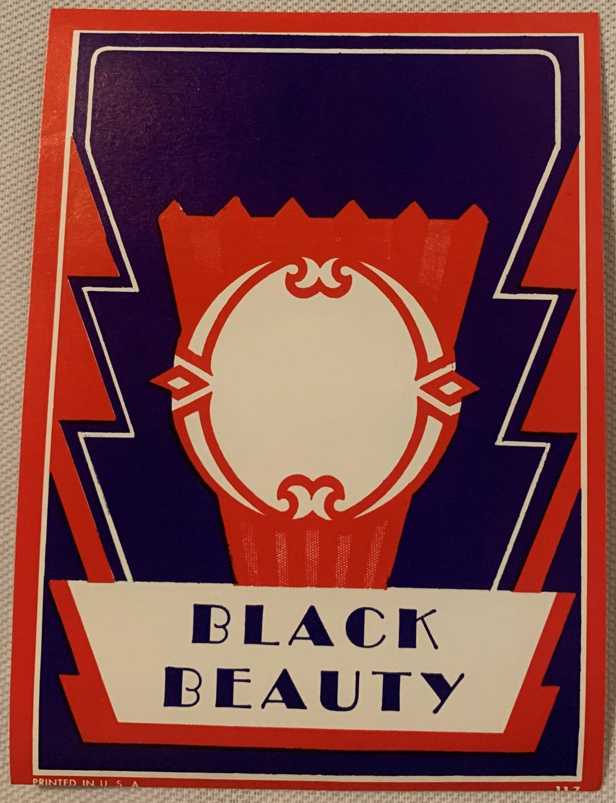
Antique Black Beauty Broom Label 🧹 NOS 1920s–30s Art Deco Lithograph Keystone Design Collectible American Made

Regular price 6.00 USD
Regular price Sale price 6.00 USD
Sale Sold out
Shipping calculated at checkout.

Description

When Did a Broom Label Become a Work of Art? 🧹

Somewhere between the end of the First World War and the rise of the vacuum cleaner, American manufacturing did something quietly extraordinary. It dressed up the ordinary. Hardware store shelves became small galleries of color and ambition, and the humble broom — that most ancient of household tools — got its own poster. Not a painting, not an advertisement in a magazine, but a lithographed label so sharp, so vivid, so deliberately modern in its geometry that it could hold its own on a gallery wall today. This is one of those labels. And it survived, unused, for nearly a century.

There is a particular feeling that comes over collectors when they hold a piece of New Old Stock. It's not quite the feeling of holding something old — it's the feeling of holding something that never got to be used. All that intention, all that printing craft, all that commercial hope — preserved in a storeroom drawer while the world moved on without it. That's what you're looking at here. A label that was printed, stacked, bundled, and forgotten. And because it was forgotten, it survived perfectly.

---

What This Piece Is — Brand, Era, Size, and How It Was Made 🎨

This is an antique Black Beauty broom label, New Old Stock (NOS), dating to approximately the 1920s–1930s. It measures roughly 5 inches tall by 3.5 inches wide — small enough to fit in your hand, large enough to command attention when framed. The label was never applied to a broom handle; it is unused, in the condition it left the printer, which is why its colors remain so startlingly alive. Vivid red, deep cream, and a rich, almost naval blue come together in a dramatic keystone design — that tapered, architectural shield shape that Art Deco designers loved for its visual weight and authority. Lightning-style border lines frame the composition, and across the bottom, in bold, commanding letterforms, the words BLACK BEAUTY anchor everything. The effect is less "cleaning supply label" and more "small Art Deco travel poster." The piece was produced using early 20th-century commercial lithography, a layered ink-on-stone (or later, ink-on-plate) printing process that built up color in successive passes, each layer slightly transparent, the combination producing that characteristic depth and velvety richness that modern digital printing simply cannot replicate. You can see it in the way the colors sit on the paper — not flat, not screened, but stacked, the way a fine oil painting builds dimension through glazing. This is NOS stock, meaning someone — a store owner, a warehouse manager, a broom company representative — set aside extra label inventory and never got back to it. That act of accidental preservation is the reason this label looks today the way it looked the day it came off the press.


🧹 The Golden Age of the American Broom — Industry, Identity, and Craft

The American broom industry has roots that run surprisingly deep. By the late 19th century, broom corn — a variety of sorghum grown specifically for its stiff, fibrous seed heads — had become a legitimate agricultural and industrial commodity across the Midwest and South. Illinois, in particular, became synonymous with broom manufacturing, and towns like Arcola earned the informal title of "Broom Corn Capital of the World." Factories hired skilled broom sewers, handle turners, and wire wrappers, and the finished brooms moved through an entire distribution network of hardware stores, general stores, and dry goods merchants across the country.

What most people forget — and what makes a label like this one so historically rich — is that in the era before mass broadcast advertising, the label was the marketing department. A broom company couldn't run a television spot. It couldn't sponsor a podcast. What it could do was print a label so striking, so confident in its design, that the shopkeeper would display the broom head-out and the hardware store customer would pick that broom over an unlabeled competitor simply because it looked like it meant business. The name mattered. Black Beauty — borrowed, surely deliberately, from Anna Sewell's beloved 1877 novel about a noble horse — carried connotations of strength, grace, loyalty, and durability. It was a name designed to make a housewife feel that she was choosing quality. Wrapped in that keystone design with its lightning borders, it signaled: this broom is different. This broom is better than ordinary.

The keystone shape itself was not arbitrary. It was a conscious design choice rooted in the architectural vocabulary of the era. The keystone — the central, wedge-shaped stone of an arch — is the piece that holds everything together. It bears the load. It is, literally and figuratively, the strength of the structure. Art Deco designers embraced it because it communicated stability and modernity simultaneously, and commercial lithographers working on product labels adapted it readily. To see it on a broom label is to understand just how seriously American manufacturers took their branding in this period.


🖨️ Lithography — The Lost Printing Art Behind This Label's Vividness

The word "lithography" comes from the Greek for stone writing, and in its earliest commercial form, that is exactly what it was: an image drawn in greasy crayon directly onto a flat limestone slab, treated with chemicals so that oil-based ink adhered to the drawn areas and was repelled by the dampened blank stone. In the early 20th century, lithography had evolved into a sophisticated industrial process, with large commercial print shops running multi-color jobs across zinc plates rather than stone, but the fundamental principle — and the resulting quality — remained. Each color in a label like this one required its own plate, its own pass through the press, its own careful registration so that the edges lined up. A four- or five-color label might require four or five separate pressings, each adding another layer of ink.

The result, if the presswork was good, was extraordinary. Colors overlapped and optically mixed. Edges were crisp because the ink was applied under controlled pressure rather than sprayed or screened. And the labels aged well, because the pigments used in commercial lithographic inks of this era were dense and stable. Museums and design schools actively collect and preserve original labels from this period precisely because the originals show students something that a digital reproduction cannot: the actual texture, the slight embossing at ink edges, the way color behaves when it is built up in physical layers. When collectors describe antique lithographed labels as "vivid" — and they do, reliably and consistently — they are describing a specific quality of color that is an artifact of the process itself.

This label, because it is NOS and was never glued to a handle and exposed to years of handling and humidity, retains that vividness in full. The red is red. The blue is blue. The cream is clean. There is no damage.


🏛️ NOS Survival — How These Labels Outlasted the Brooms They Were Made For

Consider the odds against this label's survival. It was printed as a consumable — a functional piece of commercial packaging, intended to be stripped from a stack, applied to a wooden handle with paste or glue, and eventually discarded along with the used-up broom. Nearly every label printed in this era met exactly that fate. Of the hundreds or thousands of Black Beauty broom labels that left the printer, almost all of them are gone. They swept floors. They were thrown away. They composted in landfills before landfills were even called landfills.

NOS survivorship almost always comes down to a single human decision: someone, at some point, simply did not use the last of the stock. A hardware store ordered more labels than it needed and tucked the extras in a back-room drawer. A broom company closed its doors and someone swept the remaining supplies into a box rather than the trash. A warehouse was cleared out decades later by someone who recognized, however dimly, that the old paper was too pretty to throw away. That accidental preservation — that small, unconscious act of saving — is the entire reason pieces like this still exist.

Lore passed down among paper ephemera collectors holds that a significant portion of surviving NOS broom and cleaning product labels came out of hardware store estate sales in the Midwest during the 1970s and 1980s, when a generation of longtime proprietors finally closed shops that had been in families for fifty or sixty years. The back rooms of those stores, undisturbed for decades, turned out to be accidental time capsules — full of stock that simply hadn't sold, or hadn't been used, or had been saved because someone liked the look of it. Local legend among Illinois broom trade historians has it that certain labels were kept deliberately by print shop foremen as samples of their best work, proud evidence of what their presses could do. Whether this Black Beauty label came out of a hardware store back room, a print shop sample drawer, or a broom factory's own overrun stock, we cannot say with certainty — but the condition speaks for itself.

As collectors, designers, gallery curators, and museum educators have increasingly recognized the artistic merit of early 20th-century commercial printing, pieces like this have moved from "old paper curiosity" to documented, framed, seriously collected examples of American graphic design history. That reclassification is ongoing and accelerating.


🖼️ Display Ideas — Making This Label the Statement It Was Born to Be

  • 🪞 Frame it simply in a black mat and thin gold frame — the contrast between the black mat and the vivid red and cream of the label is striking, and the gold frame echoes the period without overpowering it. At 5" x 3.5", this is an ideal candidate for a 5x7 or 4x6 frame with a cut mat.
  • 🍳 Hang it in a kitchen or pantry gallery wall alongside other antique food, household, and cleaning product labels from the same era — seed packets, spice tins, soap wrappers — to build a curated visual narrative of early 20th-century domestic life.
  • 🏠 Style it on a bookshelf as a small framed accent between vintage books, pottery, or folk art objects. At this size, it reads as a jewel-like detail rather than a large statement piece, which makes it enormously versatile in styled shelving.
  • 🎨 Group it with other Art Deco graphic pieces — period travel posters, WPA prints, or other lithographed labels with geometric designs — in a salon-style arrangement that celebrates the design vocabulary of the 1920s and 30s as a coherent artistic movement.
  • 🏪 Use it as a focal point in a shop, studio, or office — graphic designers, architects, and visual creatives often display historical printing and packaging as source material and inspiration. A piece this well-designed earns its place on any creative's wall.
  • 🎁 Present it as a framed gift — already mounted in a small frame, this label is a ready-made, deeply personal gift for the collector, the design lover, the history enthusiast, or the person whose home is a curated expression of their taste and curiosity.

🎁 Who Collects These — and Why This One Matters

The world of antique paper ephemera collecting is broader and more passionate than most people outside it realize. Broom labels, cleaning product labels, seed packet labels, and hardware store packaging from the early 20th century occupy a specific and increasingly valued niche within that world, collected by people who understand that commercial printing from this era represents a genuine American folk art tradition — anonymous in authorship, deeply skilled in execution, and almost entirely lost to ordinary use.

Graphic design collectors and historians seek out pieces like this as primary source material — evidence of how American commercial art evolved in the years between the Arts and Crafts movement and the full flowering of mid-century modernism. The Art Deco vocabulary in this label — the keystone, the lightning borders, the bold sans-serif lettering — is textbook, and textbook in the best sense: this is what the period actually looked like, not a reproduction, not an homage, but the real thing.

Americana and general store collectors are drawn to the specificity of the domestic world these labels represent — a world of hardware store shelves, household routines, and brand loyalties that has completely vanished. Collecting a Black Beauty broom label is, in a small way, an act of witness to that world.

Lithography and printing history enthusiasts value NOS labels as the finest surviving examples of the craft — unused, undamaged, showing the full original color range and registration quality that the printer intended. For someone who cares about how things were made, a label like this is a primary document.

Interior designers and stylists working in vintage, maximalist, or eclectic aesthetics have discovered antique labels as some of the most affordable, authentic, and visually striking wall art available. A piece this vivid, this graphically strong, framed and hung, holds its own in any room.

And then there are the collectors who simply love beautiful things with stories. This label is both.


❓ Frequently Asked Questions — Black Beauty Broom Label, NOS 1920s–30s

What does NOS mean, and how does it affect the condition of this label?

NOS stands for New Old Stock — meaning this label was manufactured in its original era (here, the 1920s–1930s) but was never used for its intended purpose. It was never applied to a broom handle with paste or adhesive. It has not been exposed to the handling, humidity, and physical wear that would have come with normal use. NOS paper ephemera can survive in genuinely remarkable condition precisely because it spent its existence in storage rather than in service. This label's vivid color — the bright red, the clean cream, the deep blue — is a direct result of that NOS provenance. What you see is what came off the press, preserved by accidental inaction rather than deliberate conservation effort.

The colors look incredibly vivid — is that accurate to the actual piece?

Yes. The vividness is real, and it has two explanations. First, this is NOS stock — the label has never been glued to a surface, exposed to sustained light, or handled repeatedly, so the original ink colors have not faded or degraded. Second, early 20th-century commercial lithography used dense, layered pigment-based inks that were inherently rich and stable. The red in this label is a genuine lithographic red — not screened, not half-toned, but laid down in a full, solid pass of ink. The depth and saturation collectors describe when they hold pieces like this is a function of the printing process itself, and it is one of the primary reasons antique lithographed labels are so sought after by collectors who have seen them in person.

How should I frame this label, given its size?

At approximately 5 inches tall by 3.5 inches wide, this label fits comfortably into several standard frame sizes. A 5x7 frame with a cut mat opening sized slightly smaller than the label is a classic approach — the mat creates visual breathing room around the design and elevates the label from "paper on a wall" to "framed artwork." A 4x6 frame with minimal or no mat is a more intimate option that suits a shelf or small gallery wall arrangement. Black, gold, or natural wood frames all complement the label's color palette depending on your display context. If you frame it yourself, use acid-free mat board to protect the paper over time. Many framing shops can cut a custom mat opening at low cost.

Is this label appropriate for display in a period-authentic vintage interior, or is it more of a collector's piece?

It is genuinely both, and that dual identity is part of its appeal. From a period-authenticity standpoint, a broom label of this design dates squarely to the Art Deco era of American commercial design — the 1920s and 1930s — and is entirely consistent with a carefully curated vintage interior from that period. It belongs on the same wall as a period WPA print, a Streamline-era product advertisement, or a collection of early radio-era packaging. As a collector's piece, it is a documented example of American lithographic printing at its commercial peak, NOS, with all its color intact, and it is precisely the kind of item that serious paper ephemera collectors seek out. Whether your interest is primarily decorative or primarily archival, this label delivers.

Was "Black Beauty" a known regional brand, or was the name used by multiple broom makers?

Brand name research for small-scale early 20th-century household goods is genuinely difficult because many regional manufacturers used evocative, unregistered names that were never formally trademarked and whose company records simply have not survived. "Black Beauty" as a product name had obvious appeal — drawn from Anna Sewell's beloved novel, it carried connotations of strength, elegance, and trustworthiness that translated naturally to a cleaning implement. It is entirely possible that more than one regional broom maker used the name in different markets, which was common practice in an era before national brand enforcement. What this label documents is one specific printer's interpretation of that name and identity, expressed through a specific Art Deco design vocabulary — and that design is what collectors and design historians value.

How do I store this label safely if I'm not framing it immediately?

Antique paper ephemera is happiest in stable, dry, low-light conditions. If you are not framing this label right away, store it flat — never rolled or folded — in an acid-free sleeve or between sheets of acid-free tissue paper. Keep it away from direct sunlight and away from areas with significant humidity fluctuation, like bathrooms or exterior walls in cold climates. Do not store it in a regular plastic sleeve for extended periods, as some plastics off-gas chemicals that can affect paper over time. Archival polyester sleeves (Mylar) are the preferred option for serious collectors. This label has already survived nearly a century in storage; treated with basic archival care, it will survive another century without difficulty.

Why are early 20th-century broom and household product labels becoming more collectible now?

Several converging forces have driven this. The graphic design community has increasingly recognized early American commercial lithography as a legitimate art historical tradition — one that produced genuinely sophisticated work by anonymous craftspeople operating under real commercial constraints. At the same time, the supply of high-quality NOS paper ephemera is finite and slowly declining as pieces are absorbed into permanent collections, framed and hung, or simply lost over time. Museum and design school interest in original printed material as teaching objects has added institutional validation to what was previously a collector-driven market. And culturally, there is a broad and growing appetite for objects that connect us to a specific, deeply human past — things that were made by hand and by craft, that carry the evidence of their making in their texture and color, and that represent a moment in American life that is genuinely, completely gone. A broom label from the 1920s is all of those things at once.

Shipping

🚚 Shipping & Handling

  • Shipping costs and timing are calculated at checkout.
  • Items curated and shipped directly by me include U.S. shipping at no additional cost, professionally packed to ensure safe arrival of your artifact.

Items from Vetted Pro Collectors
Shipping for items offered by vetted Pro Collectors is determined at checkout. All Pro Collector listings are reviewed to ensure fair, reasonable shipping practices.

For full details, please refer to our Shipping Policy.

Returns & Exchange

Product Page Return Policy

  • 60-Day Returns – Items must be in original condition.
  • Refunds – Issued after inspection (excluding shipping costs).
  • Return Shipping – Customer is responsible unless item is damaged or incorrect.
  • Damaged/Incorrect Items – Contact us within 48 hours for a replacement or refund.
  • Easy Returns – Email [email protected] or call 802-356-9872 to initiate a return.

For full details, visit our Refund Policy.

View full details
