Skip to product information
1 of 4

Vintage and Antique Gifts

Vintage The Hop Nightclub Matchbook 🐰 Los Angeles Rabbit Logo, NOS Unused Label

Regular price 12.00 USD
Regular price Sale price 12.00 USD
Sale Sold out
Shipping calculated at checkout.

Description

🐰 What Kind of Nightclub Sends a Rabbit in Sunglasses to Do Its Advertising?

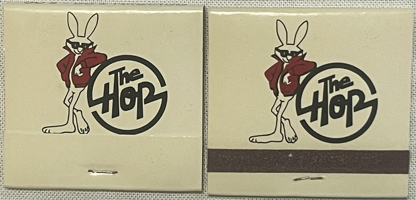
I've handled thousands of old matchbooks in my time — cigar shops, diners, motor lodges, supper clubs, roadhouses — and most of them play it safe. A name, an address, maybe a martini glass or a palm tree. Then every so often one crosses my table that just has attitude, and this one has it in spades. A cartoon rabbit, standing hip-cocked and confident, arms crossed inside a sharp red jacket, dark sunglasses hiding whatever he's really thinking, leaning his whole weight against a bold circular logo like he owns the place. He probably did, in a manner of speaking — because for whatever run of years this little guy was the face of The Hop, he was the coolest thing in the room before anyone even got past the door.

🎨 What It Is

This is a vintage advertising matchbook for a Southern California nightclub called The Hop, produced by offset lithograph printing in a compact 2" x 2" (approximately 5.1 x 5.1 cm) format — the classic pocket size that let a bar or dance hall put its name in front of a customer long after last call. The cover artwork is rendered in a tight palette of cream/tan, black, and a rich dark red/maroon: the rabbit himself is drawn in bold black outline, his jacket colored in that same deep maroon red, sunglasses inked flat black across his eyes, long ears standing straight up above a knowing, half-cocked grin. He leans against a thick black circular badge that carries the club's name, "The Hop," in a loose, hand-lettered script that has all the loose-limbed energy of a hand-painted marquee sign rather than a stiff corporate logotype. This example is New Old Stock (NOS) — meaning it comes from a run that was printed for the club, boxed up, and never went out into circulation at the register. The manufacturer's mark on the piece isn't legible, so I can't pin an exact print date to it; based on the style, lettering, and mascot artwork, the honest, defensible window for this piece runs from roughly the 1950s into the 1960s, the golden stretch of American matchbook advertising and West Coast nightclub culture alike.


🔥 The Matchbook: America's Tiniest Billboard

It's easy to forget now, in a world of neon signs and social media ads, that for most of the twentieth century the matchbook was one of the most effective, most affordable advertising tools a small business owner could buy. A nightclub, diner, hotel, or tavern could order a run of a few thousand custom-printed covers from a match company for pennies apiece, stack them by the cash register or hostess stand, and let its customers carry the ad out the door in their coat pocket, purse, or glove compartment. Big national printers like the Diamond Match Company, Universal Match Corporation, and the Lion Match Company built entire sales forces around this idea — traveling reps would visit clubs and diners with sample books of typefaces, mascots, and border designs, and the local owner would pick a look that captured the personality of the place. For a nightclub especially, the matchbook cover was doing real work: it was the thing a couple slipped into a handbag on a date night, struck later at home, and kept as a little souvenir of the evening even after the last drink was long finished.

That's exactly the kind of matchbook this is — a purpose-built piece of promotional art, made to be memorable enough that a patron would want to keep it rather than toss it. Whoever commissioned this cover for The Hop clearly understood that a nightclub competing for a dance floor crowd needed more than a plain nameplate. They wanted a mascot with swagger, and that's precisely what the artist delivered.


🌴 Southern California and the Mystery of "The Hop"

Every lead I've been able to run down on this club points toward Southern California in its golden postwar nightlife era — the years when the region's dance halls, supper clubs, and drive-in-adjacent teen hangouts were multiplying as fast as the freeways connecting them. The strongest thread ties The Hop to Los Angeles itself, remembered by longtime collectors as part of that city's swinging, big-name-band-to-rock-and-roll nightlife scene. But there's an honest wrinkle worth preserving here rather than smoothing over: other matchbook collectors over the years have placed this same rabbit-and-red-jacket cover with a club further out, toward Lakewood or Riverside. I can't settle that question with certainty from where I sit, and I'd rather tell you the truth of the mystery than invent a tidy answer — it's entirely possible The Hop operated more than one room, the way plenty of successful mid-century nightclub brands did, hopping (pun very much intended) between neighboring Southern California towns as the crowds followed the music.

What isn't in dispute is the flavor of the era this club was built for. "The Hop" wasn't a random name — in the jukebox-and-jitterbug vocabulary of the day, "hop" meant a dance, plain and simple. Sock hops, record hops, Saturday night hops: across the country, from high school gymnasiums to full-fledged commercial dance halls, "hop" was shorthand for exactly the kind of good time this club was selling. Naming your nightclub The Hop was a wink to every kid and every grown-up who'd grown up hearing that word on the radio and meaning one thing by it — get up, find a partner, and dance. Local legend among Southern California nightlife historians holds that clubs trading on that word were chasing the crossover crowd of the era: couples who'd swung to big bands in the 1940s now bringing their kids, or their younger selves, into rooms that were starting to spin rock and roll on the same stages that used to host orchestras.


🕶️ The Cool Rabbit: A Mascot Built for the Moment

Whoever the artist was — and like so many matchbook illustrators of the era, that name has been lost to time rather than credited on the piece itself — they gave this rabbit a very specific job: to look effortlessly cool. The leather-look red jacket, the flat black sunglasses worn indoors, the loose-limbed stance leaning into the logo rather than standing stiffly beside it — every choice in this artwork borrows from the visual shorthand of "cool" that was crystallizing across American pop culture at mid-century. It's the same era that gave the country its leather-jacketed rebels on movie screens and its wisecracking cartoon rabbits on Saturday matinee bills; whether the illustrator was consciously drawing from Bugs Bunny's cocky energy or simply from the era's broader obsession with the tough, unbothered anti-hero, the result is a mascot that still reads as effortlessly stylish generations later. Collectors of mid-century advertising art often point to this exact quality — mascots dressed in the "cool kid" uniform of their moment — as the reason certain matchbook and menu covers from this era have outlasted so many of their more forgettable contemporaries. A cartoon of a martini glass is forgotten in a decade. A cartoon rabbit with better sunglasses than half the customers in the room tends to stick around.

It's worth sitting with, too, how much design confidence it took to build an entire nightclub identity around an animal mascot rather than a typographic wordmark alone. Plenty of clubs of the era leaned on scripty cursive names and left it at that. The Hop's owners — whoever they were, names now unrecorded in any source I've been able to track down — clearly understood branding instinct decades before that was a common phrase: give the place a character, and the character becomes shorthand for the whole experience. You didn't need to have been inside The Hop to know, at a glance, exactly the kind of good time it was selling. That's a hard trick to pull off in ink and two colors, and this cover pulls it off.


📻 Why Pieces Like This Still Matter

Matchbook collecting — phillumeny, to use its proper old name — has quietly stayed one of the most accessible corners of ephemera collecting precisely because pieces like this one survive as tiny, self-contained time capsules. A menu gets thrown away with the meal. A neon sign gets scrapped when the building comes down. But a matchbook slipped into a pocket, a drawer, a shoebox, has a habit of outlasting the business that gave it away by half a century or more — which means, more often than not, the matchbook cover becomes the last physical trace a long-gone nightclub leaves behind. Whatever address The Hop operated from, whatever year its doors finally closed, this little printed rabbit is very likely one of the only artifacts left standing to prove the place existed at all. That's the quiet power of ephemera: it survives specifically because, at the time, nobody thought it mattered enough to save on purpose.

Today these covers get collected on multiple fronts at once — by phillumenists chasing regional nightclub and hotel history, by mid-century graphic design enthusiasts hunting down mascot-driven advertising art, and by Los Angeles and Southern California nostalgia collectors building out a picture of the region's vanished golden-age nightlife scene one small paper artifact at a time. A cover this graphic, this confident, and this well preserved as an unused NOS piece checks every one of those boxes at once.


🖼️ Display Ideas

  • 🖇️ Pin it inside a small shadow box alongside other Southern California nightlife ephemera for a mini "vanished venues" gallery wall
  • 📚 Tuck it into a matchbook album or vintage phillumeny binder as a standout mid-century mascot entry
  • 🍸 Set it out on a home bar cart or cocktail tray as a conversation-starting bit of retro nightlife styling
  • 🎨 Frame it face-out in a small floating frame to spotlight the rabbit artwork as a piece of graphic design in its own right
  • 🎁 Gift it to a design-minded friend who collects mid-century mascots, logos, or advertising art
  • 🕯️ Display it near other Los Angeles or Southern California vintage souvenirs as a regional history grouping

🎁 Who Collects These

This piece tends to find its way to a few particular kinds of collectors: phillumenists building out regional matchbook collections who prize a well-drawn, character-driven cover over a plain typographic one; Los Angeles and Southern California history buffs assembling a picture of the region's lost mid-century nightclub scene; mid-century graphic design and mascot-art collectors who appreciate confident, character-forward advertising illustration; and rabbit and bunny-themed collectors, who find in this sunglasses-and-leather-jacket rabbit one of the more genuinely stylish entries in that category. It also makes a natural gift for anyone who loves a small, self-contained piece of vintage nightlife history — the kind of object that fits in a palm but carries a whole vanished evening's worth of atmosphere with it.


❓ FAQ

What is "The Hop"?

The Hop was a mid-century nightclub known for its distinctive cartoon rabbit mascot — shown here in sunglasses and a red jacket — leaning against the club's circular logo. Its exact city has become one of the small mysteries of matchbook collecting, with leads pointing to Los Angeles and other Southern California towns.

How old is this matchbook?

There's no legible manufacturer's mark to give an exact print year, so I won't pin one on it. The design and lettering style are consistent with the 1950s–1960s, the peak era of both American matchbook advertising and Southern California nightclub culture.

What does "NOS" mean here?

New Old Stock — this matchbook comes from an original printed run that was never distributed or struck. It's being offered as an original, unused piece of nightclub advertising from its era.

What size is the matchbook?

It measures 2" x 2" (approximately 5.1 x 5.1 cm), the standard compact size used for pocket and purse matchbooks throughout the mid-twentieth century.

What printing method was used?

The cover artwork was produced by offset lithography, the standard commercial printing process used for custom matchbook advertising throughout this era.

Is this a one-of-a-kind piece?

This matchbook represents an original printed edition made for The Hop; the design, colors, and lettering described here are consistent across surviving examples of this issue.

Why do collectors want a matchbook from a defunct nightclub?

Because for many vanished venues, a matchbook cover is one of the only physical artifacts left behind. They're small, graphic, easy to display, and often the last surviving trace of a place that otherwise exists only in memory.

Shipping

🚚 Shipping & Handling

  • Shipping costs and timing are calculated at checkout.
  • Items curated and shipped directly by me include U.S. shipping at no additional cost, professionally packed to ensure safe arrival of your artifact.

Items from Vetted Pro Collectors
Shipping for items offered by vetted Pro Collectors is determined at checkout. All Pro Collector listings are reviewed to ensure fair, reasonable shipping practices.

For full details, please refer to our Shipping Policy.

Returns & Exchange

Product Page Return Policy

  • 60-Day Returns – Items must be in original condition.
  • Refunds – Issued after inspection (excluding shipping costs).
  • Return Shipping – Customer is responsible unless item is damaged or incorrect.
  • Damaged/Incorrect Items – Contact us within 48 hours for a replacement or refund.
  • Easy Returns – Email [email protected] or call 802-356-9872 to initiate a return.

For full details, visit our Refund Policy.

View full details