Good product arrive quickly
I am very happy with my purchase
Never received the item.
Quick shipping and delivery. Item was in great condition!
Just as described and was packaged very well to prevent bending.

Everything authentic. Nothing reproduced. 🏛️ Vintage and Antique Gifts is a multi-channel...

Preserving History: Authentic Objects Across Eras
Vintage and Antique Gifts
Couldn't load pickup availability
There is a particular quality of light that belongs entirely to the late 1930s — warm, saturated, unhurried. You see it in the Technicolor films of the era, in the lacquered covers of Cosmopolitan and McCall's, and most perfectly of all, in the chromolithographic portraits that Bradshaw Crandell produced with a level of technical and artistic mastery that still stops collectors cold nearly ninety years later. When you look at "Accent on Youth", that light comes right through the paper at you. A young woman sits on a stone sea wall, the ocean breeze implied in every carefully placed curl of her auburn hair. She isn't performing for you. She's simply there — composed, self-assured, faintly amused — and somehow that confidence is the most glamorous thing about her. This is what American commercial illustration looked like when it was operating at the absolute summit of its powers, and this particular print is living proof that the summit was very high indeed.
Pieces like this one don't drift back into the world very often. When they do, experienced collectors recognize them immediately — not just because of the name in the margin, but because of the feel of the thing. The paper still holds its body. The color hasn't gone muddy or faded to that flat, exhausted pallor that lesser printing of the era sometimes suffered. It has survived its eighty-plus years with a dignity entirely in keeping with the woman it portrays. That's the nature of New Old Stock: stored properly from the beginning, never subjected to the humidity and handling that age most printed ephemera. This one made it through. And now it's here, ready for the next chapter of its life on someone's wall.
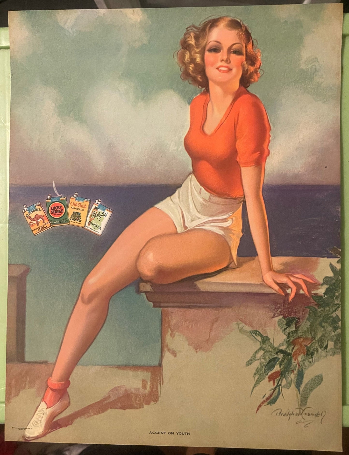
This is a New Old Stock (NOS) original chromolithographic print measuring 10.75 x 14 inches, produced by the Gerlach Barklow Company of Joliet, Illinois, and dated to the window of 1937 through 1939 — with the paper calendar pad version documented specifically to 1939.
The title "Accent on Youth" appears in printed text along the lower margin, so there is no ambiguity about what you have and who made it. The image itself is a full-color chromolithograph: a young woman seated casually on a stone sea wall, an ocean and clouded sky behind her, wearing an orange short-sleeved top, white shorts, white shoes, and red ankle socks — an outfit that manages to feel both of its precise historical moment and completely timeless.
Her auburn hair is set in the soft, deliberate curls of late-1930s fashion. She looks directly at the viewer with a composed, self-assured smile. To her left, a small cluster of cigarette packs — Camel, Lucky Strike, Old Gold, and Chesterfield — floats in the composition with the casual confidence of an era when tobacco advertising was produced with the same artistic ambition as fine illustration.
The artist is Bradshaw Crandell, and the print is, in every meaningful sense, an artifact of American graphic art history.
NOS — New Old Stock — carries a specific meaning in the collector world, and it matters here. This print was never mounted, never subjected to prolonged light exposure, never trimmed or altered. It came out of its original storage as close to its production state as eight decades will allow. That is an increasingly rare condition for printed ephemera of this period, and it is precisely why NOS examples command the attention and affection of serious collectors.
The Gerlach Barklow Company was one of the most significant commercial printing operations in the American Midwest during the first half of the twentieth century, and its home — Joliet, Illinois — was no accident of geography. Joliet sat at the crossroads of rail lines that connected Chicago's commercial energy to the rest of the country, and a printing company with national ambitions needed exactly that kind of infrastructure. Gerlach Barklow produced calendars, advertising premiums, and illustrated prints that were distributed through insurance companies, banks, hardware stores, and service businesses across the United States. Their output was staggering in volume, but what distinguished them from purely industrial competitors was a consistent willingness to commission genuinely talented illustrators — and to give the printing process the care it needed to honor that talent.
Chromolithography — the full-color printing process used for "Accent on Youth" — is a labor-intensive, technically demanding craft. Each color in the final image requires its own lithographic stone or plate, and the registration of those layers, the sequencing of ink application, and the quality of the paper stock all determine whether the finished piece glows or merely exists. Gerlach Barklow's press operators understood this. The warmth and luminosity that define the best Crandell prints produced under their imprint are not accidental — they are the product of skilled craftsmen working at the peak of a printing tradition that would soon be overtaken by faster, cheaper photomechanical methods. What you hold in this print is, among other things, a record of that craft at its finest.
Local legend in Joliet holds that the Gerlach Barklow plant ran shifts through the night during peak calendar season — roughly late summer through early autumn — and that the smell of fresh ink from the facility was a recognizable feature of the neighborhood for blocks around. Workers on the early shift reportedly knew the season's featured illustration before the sales force did, because the proofing sheets came off the stone first and were pinned to a board in the pressroom. Whether the story of a Crandell proof sheet inspiring an impromptu employee art debate is apocryphal or documented, it circulates among Joliet printing history enthusiasts with enough consistency to deserve recording. In a building full of skilled people producing beautiful things under pressure, it would be strange if some version of it hadn't happened.
Bradshaw Crandell (1896–1966) occupied a particular and rarefied position in American commercial illustration. He was not an outlier or an eccentric — he was the establishment, the standard, the benchmark that other illustrators were measured against when art directors talked about glamour portraiture. His Cosmopolitan covers, produced over a run of more than two decades, defined the visual language of aspirational American femininity for an entire generation of readers. But Crandell worked across formats, and his advertising and calendar work — produced for clients like Gerlach Barklow — shows the same technical command in a slightly different register. The calendar and advertising print format asked the artist to create a figure who would live comfortably on a wall for an entire year, who would reward repeated viewing, and who would project a mood rather than tell a story. Crandell was extraordinarily good at this.
His technique combined the draftsmanly precision of academic training with a colorist's instinct for warmth and harmony. He worked in pastels and oils, and the translation of his originals into chromolithography — when done well, as Gerlach Barklow consistently managed — preserved the softness and dimensionality of the original medium in a way that feels almost miraculous given the mechanical nature of the reproduction process. The woman in "Accent on Youth" is not flat. Her skin has gradation. Her hair has individual strands that catch light. Her clothing has fabric weight. These are not accidents of description — they are achievements of both the artist and the printer working in genuine collaboration across the gap between original and reproduction.
Whether this applied specifically to his Gerlach Barklow work is not confirmed in the published record, but the consistency of quality across surviving NOS examples from that imprint suggests that whatever quality control process was in place, it worked.
The presence of Camel, Lucky Strike, Old Gold, and Chesterfield cigarette pack imagery in this composition is not incidental — it is a window into a specific moment in American advertising history that will never be replicated. By 1939, the major tobacco companies were spending at a level that allowed them to commission the most accomplished illustrators in the country, and they understood that the vehicle for their message mattered as much as the message itself. Associating a product with a beautiful, well-composed Crandell figure was an act of brand positioning as sophisticated in its way as anything produced by later advertising agencies. The brands appear in the composition not as intrusive labels but as natural elements of the scene — present, visible, but not dominating the figure who gives the image its emotional center.
This multi-brand format — showing four competing cigarette brands simultaneously — was used in trade and point-of-sale materials designed for retailers rather than for single-brand campaigns. The practical intent was to associate the category as a whole with the glamour of the image, encouraging retailer display and consumer aspiration simultaneously. As a historical document, it captures a moment when four of America's most powerful consumer brands shared space in a single lithograph without apparent tension — a kind of competitive détente expressed in beautiful printing.
The collector base for Bradshaw Crandell printed ephemera is remarkably broad, which is itself a testament to what the work accomplishes across different collecting contexts. At one end are the pin-up and glamour illustration specialists — collectors who have studied the golden age of American commercial art in depth and who understand exactly where Crandell sits in that tradition. For these collectors, a NOS Gerlach Barklow Crandell with a documented title and date is a significant find, not a decorative curiosity.
Advertising ephemera collectors pursue this print from an entirely different direction — the cigarette advertising context, the multi-brand composition, the specific 1939 date all make it a precise historical document within their collecting framework. The tobacco advertising category is well-established in ephemera collecting, and multi-brand promotional pieces from major national campaigns are particularly sought.
Calendar art and Americana collectors form another significant group. Gerlach Barklow produced some of the most artistically accomplished calendar premiums of the pre-war era, and collectors who focus on American calendar art from this period treat NOS surviving examples as primary source material. The Joliet, Illinois provenance adds a specific regional collecting interest as well — Illinois paper Americana enthusiasts and Midwest commercial history collectors both have reasons to value this piece within their own frameworks.
And then there is the largest group of all: people who simply respond to beautiful things made with genuine craft and care, who want something on their wall that rewards looking at it, and who find that the story behind an object — the printer, the artist, the era, the survival — makes it more rather than less beautiful. These collectors are not wrong. They are, in a meaningful sense, the audience Crandell and the Gerlach Barklow pressroom were working for all along.
This is an original chromolithographic print produced by the Gerlach Barklow Company of Joliet, Illinois, during the 1937–1939 production window, with the calendar pad version documented to 1939. It is New Old Stock — meaning it was never put into retail or household use and has survived in production-state condition. It is not a photographic reproduction, digital reprint, or later facsimile. The printing process itself — chromolithography, with its characteristic layered ink depth and the slight texture that comes from stone or plate printing — is visible and verifiable in the piece. Experienced collectors who handle it will recognize immediately what they are looking at.
New Old Stock (NOS) is a term with a precise meaning in collecting: it refers to items that were produced for sale or distribution but were never actually used, displayed, or put into service — and have survived in that unused state. For printed ephemera like this lithograph, NOS condition means the paper was never mounted, never exposed to prolonged light, never handled extensively, never subjected to the moisture and temperature fluctuations that characterize a life on someone's wall. The result is paper that retains its original body and weight, color that hasn't faded or shifted, and margins that haven't been trimmed or altered. In a category where condition is everything — because chromolithographic color is acutely sensitive to light degradation — NOS is the condition all serious collectors are seeking and rarely finding.
The print measures 10.75 x 14 inches. This is not a standard frame size in current production, which is something collectors of period prints encounter regularly. The most common approach among collectors is custom framing — which allows for a mat that both accommodates the non-standard dimensions and adds a visual border that benefits the composition. A mat cut to present the image within a standard 11x14 or 12x16 frame opening works well and gives the framer flexibility. Many collectors who take period illustration seriously prefer custom framing in any case, because it allows them to match period-appropriate materials to the work.
Bradshaw Crandell (1896–1966) was among the most accomplished and widely recognized glamour portraitists in American commercial illustration history. He produced covers for Cosmopolitan magazine for more than two decades — a run that made his vision of feminine beauty and sophistication familiar to millions of American readers across the country. His calendar and advertising work, produced for publishers including Gerlach Barklow, extended that vision into a format designed for sustained, repeated viewing in homes and businesses. His technical facility in pastel and oil translated with unusual fidelity into chromolithographic reproduction, which is why surviving NOS prints from his Gerlach Barklow collaborations are as vivid and dimensionally rich as they are. Among collectors of Golden Age American illustration, his name carries the same weight as contemporaries like Gil Elvgren and Zoë Mozert — artists who defined an era's visual language and whose original and printed work remains actively collected and studied.
The presence of all four major cigarette brands in a single composition identifies this print as a trade or multi-brand promotional piece rather than a single-brand advertising campaign. This format was used in point-of-sale and retailer display materials, where the goal was to associate the tobacco category as a whole — rather than a single brand — with the glamour and aspiration embodied in the Crandell figure. For advertising ephemera collectors, multi-brand tobacco promotional pieces from the pre-war era are a specific and valued category, because they represent a moment in American commercial history when competing brands could share space in premium illustrated material. The four brands named — Camel, Lucky Strike, Old Gold, and Chesterfield — were the dominant American cigarette brands of the period, and their simultaneous presence in a single Crandell lithograph makes this piece a document of 1939 American brand culture as much as it is a work of illustration art.
Yes — the title "Accent on Youth" appears in printed text along the lower margin of the image, which is an important point of authentication and documentation. The Gerlach Barklow Company produced calendar prints in multiple formats — the same illustration might appear as a standalone lithographic print, as a calendar pad print with a date block attached, or as a promotional premium in a slightly different size or format. The version documented specifically to 1939 is the calendar pad format. NOS standalone lithographic prints from the same 1937–1939 production window are the form offered here. Collectors who encounter this image in different formats — or who find it referenced in period catalog listings — can use the printed title and Gerlach Barklow imprint to confirm they are working with the same composition across different production iterations.
The primary enemies of chromolithographic prints from this era are light, humidity, and acidic materials. For display, UV-filtering glazing — either glass or acrylic — makes a meaningful difference in slowing any future color shift, particularly for the warmer pigments (reds and oranges) that are most sensitive to light exposure. Mounting with archival, acid-free materials protects the paper from the kind of slow chemical degradation that comes from contact with acidic boards or backings. For storage rather than display, flat storage in acid-free sleeves or folders, away from heat sources and humidity fluctuations, is the standard archival approach. Many collectors of NOS printed ephemera choose to display in lower-light environments — a study, a hallway with indirect light, a bar or lounge — both because those settings suit the period aesthetic of the piece and because they extend the life of the color. The fact that this print has reached 2024 in NOS condition is proof that good storage practices work; continuing them honors both the object and the care it has already received.
Items from Vetted Pro Collectors
Shipping for items offered by vetted Pro Collectors is determined at checkout. All Pro Collector listings are reviewed to ensure fair, reasonable shipping practices.
For full details, please refer to our Shipping Policy.
Take your time — you've got a full six months. If a piece isn't right for you, send it back the way it reached you and we're good.
In the first 30 days your money goes straight back the way you paid. After that it's store credit, so you can put it toward something you'd rather have.
Return shipping we sort out between us, case by case. I don't make this difficult.
If something arrives damaged, or it isn't what I said it was, send me a photo within 48 hours and I'll make it right.
Email info@vintageantiquesgifts.com or call 802-356-9872 — that's me answering, not a call center.
The only things I can't take back are custom or special-order pieces and gift cards.