Skip to product information
1 of 3

Vintage and Antique Gifts

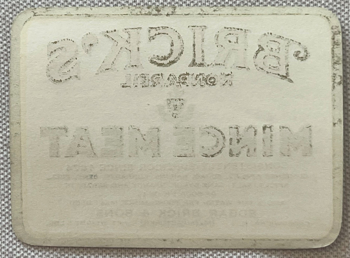
Antique Brick's Nonpareil Mince Meat Label 🦁 5 LB SIZE, Edgar Brick & Sons Crosswicks NJ, NOS 1910s-1930s

Antique Brick's Nonpareil Mince Meat Label 🦁 5 LB SIZE, Edgar Brick & Sons Crosswicks NJ, NOS 1910s-1930s

Regular price 9.00 USD
Regular price Sale price 9.00 USD
Sale Sold out
Shipping calculated at checkout.
Quantity

# What Does a Rampant Lion on a Mince Meat Label Actually Mean?

🦃 It means someone earned it. There is a moment, when you hold a piece of antique commercial printing from the early twentieth century, where the distance between then and now simply collapses. You are no longer looking at paper and ink. You are holding a decision — a choice made by a printer, an art director, a family business owner who sat across a desk in a small New Jersey town and said: put the lion on it. Make it bold.

Make it red and gold and black. Make sure anyone who picks up a tin of our mince meat in any general store from Trenton to Philadelphia knows exactly who made it and exactly how long we have been doing this. That is what this label is. Not a curiosity. Not ephemera in the casual, dismissive sense of the word. It is a primary document of American commercial culture at the moment when regional food brands were fighting — with typography, with color, with heraldry borrowed from the oldest visual vocabulary in the Western world — to own shelf space and to own trust.

I have been collecting American food labels, trade cards, and commercial printing for a long time, and I will tell you plainly: the Brick's Nonpareil Mince Meat label is one of the genuinely beautiful ones. When you lay it on a table in good light, it commands the room. It was designed to do exactly that, and more than a century later it still does. ---

What You Are Actually Looking At 🥧 This is an original, unused, New Old Stock antique paper label for Brick's Nonpareil Mince Meat, produced by Edgar Brick & Sons of Crosswicks, New Jersey, dating to the period between approximately the 1910s and 1930s.

The label measures 2.25 inches by 3 inches — a substantial sheet, built to wrap around a tin canister with full graphic authority and room to spare. New Old Stock means exactly what collectors understand it to mean: this label was never applied to a product. It was pulled from old printer's or warehouse stock in precisely the condition it left the press — unfolded, unglued, unfaded by the particular cruelty of window light or damp storage shelves.

The ink is as the printer laid it down. The paper carries the weight and tooth of the era. There is no applied-to-tin ghosting, no glue residue on the reverse, no evidence of a single Thanksgiving's mince meat ever touching this particular sheet. The printing itself belongs to the golden period of American commercial chromolithography and letterpress — a hybrid process that gave mid-tier and premium regional brands the visual complexity of full-color illustration combined with the clean authority of hand-set type.

The color field on this label is built around red, cream, black, gold, and blue, with a wide yellow ground behind the large red MINCE MEAT type that does what the best commercial lettering has always done: it makes you stop walking and start reading. Centered at the top, a heraldic shield bearing a rampant lion anchors the entire composition.

The phrase "Consistently Superior Since 1874" arcs above it with the understated confidence of a business that had been earning that sentence for fifty years before this label was ever printed. Below, the word NONPAREIL rides a wide black ribbon banner — a name meaning, literally, without equal — and if you think that was an accident of branding, you have not spent enough time with the Edgar Brick & Sons catalog. ---

🦁 Edgar Brick & Sons — The Company, The Family, The Record The story of Edgar Brick & Sons begins in 1874, which places its founding squarely in the post-Civil War economic expansion that turned the Mid-Atlantic corridor into one of the most productive agricultural and food-processing regions in the nation.

The Delaware Valley — that wide, fertile stretch running through southern New Jersey, eastern Pennsylvania, and northern Delaware — was producing apples, cider, beef, pork, and the full larder of ingredients that went into the Christmas and Thanksgiving staple of mince meat in quantities that supplied not just local tables but regional wholesale grocery trade reaching into Philadelphia, Trenton, and beyond.

Edgar Brick understood something that the best regional food producers of that era all understood: the product had to be right, and then the brand had to be unmistakable. The name Nonpareil — a word with roots in French and a long history in both typography (where it names a specific type size) and in confectionery — was chosen to signal a product positioned above the ordinary.

This was not a commodity label. This was a premium line, and the heraldic lion on the shield was the visual argument for that positioning. By the 1910s, when the earliest version of this label was likely in production, Edgar Brick & Sons had been feeding the region's holiday tables for more than forty years. The business had survived the economic dislocations of the 1890s, the transformation of the grocery trade from barrel-and-bin general stores to the early packaged-goods era, and the shift toward tin-canister and paper-wrapped retail packaging that made printed labels like this one essential rather than decorative.

That the family chose to invest in the quality of lithographic printing — in gold ink, in multiple color passes, in that elaborate heraldic centerpiece — tells you everything about how they saw their brand's position and their customers' expectations. The Brick family name itself carries weight in Burlington County's history, woven into the fabric of a region where Quaker settlement patterns, agricultural tradition, and small-scale manufacturing ran together for two centuries before Edgar set up his mince meat operation. ---

📍 Crosswicks, New Jersey — A Town That Deserves Its Own Chapter Crosswicks sits in Chesterfield Township in Burlington County, New Jersey — one of the oldest continuously inhabited communities in the state, with a history that predates the American Revolution by several generations.

The town's name derives from the Lenape, and its founding by English and Quaker settlers in the seventeenth century gave it the quiet, deeply-rooted character that persisted well into the twentieth century. This is not an incidental detail. The decision by Edgar Brick & Sons to operate from Crosswicks rather than from a larger industrial center like Trenton or Camden was a deliberate alignment with the values of the region: family ownership, agricultural sourcing, a production scale that allowed quality control, and a distribution radius built on earned reputation rather than national advertising budgets.

The Delaware and Raritan Canal, which runs through Burlington County, had connected Crosswicks-area producers to Philadelphia and New York markets since the 1830s, and the later rail connections of the late nineteenth century made regional distribution of preserved and canned goods not only possible but competitive. Local legend holds that during the height of the autumn production season in the early twentieth century, the smell of spiced mince meat — cider vinegar, suet, dried fruits, the warm bite of nutmeg and cloves — drifted through the streets of Crosswicks well into the October evenings, and that this became as much a part of the village's seasonal identity as the turning of the maple leaves along its quiet roads.

Whether or not every detail of that memory has been perfectly preserved in the telling, it reflects something true about how small-town food production in the rural Mid-Atlantic was genuinely woven into the sensory life of those communities.

Whether a complete set exists in any single collection remains an open question. ---

🖨️ American Commercial Printing at Its Peak — Why This Label Looks the Way It Does To fully appreciate what you are looking at, you need to understand what American commercial printing was doing between 1900 and 1935. This was the period in which chromolithographic and letterpress technologies had reached their mature forms — when a regional printer in New Jersey or Pennsylvania could produce a five-color food label with the visual complexity and craft that we now associate with fine art printing.

The best American label printers of this era — and New Jersey and Philadelphia were centers of the trade — treated every food label as a small poster, because they understood that on a general store shelf or a grocery counter display, a label was a poster. It had three seconds to do its work. The Brick's Nonpareil label is a master class in that tradition.

The hierarchy is clear: the lion and the shield stop your eye. The NONPAREIL ribbon establishes the product tier. The MINCE MEAT in large red type on yellow answers the essential question. And the "Consistently Superior Since 1874" arc closes the argument before you have consciously formed the thought. This is not accidental design.

This is the product of a print culture that understood visual rhetoric as deeply as any advertising agency of the era. The gold ink — present in the shield and the label's ornamental detailing — required a separate press pass, which added cost and time. Edgar Brick & Sons paid for it anyway. That tells you something. ---

🎄 Mince Meat in the American Kitchen — A Cultural Context Worth Keeping Mince meat in the early twentieth century was a holiday staple with deep roots in both English culinary tradition and American domestic practice.

The Nonpareil formulation would have been a prepared product — a cooked-down mixture of beef, suet, dried fruits, apple, spices, and preserving sugars packed into tins for the Thanksgiving and Christmas pie season — and it occupied a specific and honored place on the mid-Atlantic American table that has since largely faded from contemporary kitchen culture.

The fact that Edgar Brick & Sons was producing and branding this product from Crosswicks, New Jersey, for more than half a century speaks to just how central mince meat was to holiday food culture in this region and era. Philadelphia families, South Jersey farm tables, Delaware Valley church suppers — this was the season's centerpiece preparation, and a brand that had been doing it since 1874 carried genuine authority in the minds of the housekeepers and cooks who were making purchasing decisions at their local grocers.

Holding this label is, in some real sense, holding that tradition — the evidence that it existed, that it was taken seriously, that someone put a rampant lion on a heraldic shield to make sure you understood that. ---

🖼️ Display Ideas - 🪵 Frame it as a statement piece in a kitchen, dining room, or butler's pantry — the red, gold, and black color palette is warm and authoritative against natural wood or painted shiplap - 🍂 Style it in a seasonal vignette alongside antique pie tins, vintage rolling pins, and holiday kitchen collectibles for a Thanksgiving or Christmas display that has genuine historical weight - 🗺️ Mount it in a New Jersey or Delaware Valley regional collection alongside other Burlington County ephemera, antique maps, or Crosswicks / Chesterfield Township historical pieces - 🏛️ Include it in a food history or grocery trade display — paired with other antique food labels, trade cards, and tin lithography from the same era for a cohesive period installation - 📚 Use it as a research and reference anchor in a folk art or Americana collection — the heraldic lion motif opens a wonderful conversation about how American regional brands borrowed and adapted European commercial visual vocabulary - 🎁 Present it as a framed gift for a food historian, a New Jersey history enthusiast, a mince meat or holiday baking devotee, or anyone with roots in Burlington County or the greater Delaware Valley ---

🎁 Who Collects These The collector base for American food and grocery labels of this period is broader and more serious than most people outside the hobby realize. Paper ephemera collectors focused on New Jersey, Pennsylvania, and the greater Mid-Atlantic region seek exactly this kind of piece — regional, documented, NOS condition, with a compelling brand story attached. Kitchen antiques and advertising collectors are drawn to the color, scale, and graphic authority of premium food labels from the 1910s–1930s, a period widely regarded as the creative peak of American commercial printing before offset lithography changed the economics and aesthetics of label production. Heraldry and graphic design enthusiasts find the rampant lion and shield motif fascinating as an example of how American brands adopted old-world visual signifiers to communicate legitimacy and tradition in a competitive marketplace. New Jersey local historians and regional collectors value this as a piece of Burlington County material culture — evidence of a specific business, a specific town, and a specific food tradition that shaped community life in the early twentieth century. Holiday and seasonal collectors building Thanksgiving or Christmas-themed displays prize antique mince meat packaging for its direct connection to holiday kitchen tradition.

And typography and printing history enthusiasts recognize the letterpress and chromolithographic techniques on display here as the work of a craft tradition that deserves documentation and preservation. ---

❓ Frequently Asked Questions

What exactly does "New Old Stock" mean for a label like this?

New Old Stock — NOS — means this label was never used.

It was never applied to a tin, never subjected to canning-line humidity, never handled by a grocery stock boy or a housewife reaching for it on a shelf. It left the printer's warehouse and stayed, untouched, in some forgotten stock of surplus paper goods for the better part of a century before it surfaced. For paper ephemera, NOS condition is as close to the original object as it is possible to get — you are seeing the printer's ink and paper exactly as they came off the press, without the interventions of use, display, or time working on it.

It is the best possible condition a paper collectible can carry into the present.

How do I date this label to the 1910s–1930s range?

Dating printed ephemera without a printed date requires reading several kinds of evidence simultaneously. Typography, color palette conventions, printing technology indicators, and known company history all contribute.

Edgar Brick & Sons was operating under that name from 1874 onward, and the graphic conventions on this label — the specific style of heraldic illustration, the letterpress type choices, the chromolithographic color build, and the label format itself — are consistent with commercial printing practice from roughly 1910 through the mid-1930s.

The company's known operational history in Crosswicks frames the outer limits of the possible production window, and the visual evidence narrows it further. Dating a range rather than a single year is both honest and standard practice for unlabeled commercial printing of this era.

Is the lion on the label a specific heraldic reference, or purely decorative branding?

This is one of the genuinely interesting questions this label raises. The rampant lion — a lion standing upright on its hind legs with one forepaw raised — is one of the oldest and most widely used symbols in European heraldry, associated with courage, nobility, and ancient lineage across dozens of royal and noble traditions.

In American commercial branding of the nineteenth and early twentieth centuries, the rampant lion was frequently adopted by companies wishing to signal quality, tradition, and authority — particularly by businesses with English or Scots-Irish founder heritage, which was common throughout the Mid-Atlantic region. Whether the Brick family had any specific heraldic claim to the symbol or whether it was chosen purely for its visual and cultural authority is a question that local Burlington County genealogical records might ultimately answer.

What is not in question is what it communicates: this is a brand that sees itself as serious, established, and without equal.

What condition issues should I be aware of on a paper label of this age?

Paper ephemera from the early twentieth century can carry a range of condition characteristics that are completely normal for the age and do not diminish the piece's collector value or display presence.

Examining the piece in good light before framing is always recommended, and archival framing with UV-protective glazing is the best practice for long-term preservation.

Why is Crosswicks, New Jersey significant to collectors of this label?

Provenance matters enormously in paper ephemera collecting, and a label that can be placed in a specific town with a specific company history carries more weight — historically, culturally, and in the market — than a similar label of uncertain origin.

Crosswicks is one of Burlington County's oldest communities, with documented settlement history extending to the seventeenth century, and Edgar Brick & Sons is a part of that community's commercial and agricultural heritage. For collectors focused on New Jersey material culture, Delaware Valley Americana, or Burlington County regional history specifically, this label is not just a pretty piece of commercial art — it is a primary document of local economic and culinary history.

That specificity of place is exactly what separates a great collectible from a generic one.

How should I store or display this label to protect it?

For long-term storage, acid-free archival sleeves or folders are the standard recommendation for paper ephemera of this age and value. For display, UV-protective glazing in an archival-quality frame will protect the ink and paper from light degradation, which is the primary enemy of paper collectibles in a home environment.

Avoid displaying in direct sunlight or in rooms with significant humidity fluctuation — kitchens and bathrooms present greater preservation challenges than living rooms, dining rooms, or dedicated display spaces. If you are framing it as part of a kitchen display, UV glass is especially important given that kitchen environments tend toward more light exposure and occasional humidity.

Is this the kind of piece that a food historian or museum would recognize?

Absolutely. American food labels from the peak period of commercial chromolithographic printing — roughly 1880 through 1940 — are documented and collected by food history archives, culinary museum collections, and regional historical societies across the country. The label's combination of documented regional provenance (Edgar Brick & Sons, Crosswicks, NJ), its NOS condition, its graphic quality, its cultural content (mince meat as holiday food tradition), and its date range places it squarely within the category of objects that serious food and commercial art historians recognize as significant primary sources.

The New Jersey State Museum, the Smithsonian's collection of American commercial art, and any number of university food history archives would recognize this label's research value immediately. For the private collector, that institutional recognition is a useful calibration of what you are actually holding.

Shipping

🚚 Shipping & Handling

  • Shipping costs and timing are calculated at checkout.
  • Items curated and shipped directly by me include U.S. shipping at no additional cost, professionally packed to ensure safe arrival of your artifact.

Items from Vetted Pro Collectors
Shipping for items offered by vetted Pro Collectors is determined at checkout. All Pro Collector listings are reviewed to ensure fair, reasonable shipping practices.

For full details, please refer to our Shipping Policy.

Returns & Exchange

Take your time — you've got a full six months. If a piece isn't right for you, send it back the way it reached you and we're good.

In the first 30 days your money goes straight back the way you paid. After that it's store credit, so you can put it toward something you'd rather have.

Return shipping we sort out between us, case by case. I don't make this difficult.

If something arrives damaged, or it isn't what I said it was, send me a photo within 48 hours and I'll make it right.

Email info@vintageantiquesgifts.com or call 802-356-9872 — that's me answering, not a call center.

The only things I can't take back are custom or special-order pieces and gift cards.

View full details
