
Skip to product information
1 of 1

Vintage and Antique Gifts

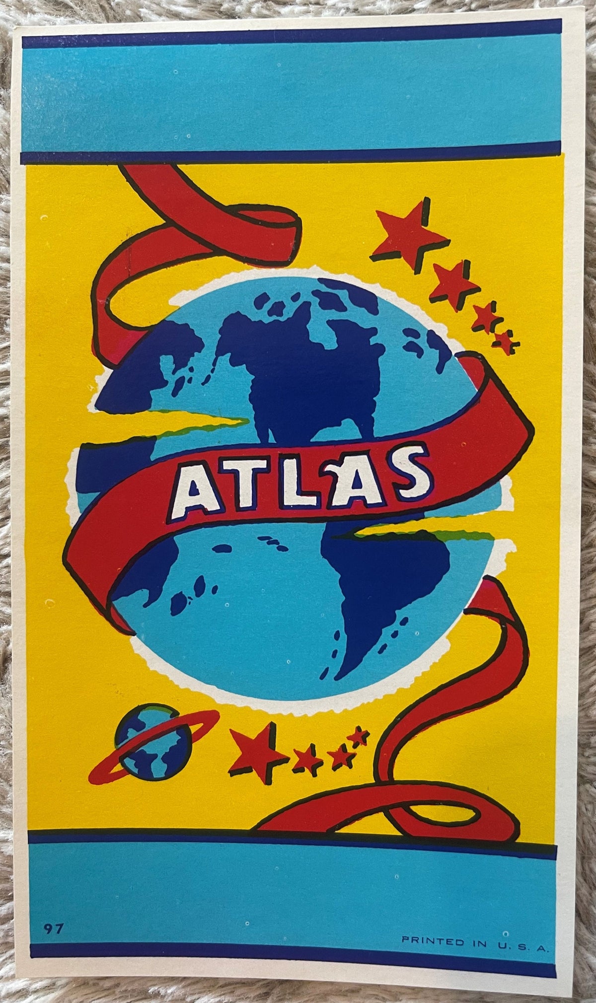
Vintage Atlas Broom Label NOS 1950s Space Age Atomic Globe Planets Stars Mid Century Modern Wall Art Decor 🧹

Vintage Atlas Broom Label NOS 1950s Space Age Atomic Globe Planets Stars Mid Century Modern Wall Art Decor 🧹

Regular price 5.50 USD
Regular price Sale price 5.50 USD
Sale Sold out
Shipping calculated at checkout.
Quantity

What Did It Take to Name a Broom After the Whole World? 🌍

There is a particular kind of commercial confidence that only a specific decade could produce — the unshakeable certainty that your broom, your hardware-store broom, deserved to carry an image of the entire Earth. Not just a wordmark. Not a simple stripe of color. The entire planet, wrapped in a red ribbon, orbited by a ringed planet, and crowned with stars radiating outward like something freshly launched from Cape Canaveral into a golden sky. That was the promise of the Atlas Brand. That was the visual declaration hanging on peg hooks in hardware stores across mid-century America. And that is exactly the energy this label still carries today — undiminished, never applied, crisp at the edges, and saturated in color so true it looks like it rolled off the lithographic press last Tuesday.

The 1950s were a decade of enormous naming ambition. Companies didn't call products "Standard" or "Good" — they called them Atlas, Titan, Hercules, Constellation, Comet. They reached for mythology and cosmology simultaneously, because the culture was doing exactly that: one eye on ancient strength, one eye on the stars. A broom called Atlas was not an accident of branding. It was a very deliberate claim. This label is the physical artifact of that claim, and it survived intact when so many did not.


🔖 What This Label Is, Exactly

This is a New Old Stock (NOS) paper lithograph broom label from the 1950s and 1960s, produced for the Atlas Brand line of household brooms marketed to the American retail hardware and general merchandise trade. It measures a clean 6 inches by 3.5 inches — substantial enough to anchor the neck of a full-size broom with visual authority, sized to be read across a hardware aisle. "New Old Stock" means this label was manufactured, warehoused, and never applied to a product. It sat in a stock room, a distributor's flat file, or a printer's overage bundle for the better part of seven decades, and it emerged without the crinkle of application, without adhesive ghosting on the face, without the bending and moisture exposure that destroy paper ephemera of this age. What you are looking at is, in the most literal sense, the thing as it was made — not as it survived.

The printing method is chromolithography, the commercial workhorse of American product labeling from the 1880s through the 1960s. In chromolithography, each color is applied in a separate press pass from a separate stone or plate, and the registration of those passes — the alignment of yellow against red against navy against sky blue against turquoise — is what gives a well-executed label its sense of depth and solidity. This label is well-executed. The colors land where they are supposed to land. The registration is tight. The result is a graphic object that reads, even at small scale, with the clarity of a well-designed poster. American commercial lithography at mid-century had seventy years of craft tradition behind it, and labels like this one are where that tradition shows most honestly — not in the prestige print runs, but in the everyday commercial work that had to be right because hardware buyers and store managers expected it to be right every time.


🌐 The Atlas Name and the Space Age Moment That Made It Perfect

The word "Atlas" carried layered meaning in 1950s America in a way it simply cannot replicate today. In Greek mythology, Atlas was the Titan condemned to hold up the celestial sphere — literally, the one who bore the weight of the heavens. By the 16th century, cartographers were publishing bound collections of maps and calling them atlases, after the figure who carried the world. By the 19th century, "Atlas" had become shorthand in American commercial naming for strength, reach, and the suggestion that whatever this company made, it covered the territory — all of it. Hardware brands, insurance companies, moving companies, and yes, broom manufacturers reached for that name because it communicated, without a single word of copy, exactly what a mid-century American housewife or hardware store proprietor wanted to believe about a product: that it was reliable, comprehensive, and built to hold up under weight.

But something happened in the mid-to-late 1950s that made the globe-and-planets visual language of a label like this suddenly charged with an entirely new layer of meaning. On October 4, 1957, the Soviet Union launched Sputnik, and the night sky over America changed. Within a year, NASA was chartered. Within four years, a human being would orbit the Earth. The Space Age was not a future projection in 1957 — it was Tuesday morning's newspaper. And into that cultural moment, a broom label showing a globe orbited by planets and scattered with radiating stars wasn't just a reference to ancient mythology. It was a visual rhyme with the most urgent conversation in American culture. The label didn't need to be redesigned. It was already speaking the right language.

This is the precise overlap — mythological naming tradition meeting Space Age visual vocabulary — that makes mid-century commercial ephemera like this Atlas label so resonant to collectors today. It is a document of a moment when the ancient and the futuristic briefly shared the same color palette: golden yellow, deep navy, sky blue, and red. That palette appears on NASA mission patches, on Atomic Age kitchen ceramics, on Eames-era furniture fabrics, and on the back wall of every well-curated mid-century modern interior you have ever admired in an architecture magazine. It is not a coincidence. It is a cultural fingerprint.


🏭 The American Broom Industry: A Trade with Deep Roots

The broom manufacturing industry in mid-century America was a genuinely significant segment of the household goods trade, with production concentrated in regions where broomcorn — the specific sorghum variety whose stiff seed heads form the sweeping surface of a traditional broom — grew reliably. Illinois, Kansas, and Oklahoma were the historic hearts of American broomcorn agriculture, and small manufacturing towns built entire economic identities around broom production. The industry had its own trade associations, its own buyer networks, its own annual trade shows, and its own label printers — because a broom without its label was a broom without a brand, and mid-century hardware buyers were brand buyers.

The label itself was a surprisingly important piece of the commercial transaction. Hardware stores of the 1950s were not self-service environments the way modern big-box stores are. They were staffed operations where the proprietor or his clerk was the first point of contact. But broom displays were often near-autonomous — a standing rack or a wall peg where the brooms hung by their handles and the labels did the selling. The label had to communicate brand identity, suggest quality, and create enough visual interest that it stood out in a context where the primary product (a bundle of broomcorn stitched to a wooden handle) offered almost no inherent visual differentiation. This is why broom labels from this era often outperform their utilitarian context in design ambition. The designers knew the label was doing all the work, and they acted accordingly.


🎨 On the Label: A Close Look at What Makes This Design Work

The composition of this label is worth lingering over, because it is doing several things at once with considerable economy of means. The central element is the globe — rendered in deep navy blue continents against a bright sky-blue field, the landmasses simplified into the kind of cartographic shorthand that is immediately legible at label scale. This is not a precision map. It is an icon. The globe reads as "Earth" in the same way that a simplified silhouette reads as a recognizable shape — through strategic reduction rather than exhaustive detail. The designers understood that at 6 by 3.5 inches, you cannot draw a Mercator projection. You draw the idea of a Mercator projection, and you draw it boldly.

The red ribbon that spirals around the globe is the composition's organizing gesture. It creates movement in what would otherwise be a static circle, and it provides the surface on which ATLAS appears in bold white block lettering — high contrast, maximum legibility, the kind of typographic decision that looks simple and is anything but. White on red is one of the most legible color combinations in commercial printing, which is precisely why it has been used on everything from Coca-Cola to Campbell's Soup to stop signs. The designers of this label understood their visual hierarchy: globe first, name second, detail third.

The ringed planet sitting below the globe — small, precise, unmistakable — is the detail that elevates this label from competent commercial work to genuinely collectible graphic art. It didn't have to be there. No broom required a Saturn reference. But someone in the design process made the decision to include it, and that decision transforms the label's meaning from "strong, worldwide brand" into "this product exists in a universe of ambition and possibility." In 1957 or 1958, that ringed planet was practically breaking news. Today it reads as pure mid-century modern poetry.

The gold-yellow ground saturated with descending red stars creates the sense of trajectory and radiation that defined Space Age graphic design — the same visual language that appeared on science fiction paperback covers, on World's Fair exhibition graphics, and on the earliest NASA mission communications materials. The framing bands of turquoise blue with navy rule at top and bottom are classic mid-century label structure: containing, organizing, and lending an authority of finish to the composition. The full palette — yellow, red, sky blue, navy, turquoise, white — is a chromatic document of its exact moment in American design history, identifiable at a glance to anyone who has spent time with the period's commercial graphics.


🖼️ Display Ideas

  • 🗺️ Framed in a shadow box with other mid-century Space Age ephemera — a Sputnik-era magazine cover, a World's Fair souvenir, a star chart — for a curated atomic-age vignette on a study or library wall.
  • 🪴 In a small clip-frame on a floating shelf alongside ceramic Eames-era objects, a globe bookend, or a vintage astronomy book for a clean, modern-retro reading nook accent.
  • 🧲 Mounted under glass on a vintage drafting table or workbench display in a home office or creative studio, where it reads as both inspiration and artifact among other tools and objects of a maker's space.
  • 🌟 As part of a gallery wall of vintage commercial labels — broom, seed packet, cigar, crate — arranged by color palette for a graphic-design-forward kitchen or dining room installation that treats American commercial art as exactly what it is.
  • 🪐 In a child's or teenager's space with a space and astronomy theme, where it functions as genuine vintage art rather than a reproduction — a real artifact of the era that first dreamed about going to the stars.
  • 🏪 As a focal piece in a vintage shop or antique booth display, framed and spotlit, with a small card noting its NOS status and date — the kind of display piece that stops browsers in their tracks and starts conversations about the whole era.

🎁 Who Collects These

The collector base for a piece like this Atlas broom label is broader and more varied than a first glance might suggest, because the label operates in multiple collecting categories simultaneously. Mid-century modern design collectors are the most immediately obvious audience — anyone furnishing, decorating, or assembling a curated environment in the aesthetic vocabulary of the 1950s and early 1960s recognizes this label's color palette and visual grammar as authentic period material, not reproduction. For this collector, the label is design documentation as much as it is decor.

Space Age and atomic-era collectors are a second major audience. The ringed planet, the radiating stars, the globe-as-cosmos imagery place this label squarely in the visual culture of the Space Race years, and collectors who focus on Sputnik-era ephemera, early NASA memorabilia, and the broader popular culture of atomic optimism recognize the label as a member of that visual family even though it originated in the hardware trade rather than aerospace.

Paper ephemera and advertising art collectors prize NOS commercial labels for their condition, their printing quality, and their specificity — a label that can be precisely dated and attributed to a brand and industry is documentation, not just decoration. Americana collectors and folk art enthusiasts find in commercial labels like this one a form of vernacular art that is entirely American in its visual ambition and its material honesty. And finally, the growing community of vintage brand and logo enthusiasts — designers, art directors, and brand strategists who study mid-century commercial graphics professionally — treats pieces like this as primary source material for understanding how color, typography, and symbolism worked together in American commerce before the digital era changed everything.


❓ Frequently Asked Questions

What does "New Old Stock" mean for this label, and why does it matter?

New Old Stock — NOS — means the item was manufactured but never used in its intended commercial application. For this Atlas broom label, it means the label was printed, warehoused as part of a production run, and never applied to a broom handle. It did not go through the adhesion process, did not absorb the humidity of a storage room while attached to a product, did not get handled by retail staff, and did not experience the mechanical stress of being bent, pressed, or removed. NOS status is the gold standard in paper ephemera collecting precisely because it represents the item at its point of manufacture rather than at the end of its use cycle.

Is the color really this vivid on an original 1950s label?

Yes — and this surprises many collectors who are accustomed to seeing vintage paper with age-related fading or darkening. The reason NOS chromolithographic labels from the 1950s can retain their color so well is that the pigments used in mid-century commercial lithography were, in many formulations, quite lightfast, and labels stored in the dark — in boxes, in flat files, in the back of stockrooms — were protected from the UV exposure that causes fading. When a label like this one has been kept away from light and handled infrequently, the colors it shows today are very close to the colors that came off the press. The golden yellow, the deep navy, the sky blue, the turquoise banding — these are not faded approximations of their original selves. They are the real thing.

How large is this label, and how would I frame it?

The label measures 6 inches by 3.5 inches — a horizontal rectangle of quite satisfying proportion for display purposes. For framing, most collectors choose one of two approaches: a simple clip-frame or float-mount that keeps the presentation clean and lets the label speak for itself, or a shadow-box arrangement that incorporates depth and pairs the label with complementary objects. Standard 4x6 photo frames can work with minor matting adjustment, and custom mat-cutting to center the label in a larger frame — say, 8x10 or 5x7 — creates a finished presentation that reads as intentional wall art rather than a pinned curiosity. Archival-quality materials (acid-free mat, UV-filtering glazing) are always recommended for paper this age, not because the label is fragile, but because you are investing in its next seventy years of preservation as much as you are enjoying its present display.

What is chromolithography, and is it still done this way?

Chromolithography is a printing process in which each color in a design is applied to the paper in a separate press pass, using a stone (in traditional lithography) or a metal plate (in the later offset adaptations) that carries only that color's information. A label with six distinct colors required six separate passes through the press, with careful registration — alignment — between each pass to ensure the colors landed in exactly the right relationship to one another.

The craft of a skilled lithographic printer lay in managing that registration across an entire press run, maintaining consistency from the first sheet to the last. Commercial chromolithography of the quality seen in this label was the dominant method for American product labeling from roughly the 1880s through the 1960s, when photographic offset printing processes gradually displaced it for most commercial applications.

Today, the process exists primarily in fine art printmaking studios and among specialist printers working in historical methods. The commercial label lithography that produced this Atlas label is no longer practiced at industrial scale — which is precisely what makes surviving examples like this one irreplaceable artifacts of a print tradition.

Can this label be authenticated to the 1950s?

Authentication of paper ephemera from this period relies on a convergence of evidence rather than a single definitive test. The printing method — chromolithography executed in a specific palette and with specific typographic conventions — is consistent with mid-century American commercial label production. The paper stock, its weight and texture, is consistent with the grades used by American label printers of the period. The design vocabulary — globe imagery, Space Age celestial elements, the specific palette of golden yellow with red, sky blue, navy, and turquoise — is deeply characteristic of late-1950s American commercial graphic design, tightly bounded to that moment. The style of the block lettering and the structural organization of the label composition are consistent with American label design conventions of the 1950s rather than earlier or later periods. Taken together, these elements place the label confidently within its stated era, and its NOS condition — no applied adhesive, no product-contact aging patterns — is itself consistent with legitimate old-stock provenance.

Is this label appropriate as a gift for someone who isn't a "serious" collector?

Emphatically yes, and in some ways this kind of piece is better as a gift for someone who loves the era, the aesthetic, or the subject matter without approaching it through the lens of collecting discipline. A mid-century modern enthusiast who decorates with the period's furniture and ceramics and textiles will immediately recognize this label's visual language and understand its authenticity without needing a primer on paper ephemera collecting. Someone with a home office, workshop, or creative studio decorated in vintage Americana will respond to the label's graphic confidence and its artifact status. And anyone with a genuine emotional connection to the Space Age — to the era of Sputnik and early NASA and the particular optimism of a moment when going to the moon seemed like the natural next step for an ambitious civilization — will find in this small label a genuine, tangible piece of that moment. At 6 by 3.5 inches, it is the right size to be a discovery, a small treasure, a thing that rewards closer looking. Those make the best gifts.

How rare is this label, and will it become harder to find?

Vintage commercial broom labels from the 1950s are a genuinely finite resource. They were not collected or preserved by design — they survived through accidents of storage, through the hoarding instincts of printers and distributors who kept their overruns, and through the attentiveness of paper ephemera dealers and collectors who recognized their value before the broader market did. The NOS examples — those that were never applied — are rarer than applied-and-recovered labels, because the use cycle that would have preserved them (application, retail sale, eventual discard) is exactly the cycle most labels went through, leaving very few in unused warehouse condition. As mid-century modern collecting matures as a field and as Space Age ephemera attracts more collector interest from design professionals and cultural historians, the supply of authentic NOS commercial labels from this period will only decrease. These labels are not being reprinted. The lithography shops that made them are gone. Each surviving NOS example is what it is — and there will not be more of them.

Shipping

🚚 Shipping & Handling

  • Shipping costs and timing are calculated at checkout.
  • Items curated and shipped directly by me include U.S. shipping at no additional cost, professionally packed to ensure safe arrival of your artifact.

Items from Vetted Pro Collectors
Shipping for items offered by vetted Pro Collectors is determined at checkout. All Pro Collector listings are reviewed to ensure fair, reasonable shipping practices.

For full details, please refer to our Shipping Policy.

Returns & Exchange

Take your time — you've got a full six months. If a piece isn't right for you, send it back the way it reached you and we're good.

In the first 30 days your money goes straight back the way you paid. After that it's store credit, so you can put it toward something you'd rather have.

Return shipping we sort out between us, case by case. I don't make this difficult.

If something arrives damaged, or it isn't what I said it was, send me a photo within 48 hours and I'll make it right.

Email info@vintageantiquesgifts.com or call 802-356-9872 — that's me answering, not a call center.

The only things I can't take back are custom or special-order pieces and gift cards.

View full details
  • 5 stars: 1 (100%)
  • 4 stars: 0 (0%)
  • 3 stars: 0 (0%)
  • 2 stars: 0 (0%)
  • 1 star: 0 (0%)
o
o***a (689)

Great product great seller!