
Skip to product information
1 of 3

Vintage and Antique Gifts

Vintage Full Brand Orange Crate Label 🍊 1940s Waverly Florida Citrus, Comic Orange-Man, Waverly Growers Co-op

Vintage Full Brand Orange Crate Label 🍊 1940s Waverly Florida Citrus, Comic Orange-Man, Waverly Growers Co-op

Regular price 8.00 USD
Regular price Sale price 8.00 USD
Sale Sold out
Shipping calculated at checkout.
Quantity

Size: 9 x 4.5 inches

🍊 The Little Orange-Man of Waverly

This one makes people grin before they read a word. On a deep midnight-blue ground stands a character built entirely out of an orange tree: a round, glowing orange for a body, a pointed green leaf for a head — complete with eyebrows, eyes and a wry little mouth — and thin brown twigs for arms and legs, one hand still gripping the branch he grew on. Beside him, in fat white bubble letters outlined in sky blue, sits the single-word brand: "Full." Below run "Produce of U.S.A." and the maker's name. It is a Full brand orange-crate label from the Waverly Growers Cooperative of Waverly, Florida, and it is one of the most purely charming pieces the Florida citrus trade ever produced. Everything described here comes straight from the label in the photographs; the history is what can honestly be established about the co-op behind it.


🏢 The Waverly Growers Cooperative

The label names its own maker plainly: "Waverly Growers Cooperative, Waverly, Florida." And unusually for these small brands, this is a firm with a genuinely rich, documented story. It began in 1914, when a group of local growers — led by Charles Hillery Walker and a Danish immigrant named W.L. Pedersen — organised the Waverly Citrus Growers' Association and put up a small packing shed by the railroad tracks in Waverly, on the sandy citrus ridge of Polk County in central Florida. A "cooperative" like this pooled the fruit of many small growers to be graded, packed, shipped and marketed together under shared brands, giving each grower the reach of a large shipper.

The Danish connection turned out to matter. Pedersen brought with him a knowledge of the cooperative methods practised in Denmark, and out of that grew what became known as the "Waverly plan" of cooperative operation — a way of organising the packing house that made the Waverly organisation one of the most efficiently run citrus plants in the state. That little trackside shed of 1914 grew, over the years, into one of the most modernised packing houses in Florida. In 1936 the association took the name it wears on this label, the Waverly Growers Cooperative. It endured for the better part of a century, eventually becoming one of the grower cooperatives behind Florida's Natural, before the historic packing house finally passed into other hands in 2005. The Full brand is the trade dress of that institution — which gives this cheerful little orange-man a documented depth well beyond his grin.

Waverly sits in the heart of Polk County, the great citrus county of the central-Florida ridge, where the well-drained sandy hills and scattered lakes made ideal orange ground. From that ridge, fruit went north by rail and truck to markets that had never seen the grove, and a co-op's brand was its signature in those far-off places. Full was one of Waverly's — and the co-op ran others too, cheerful names like Dixie Boy among them, each dressed in its own artwork.


😀 Why an Orange With a Face?

Because the label's whole job was to be unforgettable. In a wholesale market a buyer's eye slid across dozens of stacked crates in seconds, and a brand lived or died on whether its label could stop that eye. A single powerful character beat a busy picture every time, and few characters are as instantly likable as this pun made flesh: a "Full" orange, so ripe and round he has grown arms and legs and clambered off the branch to introduce himself. The name does double duty — "Full" of juice, full of cheer — and the joke lands in a heartbeat, which is exactly what a good brand had to do. Look at the confident drawing: the wry cartoon face on the leaf, the spidery twig limbs, the glowing orange body against that saturated blue. This is accomplished commercial illustration, and it holds up beautifully framed on a wall.


📦 Genuinely Old, Never Used

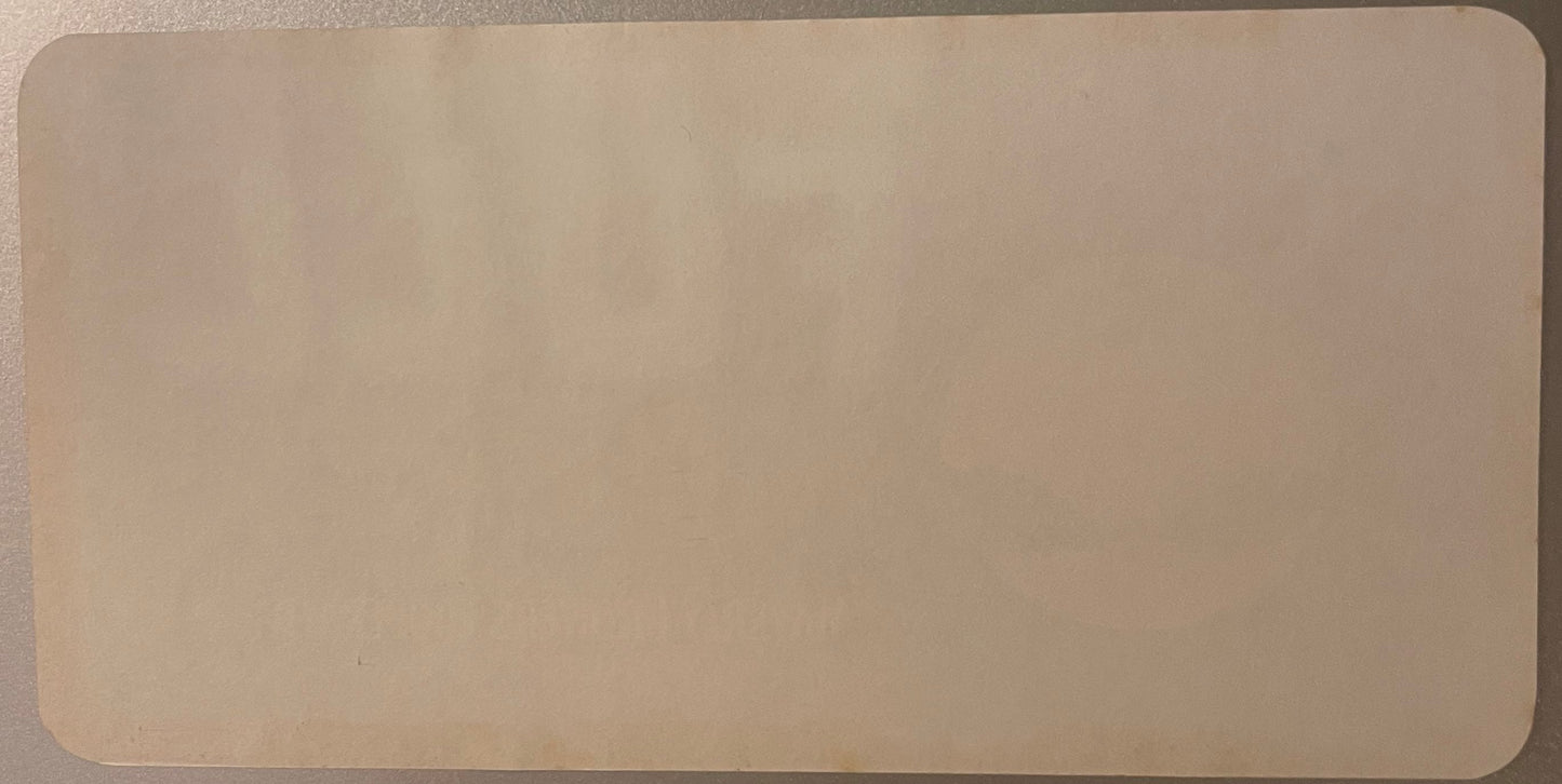
A word on why a label this old still looks freshly printed: it was never used. For decades Florida oranges rode to market in nailed wooden crates, each of which wanted a pasted paper label, so the co-op ordered them by the thousand. When pre-printed cardboard cartons took over — with the brand printed straight onto the box — the paper labels became obsolete, and leftover stacks sat forgotten on warehouse shelves. This Full label is one of those survivors: never pasted, its reverse clean but for a soft ghost of the front bleeding through, its blue ground and glowing orange as vivid as the day they were printed. In tiny type along the base is the lithographer's credit, "Brandau-Craig-Dickerson Co., Nashville, Tenn." It is described as a 1940s printing, in keeping with its style; no single exact year is claimed.


🔍 An Honest Look at Condition

Read from the same photographs: this is a single sheet of original vintage lithographed paper, unused, with a blank reverse carrying only a faint mirror-image bleed-through of the front — exactly what an unused, never-pasted label should show. The printed face is richly saturated, the midnight blue deep, the orange body glowing, the white bubble lettering crisp. It shows the light, honest character of stored vintage paper and is offered exactly as pictured, with nothing added, retouched or concealed. As a flat paper label it frames cleanly and without bulk — but note the proportion before you buy a moulding: this is a wide horizontal rectangle of roughly 2:1, about twice as wide as it is tall, not a square.


🖼️ How to Live With It

A label this likable, from a real and storied Polk County co-op, is made to be seen:

  • 🍊 Frame it as-is — the bold blue ground and grinning orange-man look terrific in a simple frame, a natural for a kitchen, a breakfast nook or a child's room.
  • 😀 Let the humour carry a modern or playful room; this is friendly pop art from before the term existed.
  • 🍊 Build a Florida citrus wall, grouping it with other orange and grapefruit labels for a bright, sun-soaked corner.
  • 🏡 Give a Polk County or Waverly connection a keepsake — a genuine local co-op's label is a specific, rooted piece of home.
  • 🎁 Use it as an affordable, genuinely-vintage gift that is guaranteed to make someone smile.

🎁 Who This Is For

Full lands hardest with a few kinds of people. The crate-label collector prizes a bold, packer-attributed Florida citrus label with a strong figural design and a named lithographer — and one from a documented, historically significant co-op like Waverly has real appeal. The lover of vintage cartoon and character advertising simply wants that grinning orange-man on the wall. And the person with roots on the central-Florida ridge finds real local history in the words "Waverly Growers Cooperative." For every one of them, this is a single original label, offered exactly as shown.


❓ Questions Worth Answering

Who made it?

The Waverly Growers Cooperative of Waverly, Florida — a citrus growers' co-op founded in 1914 (as the Waverly Citrus Growers' Association) and renamed in 1936. The label was lithographed by the Brandau-Craig-Dickerson Co. of Nashville.

What is the character?

A comic "orange-man": a ripe orange for a body, a leaf for a head with a cartoon face, and twig arms and legs. The pun is the brand — "Full" of juice.

Is it original or a reproduction?

An original vintage lithographed label. The bleed-through-only reverse and paper character indicate genuine unused new-old-stock.

How old is it?

Described as a 1940s printing, in keeping with the design and the lithography. No exact year is stated on the label and none is claimed.

What condition is it in?

Unused, with a clean blank back (bearing only a faint bleed-through) and a vivid saturated face. Offered exactly as pictured.


📦 How a Label Like This Was Used

It helps to picture the label doing its original job. The Waverly Growers Cooperative graded and packed its members' oranges in the big trackside packing house, filled nailed wooden crates, and pasted a paper label just like this one to the end panel of each. Stacked in a boxcar or a market, those panels faced outward — so the grinning orange-man was quite literally the face the co-op's fruit wore on its journey out of Polk County. That is why the design is so bold and so simple: a single unforgettable character against deep blue, readable and memorable in a glance by a buyer scanning dozens of similar crates. An unused survivor like this one preserves that whole intention in mint state, the little orange-man never once having ridden the crate he was drawn for.


🖼️ A Word on Framing and Care

Because it is flat, light and unmounted, this label could not be simpler to live with. Its wide horizontal shape — roughly 2:1, about twice as wide as it is tall — frames beautifully in a plain landscape moulding with a neutral mat, which lets the bold blue ground and the orange-man carry the wall. Do not buy a square frame for it. As with all vintage paper, a few small courtesies keep it exactly as it is now: use acid-free framing materials, hang it out of direct sunlight to protect the saturated colour, and handle it by the edges. Given that ordinary care, this genuine 1940s co-op label will stay as vivid for the next owner as it is today.


✨ Why It Matters

Every one of these labels is a small window into how a real company once sold its food — not with a photograph and a barcode, but with a picture good enough to stop a busy buyer in his tracks. The Waverly Growers Cooperative did it with pure charm: a ripe orange grown so full of juice he sprouted a face and legs and climbed off the branch to say hello. Behind that grin stands a genuinely storied institution — a 1914 Polk County co-op built on a Danish-inspired "Waverly plan" that became one of the best-run citrus houses in the state. Preserved unused for the better part of a century, this little orange-man still makes people smile. Frame him and you are keeping a real, bright piece of how one Florida co-op sold its harvest.

📐 The Proportion, Stated Properly

Worth being exact about, because it decides what frame you buy: this sheet is a wide horizontal rectangle of roughly 2:1 — about twice as wide as it is tall — with a darker vignetted border and rounded corners. It is not square.

Two small points on the printing while we are here. The lithographer's imprint is set on the object without hyphensBRANDAU CRAIG DICKERSON CO., NASHVILLE, TENN. — in tiny red-brown microtype along the bottom right of the printed area, inside the dark border; the bottom left was checked at 6x and carries no printing at all. And the country line is set with spaced initials as Produce of U. S. A.

One more thing a buyer should know: no fruit word is printed anywhere on this sheet. Nothing on it says orange, oranges or citrus. The fruit identity is carried by the artwork — the anthropomorphic orange — and by the co-op's own name.

Shipping

🚚 Shipping & Handling

  • Shipping costs and timing are calculated at checkout.
  • Items curated and shipped directly by me include U.S. shipping at no additional cost, professionally packed to ensure safe arrival of your artifact.

Items from Vetted Pro Collectors
Shipping for items offered by vetted Pro Collectors is determined at checkout. All Pro Collector listings are reviewed to ensure fair, reasonable shipping practices.

For full details, please refer to our Shipping Policy.

Returns & Exchange

Take your time — you've got a full six months. If a piece isn't right for you, send it back the way it reached you and we're good.

In the first 30 days your money goes straight back the way you paid. After that it's store credit, so you can put it toward something you'd rather have.

Return shipping we sort out between us, case by case. I don't make this difficult.

If something arrives damaged, or it isn't what I said it was, send me a photo within 48 hours and I'll make it right.

Email info@vintageantiquesgifts.com or call 802-356-9872 — that's me answering, not a call center.

The only things I can't take back are custom or special-order pieces and gift cards.

View full details
  • 5 stars: 3 (100%)
  • 4 stars: 0 (0%)
  • 3 stars: 0 (0%)
  • 2 stars: 0 (0%)
  • 1 star: 0 (0%)
h
h***a (1368)

Excellent packaging. The item arrived in perfect condition.

D
Drew Swaggerty

Arrived in great condition. Would buy again.

Hello Drew! We're so thrilled to learn you appreciated our Antique Waverly Label. It warms our hearts to see these vintage pieces finding a new home to be cherished in. Stay tuned for more hidden gems from the past from us to you. We're all about making history come alive!

D
David Hewes (Tampa, US)

Great!

Glad you liked it, Thank you!