Skip to product information
1 of 2

Vintage and Antique Gifts

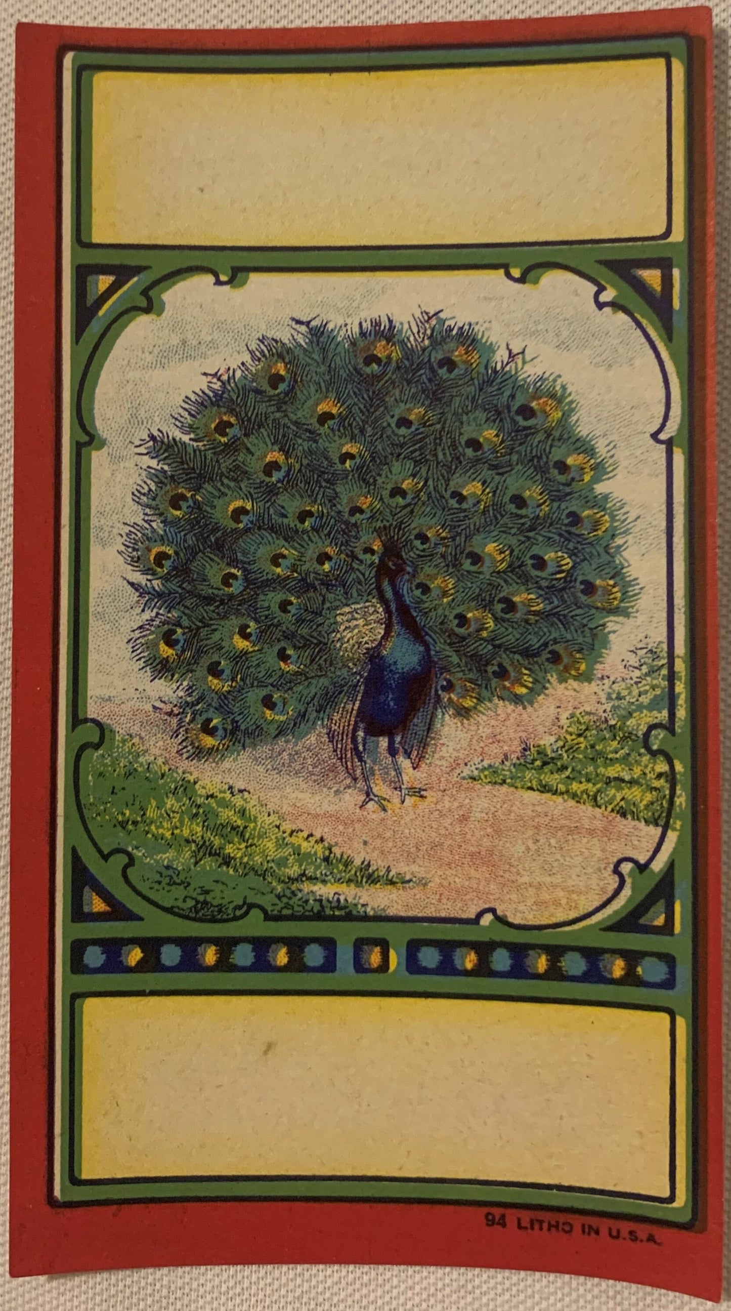
Antique Peacock Broom Label 🦚 1910s–1920s NOS Commercial Lithography | Deep Teal Bird Art American Made

Regular price 7.00 USD
Regular price Sale price 7.00 USD
Sale Sold out
Shipping calculated at checkout.

Description

# What Does a Century-Old Peacock Look Like When It's Never Been Used? 🦚 There is a particular stillness that comes over a room when you hold a piece of paper that has waited a hundred years to be seen. Not read — *seen*. Commercial lithography from the 1910s and 1920s occupies a strange and beautiful place in American art history: it was made to sell things, designed by craftsmen who were paid by the job and not celebrated by name, printed in runs of thousands and destined to be glued, handled, torn, and forgotten. Except when it wasn't. Except when a stock room closed, a warehouse went quiet, and a bundle of labels sat undisturbed in a wooden crate while the rest of the century happened without them. That is the origin story of what you are looking at right now — and the reason it still has the power to stop you cold. --- ## What This Piece Actually Is 🦚 This is an original antique peacock broom label, dating to the **1910s–1920s**, a genuine artifact of the American commercial lithography trade at the absolute height of its creative and technical power. The label measures **6 inches tall by 3½ inches wide** — a format that, the moment you frame it, reads not as ephemera but as portraiture. It is **New Old Stock (NOS)**: unused, unglued, and uncirculated, pulled from old inventory rather than salvaged from a broom handle. The paper is crisp. The colors have never faded behind a layer of varnish or adhesive. The ink surface is as alive today as the day it left the press. The printing process behind this label is **stone lithography or early offset chromolithography** — a method that required skilled artisans to hand-draw or transfer each color layer separately onto limestone or zinc plates, building up depth and luminosity through precise registration of sometimes a dozen or more passes. The result, on a piece like this, is color that seems to glow from within rather than sit on top of the paper. That deep teal, that burnished gold on the eye-spots — those are not digital approximations of a color. They are the color itself, mixed and pressed by craftsmen who spent careers learning to coax beauty out of industrial machinery. The subject — a peacock displayed in full courtship fan — fills the image field with theatrical confidence. The tail feathers radiate outward into a near-perfect circle, each individual plume articulated with care, the distinctive ocelli (those famous "eye" markings) picked out in gold with dark centers that catch light at an angle. The bird's body is positioned at the base of the composition with the posture of something that knows it is the center of attention. This is not a rushed trade illustration. This is commercial art from an era when the line between commercial and fine barely existed. ---
## 🏭 The American Broom Label Industry — A Golden Trade You've Probably Never Thought About The broom manufacturing industry in America during the late nineteenth and early twentieth centuries was far larger, far more competitive, and far more regionally concentrated than most people realize. At its peak, hundreds of independent broom factories operated across the Midwest and South — clustered especially in Illinois, Kansas, and parts of the mid-Atlantic states where broomcorn (the sorghum-family plant whose stiff fibrous stalks formed the business end of a traditional broom) grew in reliable supply and where rail freight could move finished goods cheaply to regional and national markets. What made those brooms move off the shelves was not quality claims or price — it was the label. In an era before broadcast advertising, before radio spots, before the branded shopping experience as we understand it now, the paper label wrapped around a broom handle was the *entire* marketing budget of a small manufacturer. It was the face of the company. It was the thing a housewife or a hardware store owner remembered when they placed their next order. And so broom manufacturers spent money — real money, proportional to their means — on label design and lithographic printing quality. The best labels were produced by specialty trade lithographers who understood this assignment and delivered work that deserves to hang in galleries. The peacock was not a random choice of subject matter. In the decorative vocabulary of the Edwardian and early Arts and Crafts era — the aesthetic atmosphere in which these labels were designed — the peacock was a **symbol of pride, beauty, and quality**. It appeared in tile work, wallpapers, jewelry, and theatre curtains. Putting a peacock on your broom label was a statement: this product is not ordinary. This manufacturer thought of itself as the luxury tier. Whether or not the broom itself lived up to that billing, the label certainly does. ---
## 🎨 The Lithographers Behind the Art — Craftsmen Without Credit One of the quiet heartbreaks of commercial ephemera collecting is that the artists who designed these labels are almost never identified. The printing firms sometimes appear in small text on the back of a label or tucked into a margin — a city name, a trade imprint, occasionally a printer's mark — but the individual designer or illustrator who rendered that peacock in all its teal-and-gold glory left no signature. This was simply the nature of commercial work in the trade printing houses of the era: you were hired talent, your work was the property of the manufacturer, and your name was not part of the transaction. What we do know is that the major chromolithography trade printers of this period — firms operating in Chicago, Cincinnati, New York, and St. Louis, among other printing centers — employed staff artists who were formally trained, often in European printmaking and illustration traditions, and who brought genuine artistic sophistication to even the most utilitarian assignments. A broom label commission was not beneath them. It was simply Tuesday. And on that Tuesday, someone sat down and drew a peacock that still commands a room a hundred years later. **Lore passed down among paper ephemera collectors holds** that the most prized broom labels — the ones with the most elaborate color work and the most naturalistic animal renderings — came out of a relatively short window between approximately 1905 and 1925, before cost-cutting pressures on print runs began to simplify label art and reduce color counts. Collectors who have handled hundreds of these labels report a distinct step-down in quality in anything printed after the mid-1920s, as offset lithography became dominant and the patient, layered stone-printing process gave way to faster and cheaper methods. This label sits squarely in that golden window. **Local legend among Midwest broom trade historians has it** that certain regional printing houses maintained a standing "show piece" policy — they would produce a single label design to an extremely high standard as a kind of calling card, a proof of capability they could show to prospective manufacturer clients, and that overruns from these demonstration prints sometimes ended up in the hands of stationers, framing shops, or simply in storage, never attached to a product at all. Whether this label originated that way or simply survived intact through the luck of a closed stockroom is not verifiable — but collectors have noted that NOS broom labels of this artistic quality appear in small, cohesive batches, not as single orphaned survivors, which suggests they were kept together rather than separated from a used run. ---
## 🖼️ Display Ideas - 🖼️ **Float-mount in a deep shadowbox frame** with a linen or kraft paper mat — the ivory or neutral background lets the teal and gold dominate without competition, and the slight depth gives the label a jewel-box presence on the wall. - 🌿 **Group it in a botanical or bird art gallery wall** alongside vintage audubon prints, pressed fern specimens, or other peacock-themed antique imagery — the period palette integrates seamlessly with late Victorian and Edwardian decorative prints. - 🏡 **Use it as a focal point in a study, library, or reading nook** where guests will have time to look closely — the fine detail in the feather rendering rewards sustained attention in a way that large-scale art often doesn't. - 🎨 **Pair it with Arts and Crafts or Art Nouveau period objects** — the peacock motif was central to both movements, and this label reads as a cousin to Tiffany glass, William Morris wallpaper, and Rookwood pottery in terms of its visual vocabulary. - 🎁 **Frame it as a collected gift** alongside a handwritten note about its provenance — NOS commercial lithography from this era is a genuinely rare category of antique, and framing the story alongside the piece is half the gift. - 🌊 **Display it in a color-rich interior** — deep jewel-tone walls in navy, forest green, or burgundy create a backdrop against which the teal and gold of the peacock become electrifying rather than simply decorative. ---
## 🎁 Who Collects These The community that gathers around antique advertising labels and commercial ephemera is one of the warmest and most knowledgeable in the broader world of antiques and vintage collecting — and it spans a surprisingly wide range of motivations and backgrounds. **Paper ephemera collectors** pursue this category for its rarity and its direct connection to the material culture of everyday American life. Broom labels are a niche within a niche — produced in large numbers originally, but surviving in NOS condition only when entire stocks were never used. Serious collectors understand that an unglued, crisp example like this one is genuinely harder to find than a used label in good condition, because most of what was printed was used. **Folk art and Americana enthusiasts** are drawn to the intersection of craft and commerce that trade lithography represents. These pieces were made by skilled hands for functional purposes and were never intended to be art — which, paradoxically, is part of what makes them art. The same quality of genuine, unselfconscious making that collectors prize in quilts, trade signs, and decorated stoneware is present here in a different medium. **Bird art collectors and ornithological print enthusiasts** — people who collect Audubon, Gould, and vintage natural history illustration — find broom labels like this one a natural adjacent category. The peacock rendering here, while not a scientific illustration, achieves a comparable level of beauty and observational care. It would look entirely at home in a collection that also includes antique bird prints. **Interior designers and stylists** working with period-appropriate American antiques or with maximalist, pattern-forward aesthetics are strong buyers of framed commercial ephemera. A label like this — six inches of vivid peacock art on period paper — is the kind of detail that makes a room feel researched rather than decorated. **Gift buyers** looking for something genuinely one-of-a-kind for the person who has everything, who collects, who cares about history, or who simply loves birds and beautiful things — this is the category that delivers. A century-old piece of American art, in original NOS condition, with a real story behind it, is not something you find in a boutique or a big-box frame shop. ---
## ❓ Frequently Asked Questions ### How do I know this is genuinely from the 1910s–1920s and not a later reproduction? The dating of chromolithographic commercial labels from this era is done through a combination of printing technique, paper stock, color chemistry, and stylistic analysis — and all of those markers on this piece are consistent with authentic 1910s–1920s production. The paper has the weight and feel characteristic of period trade label stock. The color layering, visible at the edges under magnification, reflects the multi-pass stone or plate lithography process that was standard before mid-century offset methods simplified production. The stylistic vocabulary — the Arts and Crafts–adjacent peacock motif, the color palette, the typographic conventions of the era — is internally consistent with the date range. Reproductions of this specific category of American trade label are not commercially produced in any meaningful way; there is no market incentive to fake a broom label, and the paper aging and print characteristics here are not replicated. ### What exactly does "New Old Stock" (NOS) mean for this label? New Old Stock means this label was part of a commercial printing run that was never used for its intended purpose — it was never glued to a broom handle, never handled by a consumer, never exposed to the wear and environment that used labels experienced. It survived in storage, in the condition it left the press, and has come to market from that original inventory. This is the piece as it was meant to look. ### Is the color really as vivid as it appears in photographs? The color is genuinely striking in hand — the deep teal and green of the peacock's plumage and the gold of the eye-spots are rich and saturated in the way that period chromolithography achieves better than modern reproduction. That said, every screen renders color differently, and the precise warmth or coolness of the teal will look somewhat different in natural light versus artificial light, and on different displays. What the photographs cannot fully convey is the slight surface texture and the way the ink catches directional light — qualities that you notice immediately when you hold the piece. The vibrancy is real; the specific quality of it is best experienced in person. ### What is the best way to preserve and display this piece long-term? The primary enemies of paper ephemera are UV light, humidity fluctuations, and acid migration. If you are storing rather than displaying, acid-free sleeves or folders in a stable-temperature environment are appropriate. This piece has survived a century in storage; thoughtful framing will allow it to survive another. ### How large will this look framed on a wall? The label itself is 6 inches by 3½ inches, which is approximately the size of an index card — but framed, it reads substantially larger than those raw dimensions suggest. With a standard mat border of 2–3 inches on each side, you're looking at a finished framed piece in the range of 10–12 inches tall by 9–10 inches wide, which is entirely capable of holding its own as a standalone piece on a shelf or in a gallery arrangement. The vertical orientation and the bold circular composition of the peacock's fanned tail create strong visual presence that punches well above the label's physical size. ### Can this be given as a gift without additional framing? Absolutely. Many buyers of paper ephemera prefer to present the piece unframed, allowing the recipient the pleasure of choosing their own frame and mat — a choice that personalizes the piece and lets it suit the recipient's existing interior. The label itself is the artifact; the framing is the setting, and settings are a matter of personal taste. The piece presents beautifully as-is, and including a note about its provenance and history elevates it from object to story. ### Is a peacock broom label a common find, or is this a genuinely rare piece? Broom labels in general survive in far smaller numbers than their original print runs might suggest — most were used and lost. NOS broom labels, specifically, are uncommon in any condition, and NOS examples featuring elaborate chromolithographic animal subjects — particularly a peacock in full display, rendered to this standard of color and detail — are genuinely rare finds in the paper ephemera market. The peacock subject has consistent appeal across multiple collecting categories (advertising, ornithological art, Arts and Crafts decorative motifs, Americana), which means that when examples do appear, they tend to find homes quickly. This is not a category where patience is always rewarded with a better example around the corner. --- *Offered from a collection built over decades, with care for the history these pieces carry and respect for the craftsmen who made them. Every piece in our shop is described to the best of our knowledge and offered in the spirit of connecting the right collector with the right artifact.*

Shipping

🚚 Shipping & Handling

  • Shipping costs and timing are calculated at checkout.
  • Items curated and shipped directly by me include U.S. shipping at no additional cost, professionally packed to ensure safe arrival of your artifact.

Items from Vetted Pro Collectors
Shipping for items offered by vetted Pro Collectors is determined at checkout. All Pro Collector listings are reviewed to ensure fair, reasonable shipping practices.

For full details, please refer to our Shipping Policy.

Returns & Exchange

Product Page Return Policy

  • 60-Day Returns – Items must be in original condition.
  • Refunds – Issued after inspection (excluding shipping costs).
  • Return Shipping – Customer is responsible unless item is damaged or incorrect.
  • Damaged/Incorrect Items – Contact us within 48 hours for a replacement or refund.
  • Easy Returns – Email [email protected] or call 802-356-9872 to initiate a return.

For full details, visit our Refund Policy.

View full details