Skip to product information
1 of 1

Vintage and Antique Gifts

Vintage Native American Chief Broom Label 🪶 Unused NOS Store Stock | Southwest Art Print

Regular price 8.00 USD
Regular price Sale price 8.00 USD
Sale Sold out
Shipping calculated at checkout.

Description

What made a chief's profile the right face to sell a broom? 🪶

There's a particular kind of magic in commercial art that never got used for its intended job. Somewhere along the line, a printer pulled this sheet off the press, stacked it with its brothers, and it simply never made it into a distributor's bin, never got wrapped around a broom handle, never got clipped free by a store clerk restocking a shelf. It waited instead — flat, vivid, complete — until now. This is New Old Stock (NOS), meaning it is genuinely unused inventory that sat untouched rather than a piece that was later cleaned up or reproduced to look that way. What you're holding is a little piece of a vanished retail world: the hardware store aisle, the five-and-dime cleaning-supplies rack, the general store bin where a housewife picked her broom as much by the label wrapped around it as by the straw itself.

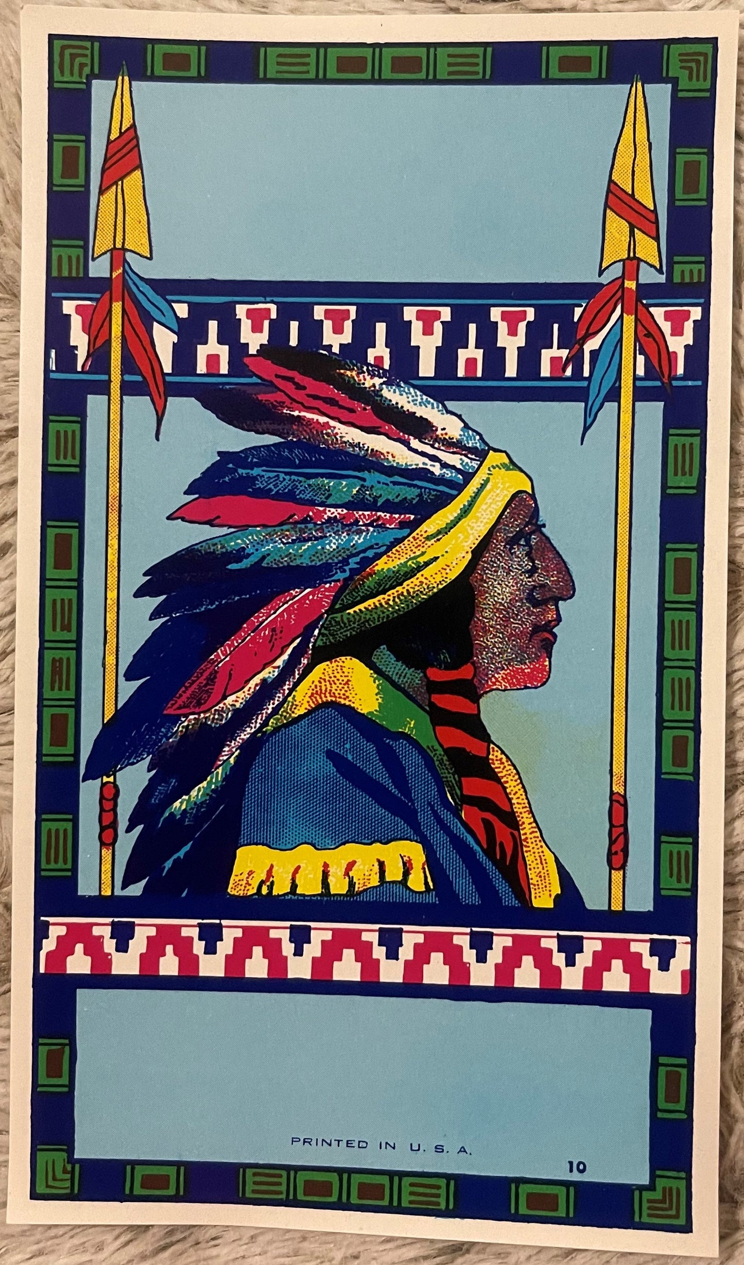
This is a Native American chief broom label, printed in halftone offset lithography and measuring a compact 6 by 3.5 inches — postcard proportions, sized to wrap neatly around a broom's neck where a shopper's eye would land first. The artwork itself is the whole story here: a chief rendered in strict left-facing profile, his war bonnet cascading behind him in a fan of feathers worked in deep navy blue, crimson red, forest green, and crisp white, each feather distinct and individually colored rather than blurred into a mass. A yellow band anchors the bonnet at his brow, and a striped red-and-black wrap sits at his throat against a blue garment finished with a band of yellow fringe. Flanking him on either side, two ceremonial arrows rise tall and straight, striped in gold and red with small tufts of feather color tied near their tips — a framing device that gives the whole composition the formal balance of columns bracketing a doorway. Above and below the portrait, bands of red-and-white stepped geometric pattern run the width of the label, pulled straight from Southwestern and Plains visual traditions, while the outer border is a deep navy trimmed with green geometric cartouches — squares, brackets, and stepped forms repeating with the discipline of a woven textile. Two pale blue rectangles sit open within the design, left blank for a distributor's brand name to be added, exactly as they left the print shop. At the base, in small type, the label carries its only printed marks: PRINTED IN U.S.A. and the number 10, almost certainly a production or grade designation from the lithographer's run. The palette, the halftone dot structure visible in the shading of the face and feathers, and the geometric Art Deco–meets-Southwestern border conventions all point to an era of roughly the 1930s–1940s, the years when this kind of four-color offset broom label was standard trade dress across the American cleaning goods industry.


🧹 The Broom Trade's Forgotten Golden Age

It's easy to forget, in a world of vacuum cleaners and disposable mops, that the humble corn broom was once serious business in America — an entire agricultural and manufacturing chain built around a single crop grown specifically for its bristly seed heads, broom corn (technically a variety of sorghum, not corn at all). Whole regions of the country organized themselves around it. Old-timers in the trade still talk about towns in Illinois and Missouri that proudly called themselves the broom corn capital of the world, hosting festivals around the harvest the way other towns celebrated apples or corn. The design itself — the flat, fanned broom shape we all still picture today — is often credited to the Shaker communities of the early 1800s, who are said to have invented the flat broom and the foot-treadle machine that stitched it, transforming broom-making from a farmhouse chore into a genuine manufacturing trade almost overnight.

By the time labels like this one were rolling off the press, broom-making had become deeply competitive. Dozens of manufacturers turned out nearly identical corn brooms, and the only real difference a shopper could see standing in front of a store bin was the paper label wrapped around the neck. That turned these labels into the actual battlefield of broom marketing — every company needed a mark that would catch a customer's eye faster than the broom next to it, and a striking image did that job better than a paragraph of text ever could. It's a detail worth sitting with: the blank pale rectangles on this very label, left open for a brand name, are a small window into how flexible this business had to be — printers often ran a strong central image in bulk, leaving space for a distributor to stamp or overprint their own name later, letting one striking design serve many companies at once.


🪶 Why the Chief? A Trademark Tradition Across American Goods

A chief in profile, crowned in a feathered war bonnet, wasn't a design dreamed up in isolation — it belonged to one of the most common visual languages in American commercial art of the era. Collectors of vintage advertising will recognize the family resemblance instantly: the same dignified profile appeared on motorcycle badges, on butter packaging, on baking powder tins, on hood ornaments, even stamped into the nation's own pocket change on the Indian Head penny and the Buffalo nickel. Manufacturers across dozens of unrelated industries reached for this same imagery again and again, using it as shorthand for strength, authenticity, and a distinctly American frontier heritage they wanted their product associated with. Broom makers were no exception — a sturdy, dependable tool needed a sturdy, dependable face, and the chief's profile delivered exactly that kind of visual confidence to a shopper glancing down a crowded shelf.

Collectors who study this category closely note that the artists commissioned to paint these trademark chiefs were often working from real reference — portrait photography and painted studies of actual tribal leaders circulated widely in this period, and a careful eye can often spot genuine attention to the details of feather arrangement, garment color, and ornament that separates a thoughtfully rendered label like this one from a lazier, more cartoonish knockoff. The two flanking arrows here, tall and formally placed like sentries, are a good example of that care — a small compositional choice that turns a simple portrait into something closer to a ceremonial emblem.


🏜️ Southwestern Design Meets the Deco Decades

The geometric border running around this label — the stepped triangles, the repeating navy-and-green cartouches, the red-and-white banding — didn't come from nowhere either. The 1920s and 1930s saw a genuine explosion of interest in Southwestern and Plains Native design across American popular culture, fueled in no small part by railroad tourism promotion out west, which packaged Puebloan and Navajo pattern work for a national audience hungry for something distinctly American to set against the imported styles of Europe. That same decade gave the country the hard-edged geometry of Art Deco, and the two influences braided together constantly in commercial art of the time — think of the stepped, symmetrical borders on movie palace facades and world's fair pavilions of the era, translated down to something as modest as a broom label. What you're looking at on this label's frame is that exact cultural moment, captured in miniature: Deco discipline wrapped around a Southwestern motif, printed cheap and bright for a store shelf rather than a museum wall.


🖨️ The Lithographer's Craft Behind the Color

Look closely at the shading in the chief's face and feathers and you can make out the halftone dot pattern that built up those tones — a hallmark of the offset lithography process that dominated commercial printing in this period. Rather than mixing custom shades, printers built color and depth from a handful of base inks — here blue, green, red, yellow, white, and navy — laid down in overlapping dot patterns that the eye blends into smooth gradients from a normal viewing distance. It was a genuinely skilled trade: separating a full-color painting into individual printing plates by hand, one per ink color, required real craftsmanship to keep the registration tight enough that a feather's edge or a jawline didn't blur or double. Labels like this one were turned out by the thousands for an industry that needed color, speed, and reliability all at once, and the surviving examples are some of the best evidence we have today of just how accomplished that pre-television era of American commercial art really was.


📦 A Piece That Never Saw the Bin

Most broom labels that survive today come to us battered — clipped free of a handle, folded from being wrapped tight around broom straw, sometimes torn at the edge where a store clerk pulled it loose. This is a genuine example of stock that never made that journey: it stayed in the printer's or distributor's stack rather than the store's, which is exactly why the color reads as sharp and the geometric border as crisp as it does. That's a meaningfully different object than a label recovered off an actual broom — it's the artwork exactly as the lithographer intended it seen, before commerce ever got its hands on it.


🎁 Who Collects These

This kind of label sits at a genuinely interesting crossroads for collectors. Advertising ephemera enthusiasts chase these for the same reason they chase old crate labels and matchbook art — small-format commercial design from an era when a company's whole personality had to fit on a few square inches. Folk art and Americana collectors are drawn to the Southwestern geometric border work and the Deco-era color sense. And a good number of collectors come to pieces like this one specifically for the Native American portrait itself, building focused collections of early-20th-century trade imagery that used Indigenous figures as brand icons — a category that's become increasingly hard to find in condition this clean, precisely because so few examples were ever preserved unused. Framers and vintage kitchen or laundry-room decorators love it too, for the simple reason that a piece this graphic holds a wall on its own without needing a whole grouping around it.


🖼️ Display Ideas

  • 🖼️ Frame it as-is under glass to let the halftone color and geometric border read as the finished piece of commercial art it is
  • 🧺 Set it inside a vintage laundry room, mudroom, or utility closet vignette alongside old washboards and enamelware for genuine period atmosphere
  • 🏜️ Pair it with other Southwestern or Native-motif advertising pieces to build out a themed trade-imagery wall
  • 🪶 Use it as the anchor piece in a small grouping of vintage advertising labels, letting its bold color carry the arrangement
  • 🛋️ Hang it in a den or study alongside other early American commercial art for a genuine conversation-starting focal point
  • 🎨 Display it loose on a shelf easel to highlight the printing quality without covering any part of the design

❓ FAQ

Is this an original vintage label or a modern reprint?

This is genuine New Old Stock — original unused inventory from the era, not a later reproduction.

Was this label ever used on an actual broom?

No — this is unused store stock. It never left the printer's or distributor's stack, which is why the artwork presents so cleanly.

What does the number "10" printed on the label mean?

It's almost certainly a production, grade, or design sequence number from the lithographic run — a common practice on broom labels of this type, though the exact internal system used by any given printer isn't something that survives in the historical record.

Why is part of the label left blank?

The pale rectangles were left open for a distributor's brand name to be added, a practice that let a single strong central design serve multiple companies selling similar corn brooms.

How was this label printed?

Through halftone offset lithography — visible in the dot-built shading of the face and feathers — using a base palette of blue, green, red, yellow, white, and navy inks.

What era does this label date to?

The palette, halftone printing characteristics, and the Art Deco–meets-Southwestern geometric border conventions place it in the 1930s–1940s window typical of American broom labels of that period.

What size is the label?

It measures 6 by 3.5 inches.

Shipping

🚚 Shipping & Handling

  • Shipping costs and timing are calculated at checkout.
  • Items curated and shipped directly by me include U.S. shipping at no additional cost, professionally packed to ensure safe arrival of your artifact.

Items from Vetted Pro Collectors
Shipping for items offered by vetted Pro Collectors is determined at checkout. All Pro Collector listings are reviewed to ensure fair, reasonable shipping practices.

For full details, please refer to our Shipping Policy.

Returns & Exchange

Product Page Return Policy

  • 60-Day Returns – Items must be in original condition.
  • Refunds – Issued after inspection (excluding shipping costs).
  • Return Shipping – Customer is responsible unless item is damaged or incorrect.
  • Damaged/Incorrect Items – Contact us within 48 hours for a replacement or refund.
  • Easy Returns – Email [email protected] or call 802-356-9872 to initiate a return.

For full details, visit our Refund Policy.

View full details
