Skip to product information
1 of 4

Vintage and Antique Gifts

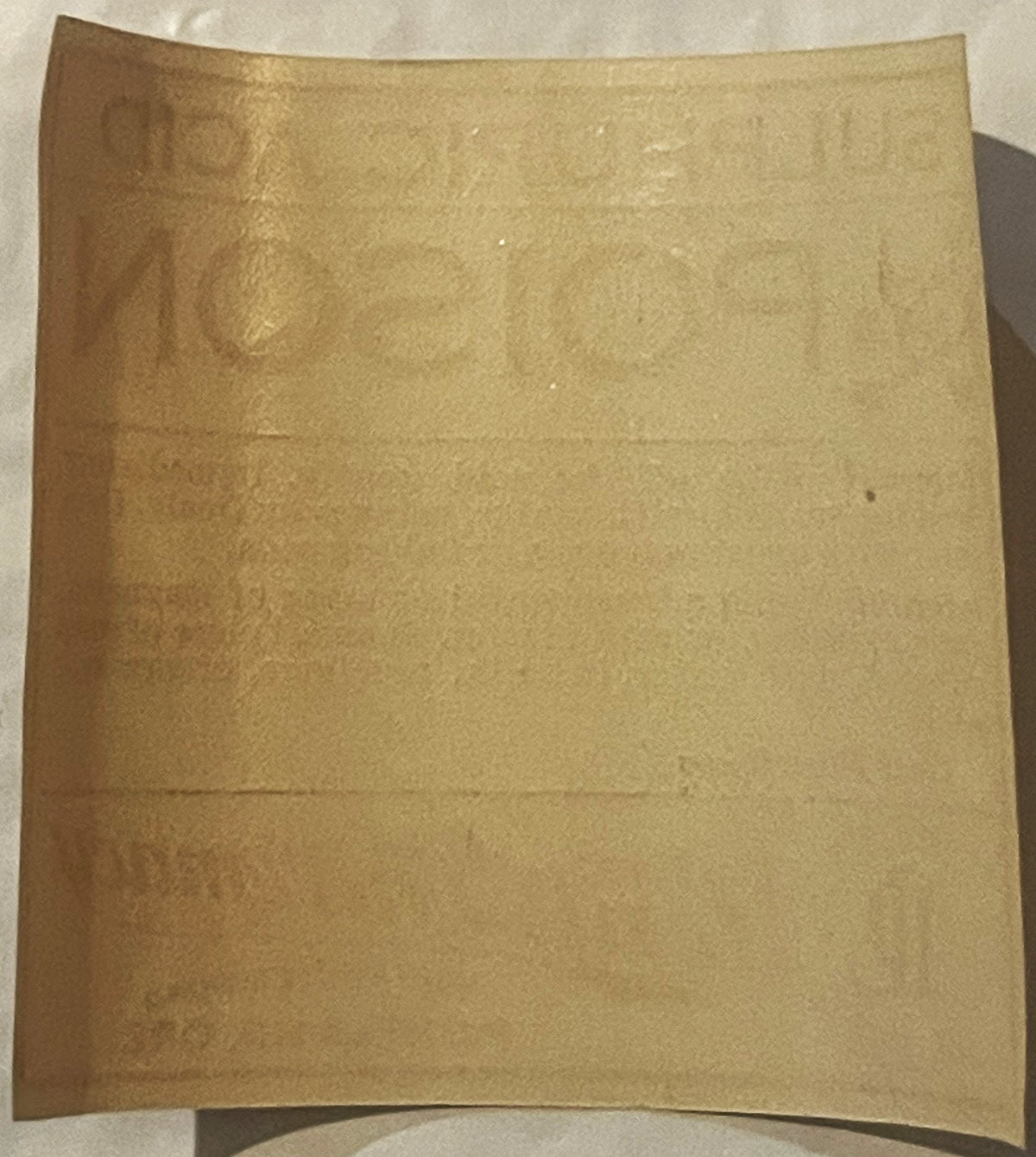
Antique Sulphuric Acid Poison Label ☠️ Lents Pharmacy Portland Oregon Druggist Skull Crossbones

Antique Sulphuric Acid Poison Label ☠️ Lents Pharmacy Portland Oregon Druggist Skull Crossbones

Regular price 5.50 USD
Regular price Sale price 5.50 USD
Sale Sold out
Shipping calculated at checkout.
Quantity

Ever Wonder What Sat Behind Grandpa's Corner Drugstore Counter, Locked Away and Marked with a Skull? ☠️

Long before poison control hotlines and childproof caps, the only thing standing between a customer and a bottle of sulphuric acid was a small paper label — a few lines of red ink, a grinning skull and crossbones, and a druggist who trusted you to read it carefully. There's something about holding one of these old labels that pulls you straight back to a slower, more dangerous, more honest era of American retail, when the corner pharmacy sold you your cough syrup, your camera film, your writing paper, and — yes — your battery acid, all from the same wooden counter. This one comes from a real Oregon storefront, and it's carried that little jolt of drugstore drama for over a century.

This is an original Sulphuric Acid Poison label from Lents Pharmacy, once operating out of 9201 Foster Road in Portland, Oregon. It's letterpress printed in a single bold red ink on cream/buff stock, with a stern skull and crossbones anchoring the upper left corner beside the towering word POISON. Below that, in smaller type, run the full first-aid instructions druggists of the day were required to provide — separate directions for External exposure (wipe off the acid gently, flood with water, soap freely, then cover with moist magnesia or baking soda) and Internal exposure (a teaspoonful or more of magnesia, chalk, whiting, or wall plaster, or a small piece of soap softened with water, taken in milk, mucilage, or raw-egg white) — closing simply with "Call Physician." Beneath that sits the pharmacy's own branding: an ornate script Lents Pharmacy logotype paired with a monogrammed "LP" set inside a horseshoe emblem, and the address, 9201 Foster Road, Portland, Ore. The lettering style here — the condensed sans-serif display caps, the slab-and-roman body copy, the flourished script logo, all rendered in flat single-color letterpress with no halftone screening — places this label in the general run of early-20th-century pharmacy poison labels, most plausibly the 1910s to 1920s. The piece measures 2.5 x 1.5 inches, a small rectangular label sized to wrap a bottle shoulder, and it comes to you as new old stock (NOS) — printed for pharmacy use and never applied.


☠️ The Druggist's Poison Cabinet: A Language All Its Own

Before the Federal Caustic Poison Act and later poison-control standardization brought uniform warning labels to every American shelf, it was the corner druggist who decided how to warn his customers — and most of them reached for the same visual shorthand: bold red ink, blunt block capitals, and that unmistakable skull and crossbones, a symbol old enough to predate the pharmacy trade itself, borrowed from ships' flags and grave markers to say one thing without a word of translation needed: this will kill you if you're careless.

What makes labels like this one so fascinating to collectors today isn't just the skull — it's the home-remedy science packed into those few lines of type. Notice what the label recommends: magnesia, baking soda, chalk, whiting, even a scrap of wall plaster, softened into a paste with milk, mucilage, or raw egg white. These weren't idle suggestions. Every one of those household items is mildly alkaline, meant to neutralize a strong acid on contact — kitchen chemistry pressed into service as emergency medicine, decades before anyone dialed a poison control center (those wouldn't exist in organized form until the 1950s). A druggist in 1915 Portland was, in a very real sense, the town's first responder, and a label like this was his instruction sheet taped right onto the danger itself.


⚗️ Why Every Drugstore in America Stocked Sulphuric Acid

It's easy to assume a bottle marked "Poison" sat gathering dust in the back room, but sulphuric acid was actually one of the most ubiquitous industrial chemicals of the era — so essential that economists of the time reportedly judged a nation's industrial output by how much of it that nation produced. Its story runs through the Leblanc process, the method that first made sodium carbonate — soda ash — cheaply and reliably available on a mass scale. Soda ash, in turn, was the backbone of the dry soap powders that scrubbed America's laundry, working through saponification, the same chemical transformation that turns ordinary fats and grease into water-soluble cleaning agents. From there, sulphuric acid's fingerprints turn up in glassmaking, papermaking, water softening, and the production of compounds like borax. Closer to home, it was the acid inside the wet-cell batteries powering early automobiles, telephones, and farm equipment. A rural pharmacy like Lents didn't stock it as a curiosity — it stocked it because half the town needed it for something practical, and the druggist was the only supplier in reach.


🚋 Lents, Oregon: A Streetcar Town Swallowed by the City

Old Portland-area histories and the memories passed down among local collectors describe Lents as its own small town long before it became a Portland neighborhood — a farming and streetcar community out along Foster Road, east of the city proper, named for Oliver P. Lent, an early Oregon settler. Foster Road itself began life as a toll road, one of the wagon routes that connected outlying farms to the young city, and by the early 1900s it had grown into a streetcar corridor lined with small commercial blocks — a butcher, a bakery, a dry goods store, and, on the northwest corner of 92nd and Foster, a two-story wood-frame building carrying the name Lents Pharmacy in bold lettering across its second-story face, right alongside a sign for stationery and S&H Green Stamps. Local history holds that Lents was folded into the city of Portland in the early 1910s, and old-timers in the area still refer to the neighborhood by its original town name rather than by any Portland district number — a small stubborn loyalty that outlived the annexation papers by a century.


💊 The Pharmacy on the Corner

Picture the scene the old photograph of that intersection preserves: horse-drawn wagons and pedestrians in long coats and broad hats standing along a dirt street, and behind them, the pharmacy's storefront windows advertising "We Lead" and "Prescriptions" in hand-lettered glass. A drugstore like Lents Pharmacy was never just a place to buy medicine — it was the town's unofficial meeting hall, its emergency room, its soda counter, and its gossip exchange all under one roof. The druggist compounded prescriptions by hand at the back counter, mixed tonics and elixirs, sold film and stationery up front, and kept the dangerous chemicals — acids, arsenic compounds, strychnine for rodents — behind the counter, each one labeled in that same stark red-on-cream house style, the little "LP" monogram tucked inside its horseshoe like a maker's mark on silverware. That horseshoe wasn't an accident — a nod, collectors like to believe, to good luck for a business built on trust as much as trade, in a town where everybody knew the pharmacist's name and half of them owed him a running tab.


🕯️ From the Poison Shelf to the Collector's Cabinet

What was once a working safety warning has, over the intervening decades, become something else entirely: a small, self-contained piece of American graphic design history. The same bold skull-and-crossbones imagery that once made customers pause now draws collectors in for exactly the opposite reason — it's become a beloved, almost affectionate symbol of a vanished retail world, prized by pharmacy and apothecary collectors, by fans of early advertising ephemera, and by anyone drawn to the darkly playful charm of old druggist graphics. Corner drugstores like Lents Pharmacy have almost entirely disappeared from American main streets, replaced by chain pharmacies with barcode labels instead of hand-set type — which is exactly why a surviving, unused label like this one carries so much weight. It's a direct, physical link to a specific building, a specific town, and a specific era of hands-on, know-your-customer pharmacy that simply doesn't exist anymore.


🖼️ Display Ideas

  • ☠️ Framed solo on a wall as a small, striking piece of graphic Americana
  • 🍸 Tucked into a home bar cart or back-bar shelf for a spooky, conversation-starting touch
  • 🧪 Grouped with other apothecary and pharmacy ephemera in a curiosity cabinet
  • 🕯️ Set out for Halloween alongside vintage oddities and gothic décor
  • 📚 Paired with old bottles, mortar and pestle, or druggist tins for an apothecary vignette
  • 🖋️ Matted alongside other Portland or Pacific Northwest ephemera for a regional history corner

🎁 Who Collects These

This label speaks to a wide circle of collectors: pharmacy and apothecary historians chasing the last physical traces of the corner drugstore era; Pacific Northwest and Portland-history collectors drawn to the Lents neighborhood's own story; advertising ephemera collectors who love early letterpress graphic design; and the growing community of oddities and gothic-decor enthusiasts who see in that skull and crossbones a piece of genuinely vintage, genuinely American dark charm rather than anything reproduced for the purpose. It's equally at home in a serious archive of pharmacy history and on the shelf of someone who just wants their bar cart to have a story behind it.


❓ FAQ

Is this an original vintage label, or a modern reproduction?

This is an original, period-printed pharmacy label, letterpress printed in red ink on cream/buff stock, coming to you as new old stock — printed for pharmacy use and never applied to a bottle.

Does it actually contain sulphuric acid, or is it dangerous to handle?

No — this is strictly the paper label itself, with no chemical content of any kind. It's purely a piece of printed pharmacy ephemera.

What does "new old stock" mean?

It means the label was printed and stocked by the pharmacy in its own era but never actually used or applied — old inventory that simply sat unused until now, rather than a label peeled off a vintage bottle.

How old is this label exactly?

There's no printed date on the label itself, so we date it by its printing style — single-color letterpress, condensed display lettering, and script logotype — which points most plausibly to the 1910s–1920s, the general era of this style of druggist poison label.

Where was Lents Pharmacy located?

At 9201 Foster Road, on the northwest corner of 92nd and Foster, in the Lents neighborhood of Portland, Oregon — once its own separate streetcar town before joining the city.

Why do old poison labels use a skull and crossbones and red ink?

Red ink and the skull-and-crossbones symbol became the go-to visual shorthand among early-20th-century druggists for anything dangerous on contact or if swallowed — a warning meant to be understood at a glance, long before standardized federal poison labeling existed.

What size is the label, and will it fit a small frame?

It measures 2.5 x 1.5 inches (about 6.4 x 3.8 cm) — a compact rectangular label well suited to a small frame or a spot within a larger grouped display.

Shipping

🚚 Shipping & Handling

  • Shipping costs and timing are calculated at checkout.
  • Items curated and shipped directly by me include U.S. shipping at no additional cost, professionally packed to ensure safe arrival of your artifact.

Items from Vetted Pro Collectors
Shipping for items offered by vetted Pro Collectors is determined at checkout. All Pro Collector listings are reviewed to ensure fair, reasonable shipping practices.

For full details, please refer to our Shipping Policy.

Returns & Exchange

Take your time — you've got a full six months. If a piece isn't right for you, send it back the way it reached you and we're good.

In the first 30 days your money goes straight back the way you paid. After that it's store credit, so you can put it toward something you'd rather have.

Return shipping we sort out between us, case by case. I don't make this difficult.

If something arrives damaged, or it isn't what I said it was, send me a photo within 48 hours and I'll make it right.

Email info@vintageantiquesgifts.com or call 802-356-9872 — that's me answering, not a call center.

The only things I can't take back are custom or special-order pieces and gift cards.

View full details
  • 5 stars: 1 (100%)
  • 4 stars: 0 (0%)
  • 3 stars: 0 (0%)
  • 2 stars: 0 (0%)
  • 1 star: 0 (0%)
l
lokipoe

Really cool item, fast ship, very kind and generous seller, thanks so much!
