Skip to product information
1 of 3

Vintage and Antique Gifts

Antique Pinup Broom Label 🧹 1920s–30s Chromolithograph NOS Sexy Housewife Art Yellow & Navy

Antique Pinup Broom Label 🧹 1920s–30s Chromolithograph NOS Sexy Housewife Art Yellow & Navy

Regular price 11.00 USD
Regular price Sale price 11.00 USD
Sale Sold out
Shipping calculated at checkout.
Quantity

Did a Broom Label Really Stop You Cold? 🧹 This One Will.

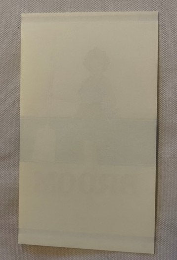
There is a particular feeling that comes over a collector when something has been waiting — truly waiting, undisturbed, decades folded into a drawer — and then it surfaces, and the colors hit you like the thing was printed yesterday. That is exactly what happens with this label. A vivid yellow background that practically radiates heat. A deep navy band cutting hard across the center. And there she is: a dark-haired woman in a red skirt and blue apron, one hand resting easy on the broom handle, the other caught mid-gesture, a smile playing on her face that says she has always known the effect she has on people. Bold red block letters underneath close the deal with a single word: BROOM. That was the whole pitch. It was enough. It was more than enough.

This is a piece of living American commercial art — not a reproduction, not a reprint, not a later homage. It came out of the same golden decade that put pinup women on wall calendars, cigar box lids, and the branded paper labels that wrapped broom handles in kitchen closets from Pennsylvania to California. It has been waiting in storage for the better part of a century. The colors are still vivid. The paper is still crisp. And it still stops you cold.


🧹 What This Label Is, Exactly

This is a New Old Stock (NOS) antique chromolithographed broom label, measuring 6 x 3.5 inches, printed in the United States and dating from the 1920s to 1930s — the window in American commercial printing history when chromolithography had reached full industrial maturity and every manufacturer with a product worth selling was pouring money into printed paper labels that announced quality, character, and regional pride in a single glance. "New Old Stock" means exactly what it sounds like: this label was produced during that era, never used on a broom handle, never pasted, never folded into someone's scrapbook. It came off the press, went into inventory, and stayed there. Collectors call that the best possible scenario, and they mean it. What you are looking at is the label at its most honest — exactly as it left the lithographer's press, colors uncompromised, paper untouched.

The printing process that produced this label — chromolithography — was not a simple or inexpensive operation. It involved drawing or photographing an image, then separating it into individual color layers, each one requiring its own hand-prepared stone or metal plate. A skilled lithographer could spend days preparing a single color pass. The stones were inked, the paper pressed onto them in careful registration, and the result — when the pressman knew what he was doing — was a richness of color that photographic reproduction of the era simply could not match. That warm yellow background was not printed in a single pass. Neither was the navy band, nor the red of her skirt, nor the precise flesh tones of her face and hands. Each of those colors was a deliberate decision, a separate plate, a careful layer. The vibrancy you see today is not an accident. It is the direct result of skilled craft labor applied to commercial printing at its American peak.


🌾 The Broom Industry and the Towns That Built It

There was a time in America when a broom was not a humble afterthought tucked behind a laundry room door. It was a household essential, a craft product, and a point of genuine regional pride. The raw material — Sorghum bicolor, better known as broomcorn — grew in tall, fibrous stalks whose seed-head brush was harvested by hand, sorted by quality, and bundled into the tight, tapered shapes that broom makers would wind and stitch onto hardwood handles. The quality of the broomcorn determined the quality of the broom. The quality of the broom determined the reputation of the manufacturer. Broom making clustered into regional centres whose makers competed on quality, on branding, and on the vividness of their printed labels.

By the late 19th century whole towns had become home to concentrations of broom manufacturers, many of them family operations and some multi-generational, whose names appeared on labels across the country. A hardware store owner in Ohio or a general mercantile operator in Georgia might never visit the factory, but he recognised the label, and he knew what it meant. The label was the handshake. It was the salesman who never got tired.

The broom industry operated at genuine industrial scale during the first half of the twentieth century. Freight cars loaded with finished brooms moved out on the railroads, distributing product across the eastern seaboard and beyond. The broomcorn itself arrived by rail from the Midwest, where it had been grown on large agricultural operations in Illinois, Kansas, and Oklahoma. The factory towns were the processing centres — the places where raw material became branded, labeled, finished product. Local families worked the trade across generations. Sons learned from fathers. The techniques for winding and stitching broom brush were passed person to person in the workshops, not written down in manuals.

Local legend in the broom towns has it that at the height of the trade, the smell of dried broomcorn — a faintly sweet, grassy, dusty scent — settled over certain neighborhoods on warm afternoons when the factory windows were open, and that longtime residents came to regard it as simply the smell of prosperity. Lore passed down among collectors holds that some of the smaller manufacturers commissioned their labels in large batches precisely because chromolithography was cheaper per unit at high volume, and that NOS examples like this one survived because production occasionally outpaced demand — labels were printed in anticipation of orders that shifted, or factories that consolidated, leaving inventory sitting in flat files and storage drawers for decades. That is the collector's lucky inheritance.


💄 Pinup Art in the Mainstream — How It Got Onto a Broom Label

The 1920s and 1930s represent a very specific moment in the history of American commercial illustration. The pinup figure — the attractive woman presented with energy, confidence, and a degree of playful glamour — had been circulating in American visual culture since the late 19th century, primarily in the form of theatrical posters and the illustrated covers of popular magazines. What changed in the 1920s was scale and distribution. Offset and lithographic printing had become industrial processes. The cost of producing full-color printed imagery had dropped to the point where manufacturers of consumer goods — not just publishers and theater owners — could afford to put vivid illustrated figures on their branded materials.

The woman on this label is not a passive figure. She is not decorative in the passive sense. She stands with the easy confidence of someone who has been placed at the center of the composition by an illustrator who understood exactly what he was doing. The red skirt and blue apron are not accidental color choices — they balance against the yellow and navy of the label's field with the kind of deliberate complementary tension that a trained commercial artist understood instinctively. Her expression is not coy. It is knowing. She is the product's ambassador and she is entirely comfortable in that role.

This is the visual vocabulary of a specific American cultural moment — the interwar years, when prosperity and mass production and a loosening of Victorian visual conventions combined to produce a commercial art landscape of genuine energy and sophistication. The illustrators who produced this kind of work were not fine artists who had condescended to commerce. Many of them were highly skilled commercial draftsmen who understood color, composition, and human anatomy, and who applied those skills to the practical problem of making a product label arrest a shopper's attention at the point of sale. They succeeded here. Completely.


📄 The Life of a Broom Label — From Press to Closet to Collection

Most broom labels did not survive. They were printed to be used — wound around a handle with a tight paper wrapper or pasted to a card attached to the broom's brush end — and once the broom went into service, the label went with it. It got damp from storage near the back door. It got torn when someone grabbed the broom in a hurry. It faded in the light above the kitchen window. The functional life of a broom label was, in most cases, measured in months before it became illegible or was discarded entirely.

NOS examples — labels that never made it onto a broom, that stayed in a printer's flat file or a manufacturer's storage drawer — are the survivors. They are what chromolithographic broom labels actually looked like on the day they left the press, before time, moisture, light, and use could compromise them. When a NOS example surfaces with colors this vivid and paper this clean, it is not simply a nice find. It is documentary evidence of what the original object looked like at its intended best.

The fact that this particular label features pinup-style illustration adds a dimension that elevates it beyond the category of generic broom ephemera. Pinup-illustrated trade labels occupy a specific collector niche where advertising ephemera, pinup art, and kitchen Americana intersect — and that intersection is genuinely rare. Most broom labels from this era feature text-heavy designs, geometric patterns, or simple brand marks. A label with a full illustrated figure, this level of chromolithographic color work, and this degree of surviving vibrancy represents a convergence of fortunate circumstances that collectors recognize immediately.


🖼️ Display Ideas

  • 🪞 Frame it in a deep-set shadow box — a 1-inch mat in cream or ivory lifts the yellow background and lets the navy band read as a design element rather than simply a color field. Hang it in a kitchen, a butler's pantry, or a breakfast nook where morning light will catch those chromolithographic layers.
  • 🏠 Group it with other period kitchen ephemera — soap labels, flour sack graphics, and seed packet labels from the same interwar era share a visual vocabulary with this piece. A small gallery wall of three to five framed examples creates a cohesive period display that functions as both art and history.
  • 🗂️ Display it unframed in a archival sleeve on a tabletop easel — the raw-paper quality of a NOS chromolithograph in an archival sleeve has its own appeal for collectors who want to be able to examine both sides and handle the piece without risk. An inexpensive crystal-clear archival sleeve and a small brass easel is a zero-commitment display option.
  • 🧺 Pair it with a period broom — a surviving example of a 1920s–30s corn broom, or even a later example in the same style, mounted on a wall bracket alongside the framed label creates an interpretive display that tells the full story of the object in its original context.
  • 🎨 Use it as the anchor piece in a pinup ephemera collection display — alongside period calendar pages, tobacco silks, and trade cards featuring similar illustrated figures, this label holds its own as a major example of interwar commercial pinup art applied to a workaday household product category.
  • 🏡 Install it in a mudroom, laundry room, or utility space — there is a particular pleasure in returning a piece of functional domestic ephemera to a domestic context. A framed broom label in a working mudroom is a small, witty act of historical restoration.

🎁 Who Collects These

The collector base for a piece like this is genuinely broad, and that breadth is worth understanding because it reflects the multiple layers of meaning packed into a single 6 x 3.5 inch label.

Advertising and trade ephemera collectors pursue chromolithographic labels as primary documents of American commercial printing history. For this community, the interest is in the printing process itself — the color separations, the registration quality, the survival of the original vibrancy — as much as in the subject matter. A NOS example with vivid color is the standard they are always chasing.

Pinup art collectors — a large and passionate community spanning everything from original magazine illustration to die-cut store displays — find pieces like this particularly compelling because pinup imagery applied to utilitarian household products represents the art form at its most democratic. This was not a specialty publication or a collector's item in its own time. It was a broom label. The fact that it carried this level of illustrated figure work says something important about how normalized and mainstream the pinup aesthetic had become in American commercial culture by the interwar period.

Local-history collectors have a specific and deep interest in the material culture of the broom industry. Whole regional identities were genuinely shaped by this trade, and surviving branded materials from that era are primary sources for understanding how regional manufacturers positioned themselves in the national marketplace.

Kitchen Americana and domestic history collectors seek out objects that illuminate the material culture of the American home at specific historical moments. A broom label featuring a confident, glamorous illustrated homemaker from the 1920s–30s is a complex and interesting document of how domestic labor was visualized and marketed during a period of genuine cultural transition.

Mid-century and interwar graphic design enthusiasts collect chromolithographic commercial art for its visual qualities alone — the color palettes, the typography, the compositional conventions of the period. This label's yellow-and-navy field with red accent type is a textbook example of interwar commercial color theory applied at the trade-goods level.


❓ Frequently Asked Questions

What does "New Old Stock" (NOS) mean for a label like this, and why does it matter?

New Old Stock means that this label was manufactured during the 1920s–1930s but was never put into use on an actual broom. It remained in storage — most likely in a printer's flat file or a manufacturer's label inventory — from the time it was printed until it surfaced recently. For paper ephemera, NOS status is the gold standard of condition. Labels that were actually applied to brooms were subject to moisture, tearing, light exposure, and general handling that degraded them rapidly. A NOS label represents the object at its original best — the colors as the lithographer intended them, the paper uncompromised by the conditions of use. When you see the vibrancy of the yellow and navy on this piece, you are seeing exactly what came off the press, not a survivor of decades of kitchen-closet life.

Is the color really as vivid as it looks in the photographs?

Yes. The yellow background is a warm, saturated chrome yellow — the kind of chromolithographic yellow that reads almost luminous in person. The navy band is deep and cleanly printed. The red of her skirt is true red, not faded toward orange or pink. The flesh tones in her face and hands are warmly rendered with the subtle color-layering that good chromolithography produced and that later printing technologies took decades to convincingly approximate. This piece has been described by people who have held it as genuinely arresting — the colors read as fresh in a way that catches you off guard given the age of the paper. The NOS condition is the direct explanation for that.

How was chromolithography different from other printing methods of the era, and why does it produce such vivid results?

Chromolithography — lithographic printing in multiple colors — was a labor-intensive process that required preparing a separate stone or metal plate for each color in the final image. A skilled lithographic artist would analyze the original illustration, determine how many color layers were needed to reproduce it faithfully, and then draw or photograph each color separation individually. The papers were then run through the press multiple times, once for each color, with careful registration to ensure the layers aligned correctly. The result, when executed by a skilled pressman with quality inks and paper, was a richness and depth of color that the era's photographic and early offset processes could not match. The layering of transparent ink washes produced optical color mixing — colors that read differently under different light conditions, that seem to have dimension and warmth. That is what you are seeing in this label's yellow background and the chromatic complexity of the illustrated figure.

What is the best way to store or preserve a paper label like this one?

For long-term preservation, archival-quality storage is the standard recommendation among paper ephemera collectors. This means keeping the label in a polypropylene or polyester archival sleeve — never PVC, which off-gasses acids over time — away from direct light, in a stable environment with low humidity. If you display the label rather than storing it, UV-filtering glass or acrylic in a properly sealed frame will significantly reduce the rate of color change from ambient light exposure. The paper on a NOS label that has been in stable storage for nearly a century is already chemically mature — it has been through its most volatile aging phase — but light and humidity remain the primary ongoing risks. Archival materials are widely available from art supply and museum supply retailers and represent a modest investment relative to the value of the piece.

Is this label appropriate for a kitchen or domestic display context, or is it primarily a collector's-case piece?

It is genuinely both, and many collectors find the most satisfying approach is to display it in a domestic context — properly framed and protected — precisely because that context restores some of the original meaning of the object. A broom label belongs in a house. Framed behind UV-filtering glass and hung in a kitchen, mudroom, or pantry, it reads simultaneously as a piece of commercial art history and as a wry, confident piece of domestic décor. The figure's knowing smile is, if anything, more resonant when she's back in the environment she was designed for. For collectors who prefer a more formal archival presentation, a shadow-box frame with a mat and a backing of archival foam board is the museum-standard approach and works equally well in a study, library, or dedicated collection space.

How rare are NOS chromolithographic broom labels with pinup-style illustration?

Chromolithographic broom labels in any condition are not common — most were used and discarded, and even the surviving examples in dealer and auction inventories tend to show the wear of actual use. NOS examples represent a much smaller subset. NOS examples with pinup-style illustrated figures, vivid surviving color, and clean paper narrow the field considerably further. The intersection of pinup commercial art with utilitarian household product labels was a specific and time-bounded phenomenon — concentrated in the interwar decades when the pinup aesthetic had crossed into mainstream commercial printing but before post-war shifts in both printing technology and advertising conventions changed the visual language of trade labels significantly. A NOS label from that window, with this level of chromolithographic quality and subject matter, is the kind of piece that surfaces in collections and stays there.

Shipping

🚚 Shipping & Handling

  • Shipping costs and timing are calculated at checkout.
  • Items curated and shipped directly by me include U.S. shipping at no additional cost, professionally packed to ensure safe arrival of your artifact.

Items from Vetted Pro Collectors
Shipping for items offered by vetted Pro Collectors is determined at checkout. All Pro Collector listings are reviewed to ensure fair, reasonable shipping practices.

For full details, please refer to our Shipping Policy.

Returns & Exchange

Take your time — you've got a full six months. If a piece isn't right for you, send it back the way it reached you and we're good.

In the first 30 days your money goes straight back the way you paid. After that it's store credit, so you can put it toward something you'd rather have.

Return shipping we sort out between us, case by case. I don't make this difficult.

If something arrives damaged, or it isn't what I said it was, send me a photo within 48 hours and I'll make it right.

Email info@vintageantiquesgifts.com or call 802-356-9872 — that's me answering, not a call center.

The only things I can't take back are custom or special-order pieces and gift cards.

View full details
  • 5 stars: 2 (100%)
  • 4 stars: 0 (0%)
  • 3 stars: 0 (0%)
  • 2 stars: 0 (0%)
  • 1 star: 0 (0%)
i
i***y (1636)

nice vintage label in mint condition - thank you

w
waxwing19672

Smooth transaction; item as described; recommended seller!

Thanks for your business and review. We really appreciate it! Hope to see you again soon.