
Skip to product information
1 of 3

Vintage and Antique Gifts

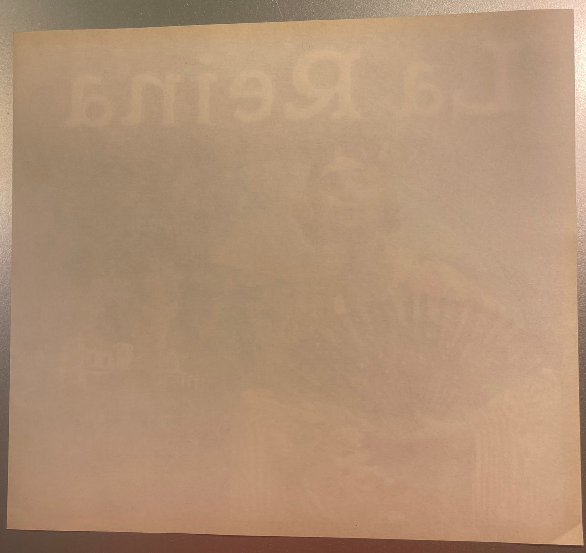
Vintage 1930s La Reina Orange Crate Label Rialto Orange Co San Bernardino California Spanish Señorita Fan Color Lithograph Western Litho American 🍎

Vintage 1930s La Reina Orange Crate Label Rialto Orange Co San Bernardino California Spanish Señorita Fan Color Lithograph Western Litho American 🍎

Regular price 10.00 USD
Regular price Sale price 10.00 USD
Sale Sold out
Shipping calculated at checkout.
Quantity

When Did California Stop Looking Like a Dream — and Start Selling One? 🍊

There's a particular kind of magic that happens when commerce becomes art without meaning to. Somewhere in the early-to-mid twentieth century, in the orange groves and packing houses of Southern California's Inland Empire, a handful of lithographers and citrus cooperatives accidentally produced some of the most beautiful printed ephemera this country has ever made. They weren't trying to make collectibles. They were trying to sell fruit. And yet here we are, decades later, framing these labels and hanging them on our walls — because the craft, the color, and the story they tell are simply irreplaceable.

This is one of those pieces. La Reina. The Queen. And she more than earns the title.


🍊 What You're Looking At

This is an original, authentic La Reina brand California orange crate label, produced for the Rialto Orange Co. of Rialto, San Bernardino County, California — printed in full color by the Western Lithograph Company of Los Angeles, the premier citrus-label printer of the American West. The label reads, verbatim: La Reina · Grown in U.S.A. · Rialto Orange Co. · Rialto, San Bernardino Co. · California.

Based on the documented production window confirmed by UCLA's Charles E. Young Research Library and corroborated by individual dated examples known to collectors, the La Reina brand was in active use across roughly the first half of the twentieth century — circa 1905 through the early 1950s. Your specific label carries its own Western Litho date code, typically a small numeric notation in the lower margin or verso; that code, once read, will pin your copy to an exact month and year within that span. Without reading that code, a wide and honest range is the only responsible dating — and that range itself tells a story spanning half a century of California citrus history.

The label measures approximately 11 inches by 10 inches and is New Old Stock (NOS) — a surviving, unused example from the original print run, never applied to a crate. The lithography is full-spectrum color: a commanding deep cobalt blue ground, a rich olive and forest green arched frame, warm yellow and pink in the señorita's floral shawl, black in the ornate folded fan she holds before her, and flashes of red in the Spanish-style tiled roofline behind her. Behind the figure, rendered in soft atmospheric perspective, stand tall California palm trees, a mountain range dissolving into the horizon, and a handsome hacienda that could be a mission, a rancho, or a wealthy grower's estate — California as it wished to be remembered.

The central figure herself is a Spanish señorita — dark hair pinned beneath a traditional comb, a rose tucked at her temple, long drop earrings catching the implied light, a painted floral shawl draped across her shoulders with fringe at the hem. She holds a large, fully opened black fan decorated with pearl-like dots, and she gazes slightly upward and away with an expression that manages to be both regal and deeply human. Museum and archival sources — UCLA, the Oakland Museum of California, CSUSB's Pfau Library Special Collections — are unanimous on this identification: a Spanish señorita, not any other cultural figure. The Oakland Museum catalogs this exact label as a "full color litho of Señorita, Western Litho Co., L.A." That is the institutional record, and the artwork confirms it without question.


🖨️ The Printer: Western Lithograph Company, Los Angeles

You cannot fully appreciate this label without understanding who made it — because the Western Lithograph Company of Los Angeles was not simply a commercial printer. It was the dominant force in California citrus-label art, and its story is bound up in the very boom years that made Southern California what it became.

There were two great houses that defined the visual language of the California citrus crate. The older was the Schmidt Lithograph Company of San Francisco, established in 1873 by German immigrant Max Schmidt — one of the oldest lithographic firms in the United States at the time. The younger was Western Lithograph, founded in Los Angeles in 1908, closer to the groves, closer to the packing houses, and — perhaps because of its proximity to what would become Hollywood — possessed of a more cinematic, poster-scale visual ambition.

Western's labels tend toward the grand single image: one dominant figure, one strong background, maximum visual impact at distance. Labels like La Reina were designed to catch the eye of a wholesale buyer or a retail grocer from across a warehouse — to make one crate of California oranges look like royalty among a sea of competitors. The comparison to movie-poster design is not accidental. Western's artists were working in the same visual culture as the early film industry, and the glamour shows.

The company's earlier years involved a management transition worth noting: around 1906, the firm was purchased by partners William Gilbert and William Alvord Jones, who renamed it the Gilbert-Jones-Rugg Company. By 1910, the business had returned to the Western Lithograph name — confirmed by an advertisement in the September 10, 1910 issue of the Los Angeles Financier promoting "Western Lithograph" as the successor to "Gilbert-Jones-Rugg." That continuous institutional identity — through name changes, through two world wars, through the full arc of the citrus era — produced a body of printed work that now fills museum drawers and collector frames in equal measure.

Western Lithograph's date-coding convention is a gift to collectors and historians alike. The small numeric notation they printed on each run (a code like "353" indicating March 1953) allows individual labels to be dated precisely — a rare and remarkable thing for ephemera of this kind. If you can find that code on your label, you hold a documented artifact with a confirmed birthday.


🌴 The Town: Rialto, San Bernardino County, and the Orange Empire

Rialto is one of those California towns whose modern identity — a logistics hub in the heart of the Inland Empire, surrounded by warehouses and freeways — gives almost no hint of what it once was. To hold a La Reina label is to hold a document of that vanished world.

Rialto developed in the citrus-boom years as one of the jewels of San Bernardino County's "fruit colony" movement — communities built specifically around the cultivation of citrus, organized, irrigated, and marketed with remarkable sophistication for their era. The town's particular geographic advantage was decisive: abundant water flowing down from Lytle Creek, temperate air patterns that moderated the worst of the inland heat, and — crucially — the winds that swept through the Cajon Pass. Those Cajon winds, which would seem like a nuisance, were in fact the grove-keeper's friend. Unlike frost-prone sheltered valleys, Rialto's groves were protected by that air movement, and the navel orange thrived there as it did few other places.

At the industry's peak, Rialto operated seven packing houses. The citrus harvest was not a seasonal event — it was a year-round operation, employing virtually the entire community in one capacity or another. Most of the town's men worked in the groves and orchards; most of the women worked the packing house lines, selecting, wrapping, and boxing fruit that would travel by rail to tables across the country. The labels on those crates — labels like La Reina — were the face that California agriculture showed to the rest of America.

The deeper origin of the navel orange itself belongs to a story that begins far from California. In 1873, Eliza Tibbets, an early settler of Riverside, received navel orange budwood from William Saunders of the U.S. Department of Agriculture — trees propagated from a variety that had originated in Bahia, Brazil, and had made its way through Washington, D.C. before finding its permanent home in Southern California's soil and sun. Those original trees launched what historians of the region call the Citrus Revolution — the economic transformation of the Inland Empire from ranching and dry farming into one of the most productive and visually branded agricultural regions on earth.

Rialto was a full participant in that revolution. And then, with the same inexorable speed, the revolution ended. The postwar years brought suburban development and the kind of growth that swallowed groves whole. As documented sources record it plainly: the growth between 1953 and 1966 was phenomenal — citrus disappeared, and Rialto became a residential and industrial community. The packing houses closed. The groves were subdivided. And the labels that once covered millions of wooden crates became the only surviving images of what the town had been.

Seven packing houses. Year-round harvests. An entire community organized around the smell of orange blossom in spring and the rumble of refrigerator rail cars in summer. All of it gone in roughly a decade. The label you're looking at is what remains.


👑 La Reina: The Brand, the Image, and What She Meant

The choice to name a California citrus brand La Reina — "The Queen" — was not accidental, and it was not merely decorative. It was a deliberate appeal to the mythology of California itself: the Spanish Colonial heritage, the romance of the ranchos, the sun-drenched elegance that promoters and boosters had been selling to Midwestern and Eastern buyers since the 1880s.

The "Spanish California" aesthetic was one of the most powerful marketing frameworks of the early twentieth century. Developers, railroads, and citrus cooperatives alike understood that the Anglo American consumer was enchanted by the idea of California as an old world place — missions, señoritas, flowering gardens, dark-eyed beauties in lace mantillas. The actual history of California's Spanish and Mexican heritage was complex, contested, and often painful; the image of it, as packaged by Anglo marketers, was a warm fantasy of leisure and abundance. Citrus crate labels were one of the primary vehicles for that fantasy, and La Reina is among its most elegant expressions.

The señorita on this label is not a generic "exotic" figure — she is rendered with genuine attention and grace. The articulation of her fan, the placement of the rose at her temple, the roses worked into the pattern of her shawl, the hacienda behind her framed by palms and mountains — this is a composed, considered image. Western Lithograph's artists were skilled commercial painters working at the top of their craft, and the La Reina figure reflects that. Lore passed down among label collectors holds that the most successful citrus brands were those whose central figures seemed to have actual personality — not just a type, but a presence. La Reina has it. She is not a symbol of California. She is California, as that era wanted to imagine it.

The brand's documented production window — confirmed by UCLA's Special Collections at roughly 1905 through the early 1950s — means La Reina was in active commercial use for nearly half a century. That longevity is itself a statement of the image's power. Growers and cooperatives changed labels constantly when a brand wasn't moving product. La Reina stayed. The Queen held her throne for decades.

The label is held in the permanent collections of the UCLA Charles E. Young Research Library, the CSUSB Pfau Library Special Collections (Collection of Citrus Labels, SC-008, Box 11, Folder 2), and the Oakland Museum of California — institutional homes that confirm both its authenticity and its significance as a document of California's commercial and cultural history.


🎨 The Lithographic Craft: Why These Labels Still Astonish

I've handled a great many antique and vintage printed pieces over the years, and I will stand behind this statement: the color lithography of the California citrus-label era, produced by houses like Western Lithograph, represents a peak of the commercial printing craft that has never been equaled for its particular combination of richness, precision, and sheer visual impact. These labels were not run off cheaply. They were produced using a multi-stone or multi-plate lithographic process, each color requiring a separate pass, the registration of those passes demanding extraordinary skill and consistency.

The deep cobalt blue of a label like La Reina is not a single ink hit — it is a built color, layered and pressed with the kind of attention that modern digital printing imitates but cannot duplicate. The way the señorita's shawl glows yellow against that blue, the way the palm trees recede into atmospheric green-grey distance, the hard-edged black of the fan against the soft flesh of her hands — these are the results of a craftsman's decisions, made one stone at a time, checked and corrected across multiple proof runs before a single finished label was pulled.

Old-timers in the printing trade used to say that a good lithographer "painted with ink" — that the best color litho work of this era was closer to oil painting than to what we think of as printing. Looking at La Reina, it is hard to argue. The label was never meant to survive. It was meant to be pasted to a wooden slat crate and shipped by rail to a Chicago grocery or a New York market. That it exists today — unused, unlabeled, vivid — is a small miracle of preservation.

Paper crate labels remained in active commercial use until the 1950s, when the industry's shift from wooden crates to pre-printed cardboard cartons made them obsolete almost overnight. That transition ended an era of American commercial graphic art with remarkable abruptness. The labels stopped being made. The remaining unused stocks were set aside, forgotten in warehouse corners or packing-house back rooms, and slowly — over decades — found their way into the hands of collectors, archivists, and dealers who understood what they were looking at.

New Old Stock examples like this one are the finest survivors: labels that were printed, stored, and never used — spared the glue, the crate, the warehouse humidity, and the rough handling of commercial distribution. What you're holding is the label as its makers intended it to be seen: clean, flat, and at full chromatic strength.


🖼️ Display Ideas

  • 🪵 Rustic kitchen or dining room gallery wall — frame it in reclaimed wood or a simple black float frame and pair it with a vintage citrus bowl, a ceramic fruit piece, or a mid-century pottery vase. The cobalt and green read beautifully against warm wood tones and cream plaster walls.
  • 🌴 California / Southwestern themed room — La Reina's hacienda, palm trees, and mountain backdrop make her a natural centerpiece for any space celebrating the California aesthetic, whether Spanish Colonial revival, mid-century modern, or contemporary California casual.
  • 🏛️ Museum-style float mount — acid-free mat, UV-protective glass, archival backing — the treatment major institutions use for graphic ephemera of exactly this kind. It signals that you know what you have, and it protects the label indefinitely.
  • 🍹 Bar or entertaining area accent — the vintage fruit-and-Spanish-glamour iconography of La Reina pairs naturally with a well-stocked bar cart, citrus-inspired barware, or a collection of vintage cocktail ephemera. She presides over a good gathering.
  • 📚 Home office or library — grouped with other California ephemera — a vintage map, a railroad poster, a period photograph — La Reina becomes part of a curated narrative about place and time. Collectors of Western Americana instinctively reach for this kind of piece.
  • 🎁 Framed as a gift for a California native or citrus country family — few things connect a person to their regional roots more directly than original commercial art from that specific geography. Rialto, San Bernardino County, the Inland Empire: for families with those roots, this label is a piece of family history in graphic form.

🎁 Who Collects These

California citrus crate label collectors are a broad and passionate community — and La Reina draws from several overlapping circles within it. Serious graphic ephemera collectors recognize Western Lithograph's work immediately and seek it out for the quality of the printing alone. California history enthusiasts — particularly those with connections to the Inland Empire, San Bernardino County, or the citrus towns of the old Orange Empire — collect these as primary documents of a vanished landscape. Vintage advertising collectors prize the Spanish Colonial imagery as a specific and well-defined chapter of American commercial art history.

Interior designers and decorators with a California, Southwestern, or vintage-modern aesthetic have driven significant collector interest in recent years — these labels photograph beautifully, reproduce the color of the original era, and anchor a room with genuine historical weight rather than reproduction sentiment. Museum professionals and institutional archivists collect them for permanent holdings; the fact that UCLA, CSUSB, and the Oakland Museum all hold La Reina in their collections tells you everything about its standing in the serious archival world.

And then there are collectors — like the person who first described this piece — who simply love them for what they are: survivors. Tangible remnants of a California that existed for a few bright decades and then was gone. As unused original examples become harder to find, the collectors who understood their value early are holding what they have, and the ones who missed that window are searching harder every year. The supply of authentic NOS labels from this era is genuinely finite — there are no new ones being made, and the ones that remain are slowly finding permanent homes in frames and archives. Once they're off the market, they tend to stay off.


❓ Frequently Asked Questions

Q: Is this an original label or a reproduction?
A: This is an original, authentic La Reina label — New Old Stock (NOS) from the original print run by Western Lithograph Company of Los Angeles. It is held in the same institutional collections as examples at UCLA's Charles E. Young Research Library, CSUSB's Pfau Library Special Collections, and the Oakland Museum of California. Reproductions exist in the market; this is not one of them.

Q: Can I pin down a more exact date for my specific label?
A: Yes — and this is one of the pleasures of Western Lithograph labels specifically. The company used a numeric date-coding convention printed in the lower margin or on the verso of each label. A code like "353" reads as March 1953. The brand's documented production window runs from roughly 1905 through the early 1950s, so your code will fall within that span. Examine the label's margins carefully under good light; once you find that code, you have a confirmed print date for your specific copy.

Q: Will it frame well?
A: Buyers who have framed these labels consistently report that they present beautifully — the colors hold, the graphic reads strongly at distance, and the scale (approximately 11 × 10 inches) fits standard frame sizes without awkward cropping. For long-term preservation, an acid-free mat and UV-protective glass are worth the investment; this is the treatment major institutions use for graphic ephemera of exactly this kind.

Q: What was the Rialto Orange Company, and how significant was it?
A: The Rialto Orange Co. operated out of Rialto, San Bernardino County, California — one of the key citrus-producing towns in what historians call the "Orange Empire" of Southern California's Inland Empire. At its peak, Rialto operated seven packing houses and ran year-round harvest operations. The company is well-documented in multiple major archival collections, including UCLA, CSUSB, and the Oakland Museum. Specific founding dates and corporate officers for the Rialto Orange Co. have not surfaced in the surviving record — a gap that is common for smaller cooperatives of this era, most of whose internal records did not survive the industry's decline.

Q: Why is the woman depicted as a Spanish señorita? What's the connection to California citrus?
A: The Spanish Colonial aesthetic was one of the defining marketing frameworks of early-to-mid twentieth-century California promotion. Citrus cooperatives, railroad lines, and real-estate developers all drew on an idealized vision of old California — missions, ranchos, señoritas, flowering gardens — to sell the state to Midwestern and Eastern consumers. For citrus labels specifically, Spanish, Mexican, and California mission imagery was among the most prevalent themes precisely because it evoked warmth, elegance, and abundance. La Reina — "The Queen" — is a particularly refined example of this tradition, and her longevity as a brand (nearly half a century of production) reflects how effectively the image worked.

Q: How rare are original La Reina labels compared to other citrus labels?
A: La Reina is well-documented in institutional collections, which indicates it was produced in meaningful quantity — but "well-documented in archives" and "widely available on the market" are very different things. The entire category of unused original NOS citrus crate labels from the first half of the twentieth century is a finite and diminishing supply. Labels were never designed to be preserved; they were designed to be glued to crates. The ones that survived did so by accident — stored in warehouse corners, forgotten in packing-house back rooms — and the collector community has been absorbing that supply for decades. Examples that surface now tend to find permanent homes quickly.

Q: Is the La Reina brand connected to a specific citrus variety?
A: The label text specifies oranges grown in Rialto, San Bernardino County, and the regional documentation is clear that the dominant variety in Rialto's groves was the Washington Navel orange — the variety introduced to the Inland Empire when Eliza Tibbets of Riverside received budwood from the USDA in 1873, propagated from the Brazilian Bahia navel. Rialto's Cajon Pass winds and Lytle Creek water supply made it particularly well-suited to navel orange cultivation, and that variety almost certainly traveled under the La Reina label throughout the brand's long production run.

🏷️ What Is Printed on This Label

Read off the sheet itself, verbatim — this is the label's own printed text, not a description of it:

  • La Reina
  • GROWN IN U.S.A.
  • RIALTO ORANGE CO.
  • RIALTO
  • SAN BERNARDINO CO.
  • CALIFORNIA
  • LITHO. IN U.S.A. - WESTERN LITHO. CO. LOS ANGELES  [+ a short illegible code]

The printer is on the object — LITHO. IN U.S.A. - WESTERN LITHO. CO. LOS ANGELES, in microtype at the bottom right. A short two- or three-character group follows it that will not resolve at the magnification available. On this house that trailing group is a form or plate number, not a year, and it is left unread rather than guessed at.

The sheet prints no fruit word. ORANGE appears only inside RIALTO ORANGE CO. The picture is a señorita with a black lace fan and a fringed shawl, beside an arched vignette of mountains, palms and a red-tiled hacienda. There is no net weight, no grade, no printed date and no Sunkist or Exchange device anywhere on the sheet.

Shipping

🚚 Shipping & Handling

  • Shipping costs and timing are calculated at checkout.
  • Items curated and shipped directly by me include U.S. shipping at no additional cost, professionally packed to ensure safe arrival of your artifact.

Items from Vetted Pro Collectors
Shipping for items offered by vetted Pro Collectors is determined at checkout. All Pro Collector listings are reviewed to ensure fair, reasonable shipping practices.

For full details, please refer to our Shipping Policy.

Returns & Exchange

Take your time — you've got a full six months. If a piece isn't right for you, send it back the way it reached you and we're good.

In the first 30 days your money goes straight back the way you paid. After that it's store credit, so you can put it toward something you'd rather have.

Return shipping we sort out between us, case by case. I don't make this difficult.

If something arrives damaged, or it isn't what I said it was, send me a photo within 48 hours and I'll make it right.

Email info@vintageantiquesgifts.com or call 802-356-9872 — that's me answering, not a call center.

The only things I can't take back are custom or special-order pieces and gift cards.

View full details