Skip to product information
1 of 6

Vintage and Antique Gifts

Antique Broom Label Art Nouveau Maid with Daisies Original 1910s Lithograph Blank Panel to Personalize Farmhouse Kitchen Wall Art Gift 🧹

Antique Broom Label Art Nouveau Maid with Daisies Original 1910s Lithograph Blank Panel to Personalize Farmhouse Kitchen Wall Art Gift 🧹

Regular price 10.00 USD
Regular price Sale price 10.00 USD
Sale Sold out
Shipping calculated at checkout.
Quantity

What Was She Pointing At? 🌼 The Hundred-Year Mystery of the Daisy Maid Broom Label

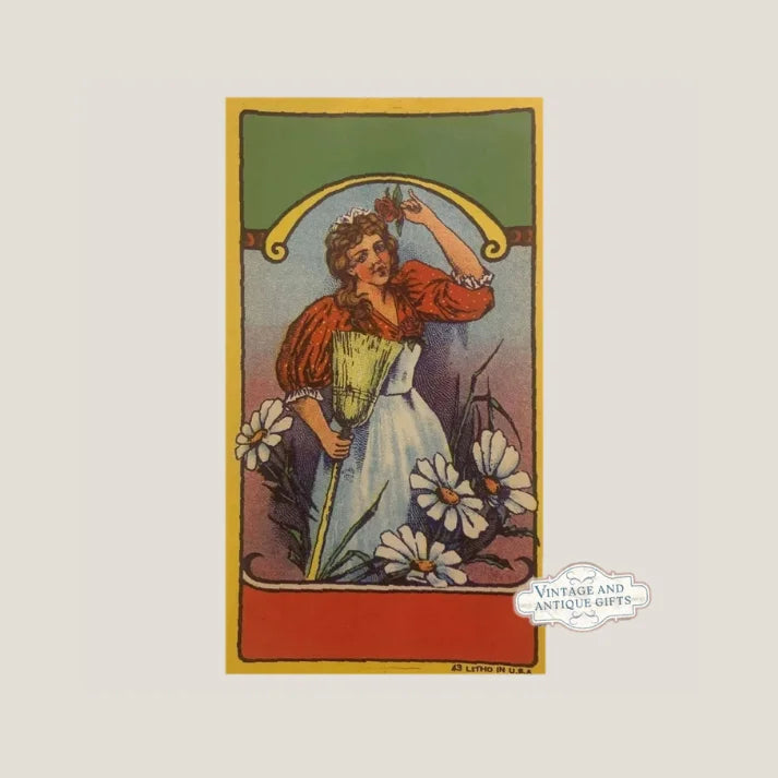
She hasn't set down her broom in over a century. Her white apron is still crisp. Her red blouse still billows at the sleeves. And that rose — the one she holds between her fingers, raised as though she's about to make a point your grandmother would've understood immediately — is still perfectly, vividly red. There is something almost uncanny about standing in front of a piece of printed paper from the 1910s and feeling, genuinely, that the woman in the image is about to say something. That she paused mid-sweep not because the label was designed that way, but because she has been waiting for someone who actually notices. This is the Daisy Maid broom label. It has been waiting a long time. And it arrived here in the condition it left the print shop: untouched, unglued, unfaded, alive.

This is what New Old Stock means in practice — not just a description of condition, but a description of a small miracle. A lithographed paper label designed to be consumed, to be pressed against a wooden handle and forgotten, instead survived intact through every decade of the twentieth century and straight into your hands. The daisies at her feet are still yellow. The border of deep green, warm gold, and brick red still holds the whole scene together like a painting in a country kitchen frame. Whatever she was pointing at, she never stopped pointing.


🖼️ What This Is — The Object, Exactly

This is a single New Old Stock (NOS) lithographed paper broom label, measuring 6 inches by 3.5 inches, printed in the United States, dating to the 1910s–1920s. The brand name is Daisy Maid. The central image depicts a woman in period domestic dress — full-sleeved red blouse, white apron, her posture that of someone who has just paused mid-task — standing beneath a golden arch, one arm raised, a single rose held delicately between her fingers. At her feet, daisies bloom. The surrounding border is printed in deep green, warm gold, and brick red, a color palette that reads as both decorative and authoritative, the visual language of an era when product labels were expected to be beautiful enough to earn a place in a home.

The printing method is chromolithography — a process that layered individual colors one stone or plate at a time, requiring skilled pressmen who understood how to register colors across multiple passes without the image drifting or muddying. The result, when done well, was a richness and depth that later offset and digital printing have never quite replicated in the same tactile way. Each color in this label was a separate decision, a separate press run, a separate moment of craft. That this particular label never made it onto a broom handle — that it survived the entire chain of manufacture, wholesale distribution, and retail storage without being applied — is what collectors mean when they talk about NOS condition. The colors here are what the pressman saw when he pulled the sheet off the stone. They are vivid. The paper is intact. The image is sharp. That is not luck after a hundred years. That is a small, specific kind of fortune.


🏭 The Broom Industry That Built a Country's Floors

It is easy to forget how central the broom was to American domestic and commercial life in the early twentieth century. This was before the vacuum cleaner had reached ordinary households, before wall-to-wall carpet had changed the nature of what a floor even was, before any of the electric appliances that would eventually crowd the closet had arrived. The broom was the implement of the household. It was purchased with care. It was replaced on a schedule. And because it was a product that lived in the home — that was seen every day by the woman of the house — manufacturers understood that the label mattered. The label was, in a very real sense, the brand's only opportunity to speak to its customer directly. There were no television advertisements. There were no social media channels. There was a paper label on a wooden handle, sitting in a dry goods store or a hardware shop, and that label had to do everything: establish trust, signal quality, and look beautiful enough that a woman would reach for it over the one beside it.

The broom manufacturing industry in the United States in this period was concentrated in regions with access to broomcorn — a variety of sorghum cultivated specifically for the fibrous brush it produced. Illinois, Kansas, and Oklahoma were significant growing regions, and the towns that built their economies around processing and manufacturing brooms were real, working places full of skilled labor. Broom factories were not small operations. They employed dozens of workers, often in family lines — the same families who had learned to sort and bind broomcorn passed the knowledge to their children, who passed it again. The labels that identified these brooms were printed by commercial lithographers, often based in larger cities like Chicago, Cincinnati, or St. Louis, who served dozens of regional manufacturers across the Midwest and mid-Atlantic states. A label printer's catalog from this era could run to hundreds of designs, some branded specifically to a manufacturer, others sold as stock designs that smaller operations could purchase and have overprinted with their own name.

The Daisy Maid label fits squarely within the aesthetic tradition of the premium end of that market. The golden arch framing the figure, the detailed floral elements, the careful rendering of the woman's costume — this is not a utilitarian label printed on the cheap. This is a label that was designed to communicate something specific: that the people who made this broom cared about how it was presented, and that the woman sweeping your floors deserved a brand that respected her eye. That messaging, delivered through a 6-by-3.5-inch piece of lithographed paper, is part of what makes these objects so resonant now. They are the advertising copy of their era — and they are beautiful.


👩 The Woman on the Label — Figure, Symbol, and the Domestic Ideal of the 1910s

She is not just a decorative figure. The woman depicted on the Daisy Maid label is a specific cultural construction — the competent, cheerful, well-dressed American housewife of the Progressive Era, a figure who appears across dozens of product categories from this period precisely because she was aspirational. She wears her work. Her apron is white, her blouse pressed, her posture confident. She is not frantic or exhausted. She has paused from her labor to offer you something — a rose, a moment, a kind of domestic authority. This was deliberate. Label designers of this era studied what moved product, and what moved product was the image of a woman who made housekeeping look graceful. The domestic arts were serious arts in this period. They were practiced with real skill and real pride, and the best product labels of the era reflected that back to their customers without condescension.

The daisies at her feet are not incidental. The daisy had strong symbolic currency in American popular culture of the early twentieth century — it was the flower of innocence, simplicity, and American fields. It appears in embroidery patterns, wallpaper, china, quilts, and seed catalogs from this period with a frequency that tells you something about what it meant to the people using it. Paired with the word "Maid," it produced a brand name that was both descriptive and poetic: the daisy maid, the girl of the fields, the clean sweep of a fresh morning. That this name is carried by a figure who clearly has never been near a daisy field in her life — who stands instead in an arch of gold like a figure from a medieval illustration — is one of the small delightful contradictions that makes label art from this period so endlessly interesting. The image and the name were saying two different things, and both of them were true.

Whether the Daisy Maid herself was drawn from life, from reference, or from imagination, the effect is the same: she feels like a person. One hundred years later, standing in front of this label, you are not looking at an abstraction. You are looking at someone who was understood to be recognizable and real by the people who designed her, and who remains recognizable and real to anyone who has ever paused mid-task to hold up something worth noticing.


📦 New Old Stock — Why These Survived and Why It Matters

A print run is rarely exact. A lithographer printing fifty thousand labels might produce fifty-three thousand to account for spoilage, registration errors, and the inevitable sheets that never make it through the press cleanly. The extras sat. They were bundled. They were set on a shelf. And when the lithography firm itself eventually closed or moved or modernized, those bundles sometimes passed through estate sales, through auction houses, through the hands of paper dealers who knew what they were looking at and sometimes through the hands of people who didn't, boxes of beautiful printed paper that seemed too pretty to throw away but whose significance wasn't yet clear.

What NOS means for you, the collector, is this: you are receiving an object that has never performed its intended function. It has never been wet, never been pressed against wood, never been subjected to the friction and humidity of a working kitchen. The paper is stable. The inks have not been exposed to prolonged light. The image is as sharp as the day the pressman lifted it off the stone. This is the condition in which commercial lithography was meant to be seen — this is the pressman's proof, in effect, the standard against which every applied label was a slight degradation. Owning NOS stock is owning the original intention of the object, not the used version of it.


🖼️ Display Ideas

  • 🪞 Frame it simply in a thin antique gold or black frame and hang it in a kitchen, mudroom, or laundry room — the 6 x 3.5 inch format fits beautifully as a standalone piece or clustered with other period ephemera in a gallery wall arrangement.
  • 🌼 Pair it with other floral domestic ephemera — seed packets, soap labels, or trade cards from the same era — in a shallow shadow box for a layered, curated display that tells a story about the domestic material culture of the 1910s and 1920s.
  • 📚 Use it as a bookmark or keepsake insert in a journal, recipe book, or household management ledger from the same period — it slides into a page like it was always meant to live there.
  • 🏡 Display it in a farmhouse or cottage-style interior on a small plate stand or in a clip frame on a windowsill — the warm palette of gold, brick red, and deep green reads beautifully against natural wood and aged surfaces.
  • 🎨 Incorporate it into a collage or altered-art project as the central image — the figure's posture and the architectural arch of gold make her a natural focal point in a larger composition.
  • 🛒 Set it on a small easel in a styled vignette with vintage cleaning implements, a crockery pitcher, or dried flowers — she was made for exactly this kind of domestic stage-setting, and she plays the part perfectly.

🎁 Who Collects These

The people who find their way to a label like this one come from several different directions, and they all recognize something different in her. There are the paper ephemera collectors — serious, systematic people who organize their collections by category, by era, by region, by printing method. For them, a chromolithographed NOS broom label in this condition is a specific acquisition with a specific place in a larger taxonomy. They know what they're looking at, they know how rarely it turns up in this kind of shape, and they do not need to be convinced of its significance. They have been looking for her.

Then there are the domestic history collectors — people drawn to the material culture of the American home in the early twentieth century, who understand that objects like this one are primary sources. A broom label is not a trivial artifact. It tells you how a manufacturer understood its customer, what visual language it believed would move product, what ideals were being sold alongside the practical implement. These collectors often work alongside researchers, writers, and educators who are documenting the history of labor, gender, and the home in this period. A label like the Daisy Maid belongs in that conversation.

There are also the kitchen and farmhouse decorators — people who are furnishing a space with intention, who want objects that carry genuine age and genuine beauty, who understand that a real antique piece of printed ephemera on a kitchen wall says something different than a reproduction. They are right. It does. And the Daisy Maid, with her warm palette and her kitchen-scale format, was practically designed for that wall.

And then there are the people who pick this up as a gift — for a grandmother who has a kitchen full of old things and would recognize immediately what this is and what it's worth, for a friend who collects anything with a daisy on it, for a daughter who is decorating her first home and has an eye for the old and the beautiful. It wraps beautifully. It arrives in extraordinary condition. And it is, by any measure, the kind of gift that stays.


❓ Frequently Asked Questions

Is this a reproduction, or is it genuinely from the 1910s–1920s?

This is a genuine antique label, not a reproduction. It dates to the 1910s–1920s and was produced using chromolithographic printing — a multi-stone, multi-pass color printing process that was standard for high-quality commercial labels in this era. The paper stock, the printing method, the color palette, and the design vocabulary are all consistent with American commercial lithography of that period. New Old Stock means it was never applied to a broom handle — it survived the intervening century in storage, unglued and unfolded, which is why the colors remain vivid and the paper is intact. There are no artificial aging marks, no distressing, no reproduction-era digital printing signatures. What you are looking at is the real thing, exactly as it left the press.

The colors look incredibly vivid for something this old. Is that normal for NOS?

Yes — and this is one of the most important things to understand about New Old Stock paper ephemera. Applied labels were subjected to moisture, friction, light exposure, and physical wear from the moment they were glued to a handle. NOS labels were not. They sat in storage, away from prolonged light exposure, protected from the humidity and handling that degrade printed paper over time. The inks used in chromolithographic printing were also remarkably stable when kept in stable conditions — the mineral-based pigments that produced those deep greens, warm golds, and brick reds were formulated to be vibrant at retail and, it turns out, to remain vibrant a century later when properly stored. The vividness you're seeing is not enhancement or retouching. It is what this label looked like in 1920, preserved intact.

What exactly is chromolithography, and why does it matter for collectibility?

Chromolithography is a color printing process developed in the nineteenth century in which each color in an image is applied separately using a different flat stone (and later zinc plate) inked in one color at a time. A label with six colors required six separate press passes, each carefully registered so the colors aligned precisely. The process required skilled artisans — the lithographic artist who drew the image in reverse onto the stone, the pressmen who managed registration across multiple passes, and the colorists who supervised the final palette. The labor intensity of the process is why chromolithographic labels from this period have the depth and richness they do — you are looking at layered, hand-managed color, not a single photographic reproduction. For collectors, this matters because chromolithographic labels are artifacts of a specific manufacturing era that ended when offset and photographic printing made the process obsolete. They cannot be precisely replicated. Their material properties — the slight texture of the ink, the warmth of the color, the way light moves across a well-printed surface — belong to their moment in time.

Is this a common label, or is it rare?

Broom labels from this period are not common in any condition. Labels were produced to be used, not preserved, and the vast majority of what was printed between 1890 and 1940 was applied, worn, and lost. NOS broom labels — labels that never made it onto a handle — are rarer still, because their survival depended on a specific and unlikely chain of events: a print overrun, an unclaimed stock bundle, a warehouse shelf that was never cleared, a box that passed through enough hands that someone eventually recognized what was in it. The Daisy Maid specifically, in this condition and at this size, is not something that turns up regularly. Collectors who specialize in domestic ephemera or in chromolithographic trade labels will recognize its scarcity immediately. For the general collector or decorator, what matters practically is this: you are unlikely to see another one exactly like it.

How should I store or display this to preserve it long-term?

Paper ephemera from this era is stable when kept away from three main enemies: prolonged direct light (particularly UV), high humidity, and acid contact. For display, framing behind UV-filtering glass or acrylic is the gold standard — it lets you see the label fully while protecting the inks from fading. Avoid hanging it in a location that receives direct afternoon sun. For storage, archival (acid-free) sleeves or envelopes are ideal — standard polyester or polypropylene sleeves sold by archival suppliers work well, and the label's 6 x 3.5 inch format fits comfortably in sleeves sized for trade cards or small ephemera. Do not store it in regular paper envelopes for long periods, as the acid in standard paper stock will eventually transfer. Keep it flat, away from heat sources and humidity, and it will remain in this condition for another century without difficulty.

Can I use this in an art or collage project?

Absolutely — and this is one of the great traditions of paper ephemera collecting. Labels from this era have been incorporated into altered books, decoupage, collage, mixed-media art, and scrapbooking for as long as collectors have been gathering them. The Daisy Maid's central figure — the arch, the raised arm, the rose, the daisies — is a natural compositional anchor for a larger work. Many collectors also choose to scan the label at high resolution before using it in a project, preserving a digital reference of its full condition. Whether you frame it, display it, or make it part of something new, you are working with an object that has been waiting for exactly this kind of attention.

What does the label's imagery tell us about the brand's intended customer?

Everything. The choice to depict a well-dressed woman in a golden arch — rather than, say, a simple product shot of a broom, or a purely typographic design — tells you that the Daisy Maid brand was positioning itself at the middle-to-upper end of the domestic product market. This is a label that assumes its customer has aesthetic standards, that she responds to beauty, that she will notice the difference between a label with a rose in it and a label without one. The gold arch is aspirational — it elevates the figure to something almost heraldic, a patron saint of the clean floor. The daisies ground her back in the domestic and the familiar. The combination is very deliberately pitched at a woman who took pride in her household and expected the products she chose to reflect that pride. Understanding this makes the label not just a pretty object but a legible document — a piece of evidence about how American manufacturers understood the women who were their primary customers in the 1910s and 1920s, and how they chose to speak to them through the language of beauty and craft.

Shipping

🚚 Shipping & Handling

  • Shipping costs and timing are calculated at checkout.
  • Items curated and shipped directly by me include U.S. shipping at no additional cost, professionally packed to ensure safe arrival of your artifact.

Items from Vetted Pro Collectors
Shipping for items offered by vetted Pro Collectors is determined at checkout. All Pro Collector listings are reviewed to ensure fair, reasonable shipping practices.

For full details, please refer to our Shipping Policy.

Returns & Exchange

Take your time — you've got a full six months. If a piece isn't right for you, send it back the way it reached you and we're good.

In the first 30 days your money goes straight back the way you paid. After that it's store credit, so you can put it toward something you'd rather have.

Return shipping we sort out between us, case by case. I don't make this difficult.

If something arrives damaged, or it isn't what I said it was, send me a photo within 48 hours and I'll make it right.

Email info@vintageantiquesgifts.com or call 802-356-9872 — that's me answering, not a call center.

The only things I can't take back are custom or special-order pieces and gift cards.

View full details