Skip to product information
1 of 1

Vintage and Antique Gifts

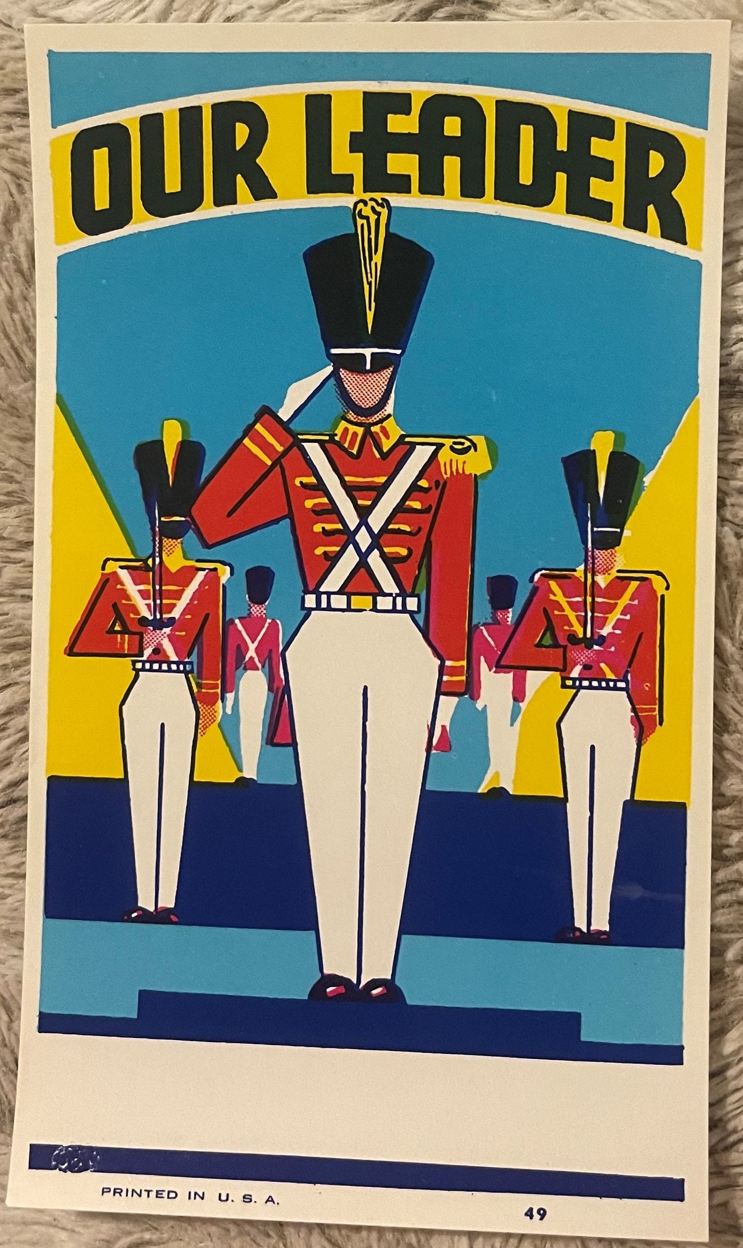
Vintage Our Leader Toy Soldier Broom Label 1930s-1940s Art Deco Marching Band Chromolithograph NOS Advertising Art 🧹

Vintage Our Leader Toy Soldier Broom Label 1930s-1940s Art Deco Marching Band Chromolithograph NOS Advertising Art 🧹

Regular price 9.00 USD
Regular price Sale price 9.00 USD
Sale Sold out
Shipping calculated at checkout.
Quantity

What Survives When Everything Was Made to Be Thrown Away? 🎖️

There is a particular kind of wonder that comes over you when you hold something that was never supposed to last. Not a portrait painted for posterity, not a commemorative medallion struck for a veteran's mantelpiece — but a broom label. A rectangle of printed paper engineered to be pasted onto a wooden handle in a hardware store stockroom, sold to a housewife or a janitor, and swept into oblivion one kitchen floor at a time. The person who designed this label knew it would be destroyed. The printer who ran it through the press knew it would be destroyed. The shopkeeper who ordered a gross of them and stacked them in the back knew it would be destroyed. And yet here it is — crisp, vivid, completely unblemished, its colors as loud and unapologetic as the day they came off the stone — a full century later, never having touched a single broom handle in its entire existence.

That is the miracle of New Old Stock ephemera, and it is a miracle that every serious collector of Americana feels in the chest rather than explains in words. This is the "Our Leader" broom label, NOS, a chromolithographed masterwork of American commercial art from the 1920s through 1940s, and it has waited long enough. It deserves a frame.


🎨 What This Is — The Object, the Process, the Particulars

Let's talk specifics, because specifics are what separate a piece of paper from a piece of history. This label measures 6 x 3.5 inches — a long, horizontal format that was standard for broom handle application, wide enough to catch the eye on a retail display and narrow enough to wrap cleanly around the handle's upper shaft. It was printed in the United States, as stated in the label's own bottom margin — a printed-in-USA notation that lithographers of this era added with genuine pride, not as a marketing afterthought. The printing method is chromolithography, the dominant commercial color-printing technology of the late 19th and early 20th centuries, in which each color was applied separately from its own etched stone or, in the later steam-press era, from zinc or aluminum plates, building the image layer by layer into the jewel-toned, slightly luminous quality you see in the best labels of this period.

The condition is New Old Stock (NOS) — meaning this label was manufactured, warehoused, and never used. It never went to a broom factory. It never got trimmed, pasted, or handled commercially. Whatever storage circumstances kept it safe through the intervening decades — whether a printer's flat file, a hardware distributor's surplus drawer, or a paper jobber's unclaimed inventory — the result is a label that presents today in the condition it left the press: colors unoxidized, paper uncreased, margins clean. NOS chromolithographic ephemera of this age is genuinely uncommon. Most examples that survive do so as used, trimmed, or adhesive-backed remnants pulled from old brooms during estate cleanouts. A pristine, unused example is a different category of find.

The dating range of 1920s through 1940s reflects the visual and typographic evidence of the piece — the Art Deco geometry of the sunburst, the confident sans-serif letterforms, the bold primary palette that chromolithographers were deploying at peak commercial confidence in that interwar window — rather than a documented manufacture date. Many broom labels of this type were printed speculatively in large runs and warehoused by regional paper goods distributors, which is precisely how NOS examples survive: the run outlasted the broom company's appetite for the design, the surplus sat in inventory, and decades later it surfaces intact.


🥁 The Design — Military Illustration at Its Most Commanding

The label's central figure is a lead marching soldier in full dress uniform: bright red military tunic, white cross-straps cutting a sharp X across his chest, white trousers with a crisp crease, and a tall black shako hat crowned with a white plume that adds another full head of visual height to an already imposing figure. His right hand is raised in a salute — not the casual acknowledgment of a parade-route soldier, but the stiff, deliberate, eyes-forward salute of someone who knows he is being watched and intends to make the watching worthwhile. Behind him and slightly reduced in scale, two flanking soldiers mirror the dress uniform and the posture, framing the central figure with the visual logic of a formal parade formation. The composition is bilateral and perfectly balanced, the way a military review is bilateral and perfectly balanced — by design, by discipline, by intention.

The background is a vivid sky blue from which dramatic yellow sunburst rays fan outward behind the soldiers — a chromolithographer's trick as old as trade card printing, borrowed from religious iconography and deployed without apology in commercial contexts because it worked. Those radiating rays create the visual illusion that the central figure is lit from within, that he is the source of the light rather than merely standing in it. A deep navy-blue ground anchors the bottom of the composition, giving the whole design weight and preventing the image from floating. It is the compositional equivalent of a bass note.

Across the top, arching on a yellow band in heavy black letterforms: OUR LEADER. Two words. Eleven letters. And yet the name lands with exactly the authority it intends. It is not "Our Broom" or "Our Brand" or any of the literal, product-forward names that lesser broom labels carried. It is a claim — a declaration that whatever you are about to sweep your kitchen floor with is led by someone worth following. The copywriter who named this product understood something that a lot of twenty-first-century brand consultants could stand to revisit: that aspiration sells harder than description, and that a household product named after a heroic abstraction will outlast a household product named after its primary function.


🏭 The Broom Label Industry — A Lost American Commercial Art Form

American broom manufacturing in the first half of the twentieth century was a genuinely significant domestic industry, centered heavily in the Midwest — particularly in Illinois, where Arcola earned the informal designation "Broom Corn Capital of the World" — but with production facilities and regional jobbers scattered across the country from New England mill towns to Great Plains agricultural communities where broomcorn was grown as a cash crop. The trade supported not just broom makers but an entire ecosystem of suppliers: broomcorn brokers, wire and twine manufacturers, wooden handle mills, and — critically for our purposes — the commercial lithography shops that produced the labels, hangtags, and branded wrappers that gave each manufacturer's product its shelf identity.

Broom labels as a collecting category occupy a fascinating niche precisely because they were produced with such consistent graphic ambition for a product so aggressively utilitarian. The competition on a hardware store shelf full of nearly identical brooms was entirely visual — and the lithographers and commercial artists who designed these labels knew it. The result was an arms race of color, imagery, and naming that produced some of the most vivid small-format commercial art of the era. Military themes were especially popular throughout the 1920s and into the 1940s, partly because the memory of World War I remained fresh through the twenties, and partly because martial imagery carried connotations of discipline, reliability, and authority that translated well to a domestic cleaning product. A broom that marched, that saluted, that led — that was a broom you could trust.

The chromolithography shops that printed these labels — many of them concentrated in Chicago, Cincinnati, and the printing trade corridors of the industrial Midwest — operated on volume and efficiency. A label like "Our Leader" would have been designed by a staff artist, approved by the broom company's buyer, and run in quantities that could number in the tens of thousands per press run. The artwork was carefully registered across multiple color passes, with each stone or plate contributing its layer to the final image. The yellow sunburst, the red tunic, the sky blue background, the black letterforms — each required its own pass, its own precise alignment, its own ink formulation. The artisans who ran these presses were craftsmen in the full sense of the word, and the surviving labels are their work.


📜 Local Legend — What Collectors Pass Down

Among paper ephemera collectors who specialize in American advertising labels, lore passed down through the trade holds that the largest single caches of NOS broom labels to surface in the postwar decades came not from broom manufacturers themselves but from the warehouse inventories of regional paper goods jobbers — middlemen who purchased overruns and discontinued print runs from lithography shops and resold them to manufacturers at a discount. When those jobbers went out of business, often through the 1950s and 1960s as consolidated national brands reduced the demand for regional label variety, their flat files and storage rooms were frequently sold off in bulk lots to antique dealers and paper collectors who didn't always know precisely what they had.

Local legend within the broom-collecting community — and yes, there is a broom-collecting community, and they are serious people — holds that somewhere in the central Illinois broomcorn belt, at least one hardware distributor's warehouse sat largely undisturbed from the late 1940s through the 1970s, its inventory of unsold labels and promotional materials preserved by nothing more dramatic than neglect and low humidity. Whether "Our Leader" labels passed through such a warehouse or through a different channel entirely is unverifiable. But the condition of surviving NOS examples is consistent with long-term dry storage, and the quantity in which they occasionally surface — usually in small, flat groups rather than single specimens — suggests a stored lot rather than an individual survivor.

Lore also holds among Art Deco ephemera collectors that the military broom label genre peaked in artistic ambition precisely in the years between the wars, when chromolithography's commercial dominance was already being challenged by offset printing, and the shops producing these labels were — consciously or not — at the height of their craft. Whether "Our Leader" was designed in 1924 or 1938 matters less, some collectors argue, than recognizing it as the product of a moment when the people making it were very good at what they did and had not yet been told the era was ending.


🖼️ Display Ideas

  • 🪖 Frame it solo in a deep shadowbox with a mat in period-appropriate navy or gold — the 6 x 3.5 inch format centers beautifully in a standard 5 x 7 opening with a generous mat border, and the sunburst radiates outward into the negative space.
  • 🥁 Group it with other American military ephemera — patriotic trade cards, World War I or II poster art, or marching band sheet music covers from the same era — in a gallery wall arrangement organized around the red, white, and blue palette.
  • 🏛️ Lean into the Art Deco moment by pairing this label with other geometric, sunburst-motif pieces from the interwar years: a Deco-era tin, a period magazine cover, a jazz-age advertising broadside — letting the "Our Leader" label anchor the display as its smallest and most concentrated example of the style.
  • 🎨 Use it as part of a commercial art study display alongside other NOS chromolithographic labels from the same period — fruit crate labels, cigar bands, seed packets — to show the full range of the lithographer's art across different product categories.
  • 📚 Archive it properly in a Mylar sleeve in a flat file if display isn't your immediate plan — NOS paper this clean deserves acid-free storage and a stable environment, which also makes it an investment-grade addition to a serious paper ephemera collection.
  • 🏠 Display it in a vintage-themed kitchen, mudroom, or entryway where its original domestic context resonates — there is something deeply right about a broom label displayed near the space it was originally designed to inhabit, elevated now to wall art rather than discarded as packaging.

🎁 Who Collects These

The collector universe for a piece like this is wider and more varied than you might expect, and that is part of what makes American commercial ephemera such a rewarding category to work in. At the center of the collecting community are paper ephemera specialists — people who understand chromolithography as a fine art medium, who can read a label's printing history in its registration marks and color separations, and who collect advertising labels across all categories with the same rigor that a fine art collector brings to prints and drawings. For these collectors, NOS condition is the decisive factor, and a pristine broom label is valued on the same terms as a pristine cigar label or a pristine seed packet: as an example of the printer's art in its ideal, uncompromised state.

Alongside them are Art Deco collectors who approach the period from a design history perspective and who recognize in the "Our Leader" sunburst and bold letterforms the same visual grammar they find in Deco poster art, streamlined industrial design, and period magazine illustration. For these collectors, the label's scale is part of its appeal — a concentrated, affordable, displayable piece of a visual moment that is otherwise represented by large and expensive objects.

Military and patriotic Americana collectors are a third community with strong appetite for this type of piece — particularly collectors who focus on the interwar period, on marching band and dress uniform imagery, and on the way American commercial culture absorbed and reflected military iconography in peacetime. The "Our Leader" soldier is not a combat figure; he is a parade figure, a ceremonial figure, a figure of national pride rather than national crisis, and that distinction places him in a specific and beloved niche within military Americana.

Finally — and this group is not to be underestimated — there are decorator-collectors: people who want a piece of vivid, authentic American commercial art for a wall without paying fine art prices, who understand that a chromolithographed broom label is genuinely old, genuinely beautiful, and genuinely made by skilled hands, and who will frame it and hang it and answer "where did you get that?" with a story worth telling. Those are the people this label was always going to end up with. It just took a hundred years to find them.


❓ Frequently Asked Questions

What exactly does "NOS" mean, and how does it affect the value of this label?

NOS stands for New Old Stock — meaning the item was manufactured during its original period of production but was never actually used for its intended purpose. In the case of this broom label, it means the label was printed in the 1920s–40s, warehoused, and never applied to a broom handle. It has not been trimmed, pasted, soaked off, or handled commercially in any way. A NOS example represents the item as the printer intended it to look, in colors that haven't oxidized from surface exposure, on paper that hasn't been compromised by adhesive or humidity. It is, in the most literal sense, the item at its best possible moment — a moment it has been holding for approximately a century.

Is chromolithography a significant printing process for collectors to understand?

Chromolithography is enormously significant in the history of American commercial art and print collecting, and understanding it transforms how you look at a piece like this. Developed in the mid-19th century and dominant in commercial color printing through the early 20th, chromolithography involved printing each color separately from its own stone (or, in later iterations, metal plate), with each pass carefully registered to align with the previous ones. A label like "Our Leader" — with its sky blue background, yellow sunburst, red tunic, black letterforms, and white details — required multiple separate passes through the press, each one adding a layer of color to the image. The resulting print has a tactile, slightly luminous quality that photomechanical reproduction doesn't replicate, and the best chromolithographic work is genuinely considered fine art by print historians. Collecting chromo labels is collecting a print medium with a serious artistic and historical pedigree — one that is affordable and accessible in a way that framed fine art lithographs often are not.

How should I store or display this label to preserve it long-term?

If you're framing it for display, the most important considerations are UV-filtering glazing (either UV-filtering acrylic or museum glass), acid-free matting and backing, and keeping it out of direct sunlight and away from humidity fluctuations. A deep shadowbox with a generous mat gives you the best visual presentation while keeping the label from touching the glazing directly. If you're archiving rather than displaying, a Mylar (polyester) sleeve — not a PVC sleeve, which off-gasses over time — in a flat file or archival box with acid-free tissue is the preferred storage method for serious paper ephemera collectors. This label has survived a century in storage already; proper archival handling ensures it survives another century.

What is the significance of the "Our Leader" name — was it a regional brand or a national one?

The "Our Leader" branding is consistent with the naming conventions of American broom manufacturing in the first half of the twentieth century, when hundreds of regional and national broom makers competed with aspirational, patriotic, and character-driven brand names rather than company names. Names like "Our Leader," "Old Reliable," "Eagle Brand," and dozens of similar appellations were used by manufacturers across the country, sometimes regionally and sometimes by multiple makers simultaneously, as trademark registration for broom labels was inconsistently enforced before mid-century. What is certain is that the name was chosen deliberately for its authority and its implied promise: this broom leads, this broom is the one worth following. Whether "Our Leader" was a regional brand specific to one manufacturer or a generic name used by multiple makers across the country is a question that broom label specialists and paper ephemera researchers continue to document through trade catalog archives and hardware store records — which is part of what makes pieces like this important to preserve as research objects as well as collectibles.

What is the size, and how does it fit into standard framing options?

The label measures 6 x 3.5 inches, which is a horizontal format that frames beautifully in several standard options. A 5 x 7 inch frame with a mat opening slightly smaller than the label gives a clean, gallery-style presentation with good border space. An 8 x 10 frame with a custom or adjustable mat gives you even more breathing room around the image, which suits the sunburst design particularly well — those radiating rays want space to radiate into. For a shadowbox presentation, standard 5 x 7 or 4 x 6 shadowbox frames from most framing retailers will accommodate the label comfortably. Custom framing gives you the most control over mat color and depth, and pairing a navy or gold mat with this label's palette is particularly effective. The label's horizontal orientation also makes it a natural candidate for long, narrow frames — a format sometimes called "panoramic" — that suit its proportions exactly.

Is there any significance to the printed "Printed in U.S.A." notation on the label itself?

Yes, and it is worth understanding what that notation meant in context. The "Printed in U.S.A." line on commercial labels of this era was not merely legal boilerplate — it was a genuine commercial statement made in a period of active public consciousness about domestic manufacturing and import competition. The lithography trade press of the 1920s and 1930s regularly addressed the question of imported printed goods, and American printers' associations actively promoted domestic sourcing to both manufacturers and retail buyers. For a broom label, which was itself part of a domestic manufacturing chain — broomcorn grown in American fields, handles milled in American factories, assembled in American broom shops — the "Printed in U.S.A." notation completed the domestic story of the product. For collectors today, it is also a useful authentication indicator: it confirms this is a period American printing rather than a later reproduction, and it connects the label to a specific moment in American commercial printing history when the domestic origin of printed goods was worth stating explicitly and with pride.

What other types of collectors or collections does this label complement?

The crossover appeal of this label is genuinely broad. For Art Deco collectors, the sunburst geometry and bold typography fit naturally alongside period posters, streamlined objects, and interwar design pieces. For military and patriotic Americana collectors, the dress uniform imagery, the saluting figure, and the "Our Leader" name connect to a rich tradition of American martial iconography in peacetime commercial art. For advertising and trade card collectors, this is chromolithography at full commercial confidence, comparable in craft and ambition to the trade cards and promotional labels that are already well-established as serious collectibles. For broom and domestic tool collectors — a more specialized but devoted community — this is a crown jewel: NOS, pristine, beautifully designed, from the peak era of American broom manufacturing's visual identity. And for collectors who simply love vivid, authentic American objects with a story attached, this label delivers on every dimension: great design, great condition, great history, and the particular pleasure of owning something that was made to be thrown away and chose, stubbornly and magnificently, not to be.

Shipping

🚚 Shipping & Handling

  • Shipping costs and timing are calculated at checkout.
  • Items curated and shipped directly by me include U.S. shipping at no additional cost, professionally packed to ensure safe arrival of your artifact.

Items from Vetted Pro Collectors
Shipping for items offered by vetted Pro Collectors is determined at checkout. All Pro Collector listings are reviewed to ensure fair, reasonable shipping practices.

For full details, please refer to our Shipping Policy.

Returns & Exchange

Take your time — you've got a full six months. If a piece isn't right for you, send it back the way it reached you and we're good.

In the first 30 days your money goes straight back the way you paid. After that it's store credit, so you can put it toward something you'd rather have.

Return shipping we sort out between us, case by case. I don't make this difficult.

If something arrives damaged, or it isn't what I said it was, send me a photo within 48 hours and I'll make it right.

Email info@vintageantiquesgifts.com or call 802-356-9872 — that's me answering, not a call center.

The only things I can't take back are custom or special-order pieces and gift cards.

View full details
