Skip to product information
1 of 1

Vintage and Antique Gifts

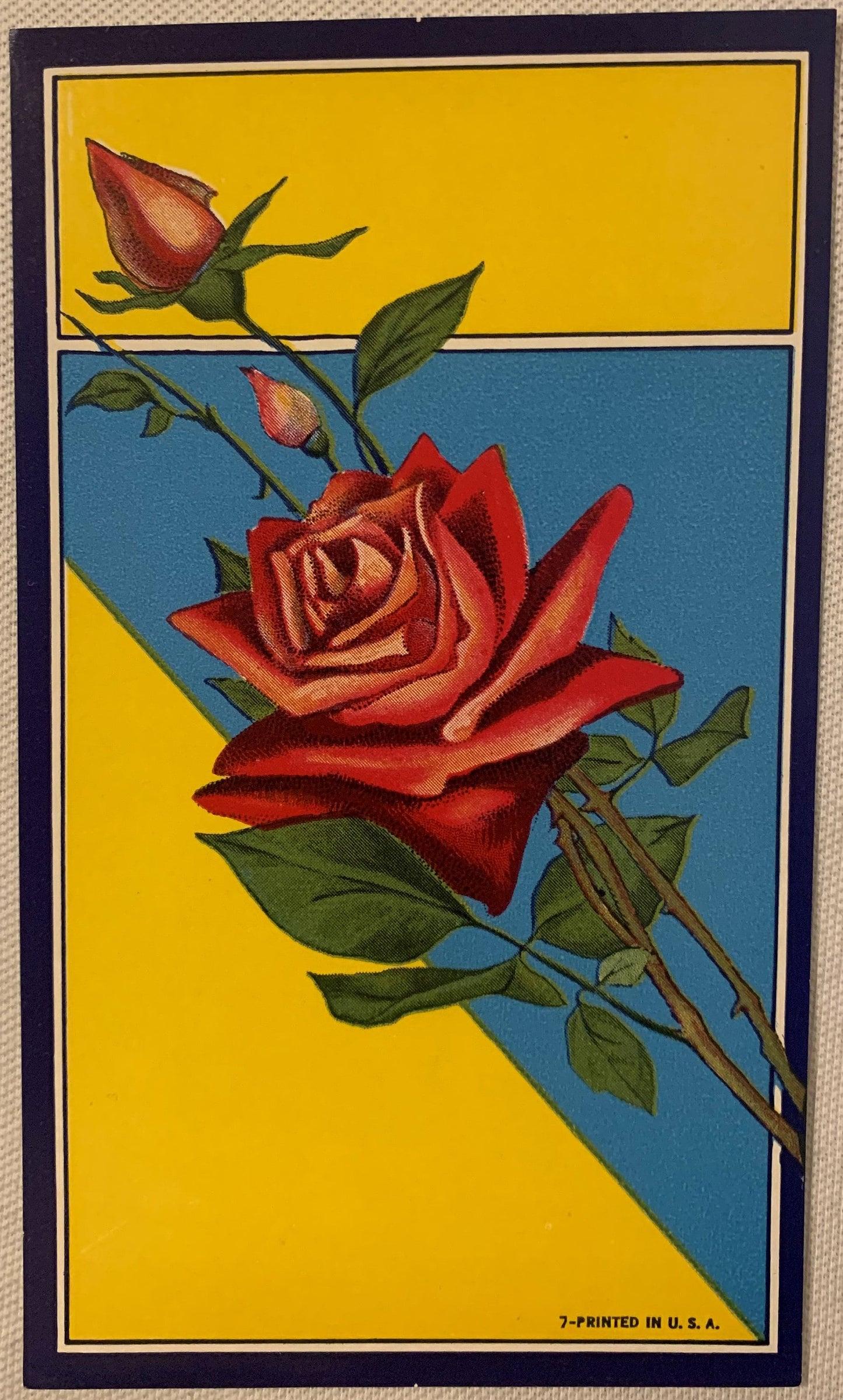
Antique Rose Broom Label 🌹 NOS Chromolithograph | 1910s–40s Yellow & Blue Litho Print Art

Antique Rose Broom Label 🌹 NOS Chromolithograph | 1910s–40s Yellow & Blue Litho Print Art

Regular price 5.50 USD
Regular price Sale price 5.50 USD
Sale Sold out
Shipping calculated at checkout.
Quantity

What Does It Take to Stop a Hardware Store Customer Cold — a Century Later? 🌹

There is a particular kind of stillness that comes over you when you hold a piece of commercial printing from the early twentieth century. Not a painting. Not a broadside. A label — something designed to sell brooms. And yet here you are, a hundred years later, unable to put it down. That is the quiet power of American chromolithography at its competitive peak, and this antique rose broom label channels every bit of it. The roses are vivid. The yellow is saturated and warm and absolutely alive. The ink has not faded, the paper has not crisped or crumbled, and the whole thing carries itself with the confidence of a piece of commercial art that never once doubted its own worth. It has been waiting — patiently, perfectly — for the right pair of hands. Quite possibly yours.

This is the kind of find that reminds you why you collect in the first place. Not because it is rare in the way a numismatic rarity is rare. But because it is intact. Because it arrived from the print shop to wherever it was stored, and it stayed there, untouched, un-glued, un-subjected to warehouse humidity or the grip of a broom handle, for the better part of a century. And now it is here. Vivid. Undamaged. Exactly as printed.


🌹 What This Is — The Object, the Era, the Process

This is an antique rose broom label, New Old Stock (NOS), printed somewhere in the window between the 1910s and the 1940s — the golden competitive era of the American broom label trade. It measures 6 x 3.5 inches, a standard horizontal format for handle-wrap labels of the period, and it is a genuine chromolithograph: meaning it was produced not by digital inkjet, not by offset printing, not by any shortcut, but by running paper through a press multiple times, once for each color, each pass aligned with exacting registration to build up the image layer by patient layer. The result is ink with body. Ink that sits on the surface with a slight presence you can sense at the edge of your fingertip. Ink that, on a piece of NOS stock like this one, has never been compromised by the adhesive backing of a broom handle or the rough handling of a retail floor.

The label's design splits into two distinct compositional zones, separated by a thin white rule that gives the whole layout an architectural quality — deliberate, formal, confident in the way that the best commercial designers of the era were confident. The upper panel fills entirely with a warm, saturated yellow, and from the lower left corner a rose bud rises on a long stem, petals just beginning to unfurl, rendered in warm pinks and coral tones, with dark green sepals anchoring the form. The stem carries two small leaves. That bud extends upward and crosses the white dividing rule into the lower panel — a compositional move that is simple, elegant, and frankly sophisticated for a label sold to broom manufacturers by the thousand. Someone cared. Someone at that print shop, or someone on the design side, understood that the rule needed to be broken — literally — to make the whole composition breathe. A century later, it still does.

NOS means this label was produced, stored, and never used in its intended commercial application. Broom labels of this period were printed in bulk for manufacturers who ordered by the gross, affixed to handles at the point of assembly, and gone. The NOS survivors — the overruns, the labels from broom companies that closed before using their full order, the stock that ended up in a printer's flat file or a paper jobber's warehouse — are the ones that come to us like this: complete, unfaded, the chromolithographic colors exactly as the press pulled them.


🏭 The American Broom Label Industry — Beauty as a Business Strategy

It is worth pausing to understand what the broom label business actually was, because the quality of a label like this one does not make sense unless you understand the commercial pressure that produced it. By the 1910s, the American broom manufacturing industry was centered in a handful of regional hubs — from the Midwest to the mid-Atlantic states — and competition among broom brands for retail floor space was fierce. Hardware stores, general stores, and dry goods merchants made purchasing decisions partly on price and partly on visual appeal at the point of sale. A broom standing handle-up in a barrel had roughly three inches of label visible from across the room. That label was the entire marketing department.

Print shops that specialized in broom labels understood this with complete clarity. The chromolithographic process, which had reached commercial maturity in the United States by the 1880s and remained dominant through the 1930s, allowed printers to produce labels with the kind of color saturation and fine detail that could genuinely stop a customer. Yellow — the warm, high-visibility yellow you see in this label — was a known attention color, used strategically. Roses were a perennial motif: they carried associations of domestic refinement, of cleanliness, of a home well-kept. Pairing a bold rose image with a strong yellow field was not an accident. It was a calculated decision made by someone who understood retail psychology before that term had a name.

The chromolithography trade in this period employed real artists — not illustrators in the diminished sense we sometimes use that word today, but trained commercial draftsmen and colorists who understood how ink layers built optical color, how negative space functioned under retail lighting, and how a design had to work both at arm's length and at twenty paces. The rose on this label is proof of that training. The coral and pink tones of the petals, the dark green of the sepals, the way the bud's form is suggested rather than overworked — this is skilled hand.


📜 The Collector's Lore — What Gets Passed Down

Among collectors of American printed ephemera, broom labels occupy a specific and affectionate niche. They were produced in enormous quantities and survived in almost none — which is the paradox that makes NOS examples so sought after. Lore passed down among paper ephemera collectors holds that the best surviving caches of broom label NOS emerged from two sources: the estate sales of retired print shop owners, who kept printer's samples and overruns as a matter of professional pride, and the occasional discovery of old paper stock in the back rooms of regional hardware distributors who had been in business since before the Second World War and simply never cleared out their supply rooms.

Local legend in more than one Midwestern printing town has it that certain chromolithography shops kept what they called "the flat file" — a broad, shallow cabinet of samples representing every label they had ever run, maintained as a sales tool for new broom company clients who wanted to see the shop's range. When those shops closed or changed hands, those flat files sometimes passed intact to employees, sometimes to estate sales, and sometimes — in the best possible outcome — to collectors who recognized what they were looking at. Whether this particular label has that kind of provenance, we cannot say for certain. What we can say is that it presents exactly as a flat-file sample or a clean overrun would: unworn, unglued, the colors carrying their full printed weight after a century of careful storage.

There is also a strain of collector discussion around the question of which rose motifs were most successful at retail — which designs actually moved brooms. Lore holds that the rose was the single most reordered broom label motif in the chromolithography trade through the 1920s and 1930s, and that shops which produced a strong rose label found themselves with repeat clients for decades. Whether or not that particular legend is provable, this label makes the argument visually. You look at it and you understand immediately why a hardware store buyer would choose it over a plain paper band. It has presence.


🖼️ Display Ideas

  • 🪞 Vintage frame, matted in cream or deep burgundy — the 6 x 3.5 inch format drops beautifully into a 5x7 frame, with the mat opening cut just inside the label — about 5¾ x 3¼ inches — so the mat overlaps the edges and holds it, and a deep burgundy mat pulls the rose tones forward dramatically.
  • 🌿 Botanical gallery wall anchor — pair this label with pressed botanicals, seed packet prints, and other chromolithographic rose ephemera for a wall installation that reads as both collected and curated.
  • 🏡 Kitchen or mudroom display — the domestic associations of brooms, roses, and household care make this label a natural in a working kitchen or a well-appointed mudroom, where it reads as history rather than decoration alone.
  • 📚 Flat in a collector's portfolio or archival sleeve — many collectors choose to display this type of NOS label in a top-loading archival sleeve, pinned to a fabric display board, so the piece can be removed and handled without risk.
  • 🎨 Printmaker's or designer's studio wall — for working artists and graphic designers, a piece like this is a primary source: real chromolithographic color theory, real commercial composition from the handcraft era of print, displayed where it can be studied daily.
  • 🕰️ Antique shop or vintage market vignette — grouped with other period paper ephemera, hardware trade items, or rose-motif collectibles, this label anchors a styled vignette with genuine age and color authority.

🎁 Who Collects These

The collector base for antique broom labels is broader and more varied than it might initially appear, and understanding who is drawn to pieces like this one helps explain why they move when the right example surfaces.

Paper ephemera and chromolithography collectors are the core audience. These are collectors who understand printing history, who can read a chromolithograph the way a wine collector reads a vintage, and who specifically seek NOS examples because the color fidelity and surface condition of an unused label is categorically different from one that was glued, handled, and stripped from a broom handle. For this collector, the NOS status is the primary argument, and the vibrant, undamaged condition of this label is the confirmation they need.

Botanical and rose motif collectors form a substantial secondary audience. There is a long tradition of collecting rose-themed antiques and vintage objects — from Victorian calling cards to seed catalog covers to advertising trade cards — and a chromolithographic rose label from the early twentieth century fits naturally into that collecting narrative. The rose here is rendered with enough botanical specificity (the sepals, the leaf structure, the gradation in the petal tones) to satisfy a collector who cares about the imagery as imagery, not just as context.

Americana and advertising art collectors are drawn by the period, the medium, and the sheer confidence of the commercial design. The 1910s through 1940s represent the mature era of American graphic commerce — a period when print advertising was the dominant visual medium and the best commercial printing shops were producing work that holds up aesthetically against anything from the period. A broom label is a democratic artifact of that era: it was not made for a museum. It was made for a hardware store. And that ordinariness is exactly what makes it extraordinary to the collector who understands American material culture.

Interior designers and vintage stylists often seek precisely this kind of piece for clients who want authentic period color and authentic period graphics without reproductions. A framed chromolithographic label brings genuine age into a space in a way that a reproduction print cannot replicate — the slight surface texture of the ink, the warmth of the original paper stock, the way the color reads under different lighting conditions.

Gift buyers looking for something genuinely uncommon round out the audience. For the person who has everything, or who collects in a specific area — kitchen antiques, rose memorabilia, printing history, Americana — a piece of NOS chromolithographic commercial art from the early twentieth century is a gift with a story behind it, a provenance of survival, and a visual impact that holds its own on any wall.


❓ Frequently Asked Questions

Is this a reproduction, or is it genuinely from the 1910s–1940s?

This is a genuine period chromolithograph, not a reproduction. The dating to the 1910s–1940s window is based on the printing style, the paper stock, the color palette, and the design conventions consistent with American commercial chromolithography of that era. NOS status means it was printed during that period and stored without being used — it is not a later printing, a facsimile, or a digital reproduction of an antique label. If you have handled period chromolithographs before, you will recognize the ink body and paper character immediately. If you are newer to the medium, the visual vibrancy of an original chromolithograph versus a modern reproduction is genuinely distinct in person.

What exactly does NOS mean, and why does it matter for condition?

NOS stands for New Old Stock — a term that means the item was produced during the period stated, intended for commercial use, but never actually placed into that use. In the case of a broom label, NOS means this label was printed, never glued to a broom handle, and stored intact through the decades. This matters enormously for condition because the typical survival path for a broom label involved adhesive backing, moisture from the handle wood, handling at retail, and often removal or damage during use. An NOS label bypasses all of that. The paper is uncompromised, the ink is unscuffed, and the colors read exactly as the chromolithographic press produced them — which in this case means vivid, saturated, and fully intact.

The label is described as vibrant — how well have the colors actually held up?

Exceptionally well. The warm saturated yellow of the upper panel and the rose pinks and corals of the bud are present at full printed intensity. Chromolithographic inks from this period, when stored away from light and moisture, have proven remarkably stable — and NOS storage conditions are by definition the best-case scenario for a paper ephemera item of this age. The colors on this label read as they were designed to read: bold, clear, and commercially confident. This is not a faded or degraded example. It presents as a piece that has been kept, not used.

How was chromolithography different from other printing methods of the era?

Chromolithography is a planographic printing process in which each color in the final image is applied from a separate stone or plate, with the paper passing through the press as many times as there are colors in the design. A well-executed chromolithograph from this period might involve six, eight, or even a dozen separate color passes, each registered precisely to the ones before it. The result is a color depth and richness that other printing methods of the era — letterpress, early offset — could not easily match. The slight layering of ink that you can sense on a chromolithograph's surface is the physical record of that process: each pass of color building on the last. It is a labor-intensive, skill-intensive method, and the survival of NOS examples in strong condition gives us the clearest possible window into what that process actually produced at its best.

What size is the label, and what framing format does it suit?

The label measures 6 x 3.5 inches. This horizontal format is well-suited to a 5x7 or 8x10 frame with a custom or adjustable mat, or to a frame cut to size if displayed without a mat border. Many collectors choose to mat it in a larger frame — an 8x10 frame with a wide mat, for example — to give the label visual breathing room and let the yellow field read fully. A cream, ivory, or deep burgundy mat will complement the rose tones. The label is also an excellent candidate for display in an archival top-loader sleeve mounted on a backing board, which allows handling without contact with the printed surface.

Is the rose on this label botanically identifiable, or is it a stylized commercial motif?

It sits between the two, which is actually characteristic of the best commercial chromolithographic rose work of the period. The bud form, the sepal structure, the leaf rendering, and the petal gradation from coral at the edges to warm pink toward the center all reflect botanical observation — this was drawn by someone who had looked carefully at roses, not copied from a generic ornamental motif library. At the same time, the rendering is optimized for color printing and for legibility at retail scale: the forms are clean, the contrast is deliberate, and the composition is designed to read quickly. It is a working rose for a commercial context, executed with genuine botanical attentiveness. For collectors of botanical imagery, that combination of observed accuracy and graphic confidence is part of what makes period chromolithographic flower labels so collectible.

What is the best way to store or display this label to preserve it long-term?

For long-term preservation, the primary considerations are light, humidity, and physical contact. Display away from direct sunlight or strong UV-emitting artificial light, both of which can affect paper and ink over time. Humidity extremes — very dry or very damp environments — are harder on paper stock than moderate, stable conditions. If framing, use UV-protective glazing (museum glass or UV-filtering acrylic) and acid-free matting materials. If storing flat rather than displaying, an archival polyester sleeve or a buffered acid-free envelope in a flat file or document box is ideal. This label has already survived a century in storage; modest archival care going forward will keep it in its current condition for generations more.

Shipping

🚚 Shipping & Handling

  • Shipping costs and timing are calculated at checkout.
  • Items curated and shipped directly by me include U.S. shipping at no additional cost, professionally packed to ensure safe arrival of your artifact.

Items from Vetted Pro Collectors
Shipping for items offered by vetted Pro Collectors is determined at checkout. All Pro Collector listings are reviewed to ensure fair, reasonable shipping practices.

For full details, please refer to our Shipping Policy.

Returns & Exchange

Take your time — you've got a full six months. If a piece isn't right for you, send it back the way it reached you and we're good.

In the first 30 days your money goes straight back the way you paid. After that it's store credit, so you can put it toward something you'd rather have.

Return shipping we sort out between us, case by case. I don't make this difficult.

If something arrives damaged, or it isn't what I said it was, send me a photo within 48 hours and I'll make it right.

Email info@vintageantiquesgifts.com or call 802-356-9872 — that's me answering, not a call center.

The only things I can't take back are custom or special-order pieces and gift cards.

View full details
  • 5 stars: 1 (100%)
  • 4 stars: 0 (0%)
  • 3 stars: 0 (0%)
  • 2 stars: 0 (0%)
  • 1 star: 0 (0%)
h
hhil

This Ebay seller goes absolutely FAR ABOVE the norm in guaranteeing customer satisfaction.... Thank you

Thank you so much for your business and kind words! Happy Holidays to you and your family. We hope to see you again soon!
