
Skip to product information
1 of 8

Vintage and Antique Gifts

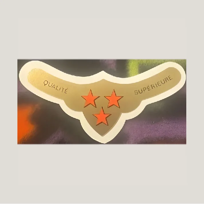
Antique 1920s French Wine Label ⭐ Qualité Supérieure Gold & Orange 3-Star Collectible 🍷

Antique 1920s French Wine Label ⭐ Qualité Supérieure Gold & Orange 3-Star Collectible 🍷

Regular price 8.00 USD
Regular price Sale price 8.00 USD
Sale Sold out
Shipping calculated at checkout.
Quantity

🍷 Antique 1920s French "Qualité Supérieure" Three-Star Wine Neck Label — New Old Stock

This is an antique French wine neck label produced in the 1920s, bearing the phrase Qualité Supérieure — "Superior Quality" — alongside three bold orange stars arranged in a triangular formation on a gold-toned heraldic shield. Labels of this form were mass-produced by French lithographic print houses for négociants and wine merchants who applied them to bottle necks as a prestige signal, a practice fully established in the French wine trade by the early twentieth century. The distinctive boomerang-and-shield silhouette, the Art Deco-influenced color palette of orange on gold, and the French-language quality declaration place this label firmly in the commercial wine ephemera tradition that flourished across France between the wars. It survives as New Old Stock — never applied, never distributed — making it a pristine artifact of the golden age of French label printing.

🌟 There is something almost cinematic about holding a piece of paper that was printed a hundred years ago in France and never made it onto a bottle. This label was made to sell wine — to ride the neck of a dark glass bottle in some merchant's cellar, to catch candlelight in a dining room, to whisper quality to anyone who looked. And then, for reasons no one recorded, it never left the printer's stock. A century later, here it is: gold still bright, orange stars still crisp, the shape still as confident as the day it was cut.

---

✨ What You're Looking At

The label itself is die-cut into a form that collectors immediately recognize: a wide, rounded boomerang bar across the top — the part that wraps around a bottle neck — that swoops down at the center into a heraldic shield shape. The overall silhouette is symmetrical and elegant, the kind of shape a trained commercial artist would have drafted with a compass and a steady hand. The outer border is cream-white, clean and unprinted, giving the gold interior a framed, finished quality.

🛡️ The shield at the center carries three five-pointed stars in a vivid orange-red, arranged two above and one below — a heraldic triangle that reads at a glance as distinction, rank, prestige. In the wine trade of the 1920s, a three-star rating was the highest shorthand a merchant could print. One star meant decent. Two stars meant good. Three stars — trois étoiles — meant the best the house had to offer. The stars here are bold, slightly raised in appearance from the gold ground, and carry the warm orange-vermillion tone that French commercial lithographers of the era favored for maximum visibility.

The words Qualité on the left wing and Supérieure on the right are lettered in a dark, upright serif that sits comfortably in the Art Deco register without being showy about it. The phrasing is split deliberately: the two wings of the label complete a single phrase together, the way a sentence wraps around the neck of a bottle. It is clever design, elegant engineering, and it required a lithographer who knew exactly what they were doing.

📐 This label measures approximately 4 x 1.75 inches. The boomerang format with the dropped shield center would have been designed to fit the standard Bordeaux and Burgundy bottle neck profile of the period.

---

🖨️ The Art of the French Wine Label

The lithographic printing process that made labels like this possible was invented by Alois Senefelder in 1798 — a discovery that would transform commercial printing across Europe over the following century. By the mid-1800s, French print houses had mastered the art of producing small, elaborate, adhesive-ready labels that could carry color, heraldry, portrait medallions, and gold foil effects at scale. The great Champagne houses — Moët & Chandon, Ruinart, Veuve Clicquot — were among the earliest to develop prestige labels using silver, gold, and heraldic crests as their visual language, establishing a code of quality signals that the entire French wine trade would borrow for generations.

🎨 By the 1920s, the French wine label had become a minor art form in its own right. Printers competed for the business of négociants and châteaux, and the best commercial artists in Paris were putting serious craft into label design. The period's dominant aesthetic — what we now call Art Deco — found a natural home on the wine bottle: clean geometry, bold color, restrained ornament, and a graphic confidence that felt modern without abandoning prestige.

Paris commercial print studios were thriving. Mourlot Studios, founded in 1852 and later known as Imprimerie Mourlot, was one of the most celebrated — and starting in the 1920s, Fernand Mourlot transformed one of the firm's locations into a dedicated fine art lithography studio. The same decade that saw Mourlot pivoting toward fine art was the decade when commercial labels like this one were rolling off the press by the tens of thousands, destined for négociants across France who would fill orders from wine merchants all the way from Bordeaux to Brittany.

The phrase printed on this very label — Qualité Supérieure — was the standard boilerplate of the négociant wine trade. A négociant was not necessarily a château; a négociant bought wine, blended it, bottled it under their own name, and sold it. Labels bearing generic prestige phrases like Qualité Supérieure, Cuvée Spéciale, or Grande Réserve were the merchant's calling card — printed in stock quantities, to be applied to whatever lot the house was proud of that season. Among collectors, the lore holds that these generic négociant labels were produced in enormous print runs by regional lithographers, making the labels themselves a kind of parallel history of the French wine trade — not the story of a single famous château, but the story of the thousands of smaller houses that built French wine culture from the ground up.

---

🏰 The Revolution Happening at the Top of the Market

While anonymous négociant labels like this one were being printed by the carton-load, something remarkable was happening at the very top of the French wine world in the same decade. In 1922, a twenty-year-old named Baron Philippe de Rothschild arrived at Château Mouton Rothschild — the Pauillac estate his great-grandfather Baron Nathaniel de Rothschild had purchased in 1853 — and immediately set about upending the traditions of the Médoc.

🍾 The old guard considered him an outsider and an upstart. He didn't care. In 1924, the year that the négociant houses were printing shields and stars like the ones on this label, Baron Philippe inaugurated two practices that would change French wine forever: he began bottling, labelling, and storing wine in cellars at the estate itself — the practice of mis en bouteille au château — and he commissioned the first ever "signed" label for a fine wine, inviting Cubist artist Jean Carlu to design the 1924 vintage label for Mouton Rothschild.

The lore that has circulated among collectors and wine historians ever since holds that Carlu's avant-garde label was simply too radical for its moment. Contemporary accounts suggest the design — geometric, modern, utterly unlike the heraldic crests and script lettering that the Médoc had always worn — was considered a commercial misstep. The story passed down says that the experiment was considered a failure by the market, and the tradition of commissioning a guest artist for each new vintage was quietly set aside.

🎭 It would not be revived until 1945, when Baron Philippe definitively established the tradition that made Mouton Rothschild labels among the most collected art objects in the wine world. The artists who followed — Picasso, Braque, Dalí, Chagall, Warhol — would eventually make the label as famous as the wine inside the bottle. But in 1924, when that first Carlu label was considered too bold, it was the anonymous three-star négociant shields — exactly like this one — that represented the commercial mainstream of French wine label design.

There is a lovely irony in that history: the label that tried to change everything was set aside, while the label that asked for nothing more than three orange stars and quality gold kept selling wine across France for another generation.

---

📜 A Generic Label With a Specific Story

Collector lore — and it is lore, widely passed around in label-collecting circles — holds that labels bearing phrases like Qualité Supérieure without a named château or producer were almost always printed for négociants rather than estate bottlers. The négociant tradition was the backbone of French wine commerce for centuries: merchants would buy wine from growers, blend it, bottle it, apply their house label, and sell it under their own name. Generic quality phrases were the négociant's signal to the buyer: this house stands behind this wine. No vineyard name needed. The house's reputation was the guarantee.

⭐ What this means for a collector is significant: without a specific château name or merchant's imprint anywhere on the label, this piece represents the broadest and most democratic layer of French wine culture — not the famous names, not the Premier Crus, but the commercial wine trade that put French bottles on tables across Europe and beyond every single day of the 1920s. It is, in its own way, a more honest document of how most people actually encountered French wine in that era than any signed Mouton Rothschild label ever could be.

The three stars on the shield were not invented decoration — they carried real commercial weight. The three-star system was a standard that French merchants, restaurants, and buyers understood without translation. A three-star négociant wine was the house's flagship, the best it offered, the one reserved for special orders and good customers. Putting those three stars on a gold shield and framing them with Qualité Supérieure was the 1920s equivalent of a premium designation — not a Michelin star, but not far off in spirit.

---

🖼️ For Collectors, Framers, and Lovers of French History

New Old Stock paper ephemera from the 1920s is a different category of collectible from a lot of what survives. Most paper from that era has been used, handled, filed, stuck to something, torn, or discarded. What survives in pristine, unapplied condition is the printing-house stock that never left the warehouse — the labels that were printed in anticipation of orders that never quite materialized, or that were superseded by a new design before the run was exhausted. That survival is a happy accident of commerce: someone kept the stock, and it traveled through the decades intact.

🎨 French wine label collecting has a devoted international following, and the 1920s–1940s period is considered the golden era by most serious collectors. The combination of lithographic printing quality, Art Deco design influence, and the golden-age commercial wine trade produces labels that are visually compelling as standalone objects — which is why so many end up framed, matted, displayed in collections of ephemera and advertising art, or used as reference pieces by designers and illustrators studying the period's commercial aesthetic.

The gold-and-orange palette of this particular label photographs beautifully and displays well against both light and dark backgrounds. The die-cut silhouette — that boomerang-shield form — gives it three-dimensional interest even flat. Mixed-media artists and collage practitioners have long known that authentic vintage French labels carry a quality of surface, color, and graphic authority that reproduction simply cannot replicate. This one, in New Old Stock condition, is as close to the printer's original intention as it is possible to get a century later.

---

❓ Questions Collectors Ask

What exactly is a French wine neck label, and what was this one used for?

A French wine neck label is a die-cut paper label designed to wrap around the neck of a wine bottle, just above the main body label. This particular label — in the boomerang-and-shield format — was produced for the French négociant wine trade of the 1920s, where merchants applied prestige labels to bottles of their best lots as a quality signal to buyers. The phrase Qualité Supérieure and the three-star heraldic shield were standard commercial shorthand in that trade for a house's highest-quality offering. Labels of this form were produced by lithographic print houses in large quantities for merchants across France.

How can you date a French wine label to the 1920s?

Several visual and historical markers help date this label to the 1920s. The lithographic printing method — which produced the smooth gold-tone ground and the vivid orange stars — was the dominant commercial printing technology of that era before offset printing took over mid-century. The Art Deco-influenced design language, with its clean geometry, heraldic shield form, and bold symmetry, is characteristic of French commercial art from approximately 1915 to 1935. The specific combination of the négociant quality phrase Qualité Supérieure with a three-star heraldic motif was a convention fully established in the French wine trade by the 1920s and in wide use through the 1940s.

What makes New Old Stock wine labels significant to collectors?

New Old Stock wine labels — those that were printed but never applied to a bottle — survive in a condition that used labels simply cannot match. An applied label would have been exposed to moisture, adhesive, cellar humidity, and handling; NOS labels carry their original color saturation, paper integrity, and printing detail intact. For collectors of French printed ephemera and wine label art, NOS condition from the 1920s represents the closest possible contact with the printer's original work. The survival of unapplied stock from this era is a function of commercial accident — print runs that exceeded orders — rather than deliberate preservation, which makes intact NOS pieces genuinely uncommon a century on.

Why did French négociant wine labels use stars as a quality rating?

The star rating system on French négociant labels predates the modern Michelin star by decades and draws on a much older European tradition of using celestial symbols as rank indicators. In the French wine and spirits trade, the three-star designation had been in commercial use since at least the mid-nineteenth century — the cognac trade, for example, formalized the three-star VS (Very Special) designation that survives to this day. By the 1920s, any French wine buyer understood that a three-star label meant the merchant's best tier. The stars on a négociant label were not an external rating but the house's own quality declaration — a promise printed directly onto the bottle.

How do you tell an authentic 1920s lithographic label from a modern reproduction?

Authentic lithographic labels from the 1920s carry characteristics that modern offset or digital printing cannot replicate precisely. Under magnification, true lithographic printing shows a continuous ink layer rather than a dot-screen pattern; the color transitions are smooth and the paper surface carries a slight texture from the printing process. The paper stock itself ages differently from modern papers — 1920s commercial label stock was often rag-based or mixed-fiber, giving it a density and hand-feel distinct from modern wood-pulp papers. Gold-tone areas on authentic period labels often show subtle variation in coverage that reflects the hand-worked nature of stone or plate lithography. New Old Stock condition, as with this label, means the paper has not been artificially aged or distressed, which is itself a marker of authenticity.

How should a vintage French wine label be displayed or stored?

Paper ephemera from the 1920s benefits from archival storage or display conditions: away from direct sunlight (which fades lithographic inks, particularly the orange and gold tones most vulnerable to UV), in stable humidity (not near exterior walls or heating vents), and either in acid-free sleeves for storage or behind UV-filtering glass for framing. The die-cut silhouette of a neck label like this one displays particularly well when matted with a deep mat that lets the shaped edge breathe — the boomerang-shield form reads best when it has visual space around it. Many collectors display French wine labels in small grouped arrangements, mixing labels from the same era to create a snapshot of 1920s commercial graphic design.

Do collectors of French wine labels also collect related ephemera from the same period?

French wine label collectors frequently pursue adjacent categories: wine-trade advertising posters, négociant letterhead and invoices, cork brands, capsule foils, and full-bottle labels from the same era. The 1920s–1940s period is particularly rich because it sits at the intersection of the Art Deco design movement and the peak of French lithographic printing craft, producing commercial ephemera that holds its own aesthetically against the fine-art printing of the same period. Labels bearing the same generic quality phrases — Qualité Supérieure, Grande Réserve, Cuvée Spéciale — are collected as a set, documenting the visual conventions of the négociant trade across different regional styles and print houses. This label, with its gold-shield heraldry and three orange stars, is a textbook example of the prestige-négociant visual language of its decade.

---

🍷 A hundred years ago, somewhere in France, a lithographer pulled this label off a press, stacked it with thousands of others, and waited for an order that history apparently had other plans for. The order never came — or came and was superseded, or was filled and this stack was the remainder. Whatever the reason, the label survived. The gold is still gold. The stars are still orange. The French is still confident. Qualité Supérieure. Some things, it turns out, do not need a bottle to make their point.

New Old Stock (NOS): unused old store inventory, preserved exactly as it was set aside decades ago.

Shipping

🚚 Shipping & Handling

  • Shipping costs and timing are calculated at checkout.
  • Items curated and shipped directly by me include U.S. shipping at no additional cost, professionally packed to ensure safe arrival of your artifact.

Items from Vetted Pro Collectors
Shipping for items offered by vetted Pro Collectors is determined at checkout. All Pro Collector listings are reviewed to ensure fair, reasonable shipping practices.

For full details, please refer to our Shipping Policy.

Returns & Exchange

Take your time — you've got a full six months. If a piece isn't right for you, send it back the way it reached you and we're good.

In the first 30 days your money goes straight back the way you paid. After that it's store credit, so you can put it toward something you'd rather have.

Return shipping we sort out between us, case by case. I don't make this difficult.

If something arrives damaged, or it isn't what I said it was, send me a photo within 48 hours and I'll make it right.

Email info@vintageantiquesgifts.com or call 802-356-9872 — that's me answering, not a call center.

The only things I can't take back are custom or special-order pieces and gift cards.

View full details