
Skip to product information
1 of 4

Vintage and Antique Gifts

Antique French Wine Collarette Label 🍷 Cuvée Spéciale Crowned Heraldic Crest Lithograph NOS

Antique French Wine Collarette Label 🍷 Cuvée Spéciale Crowned Heraldic Crest Lithograph NOS

Regular price 5.50 USD
Regular price Sale price 5.50 USD
Sale Sold out
Shipping calculated at checkout.
Quantity

Size: 7 x 3 inches

What Did a French Wine Bottle Say Before It Said a Single Word? 🍷

There is a moment — familiar to anyone who has ever lifted a properly dressed bottle of French wine — when the packaging does something the wine itself cannot yet do. The wine is sealed. The cork is still in. The contents are invisible. And yet the bottle speaks. It speaks through the label on its belly, yes, but it speaks first through what rides the neck: that curved crescent of printed paper, gilded and heraldic, announcing the wine the way a footman announces a distinguished guest at the threshold of a great house.

That piece of paper has a name. It is called a collarette. And in the years when French wine culture was at once deeply traditional and quietly modernizing — when négociant bottlers were dressing house blends for export and for a growing domestic merchant class — the collarette was not decoration. It was credential. It was the first argument that what was inside was worth opening. It was the signet ring pressed into wax before the letter was even read.

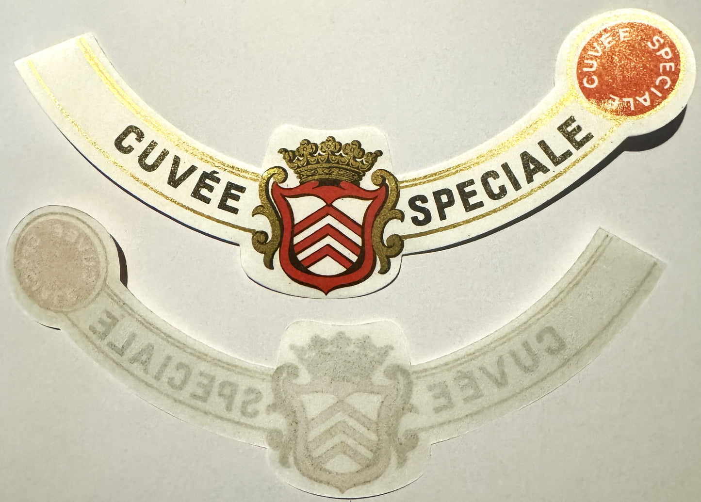
This listing is for one of those credentials. A genuine antique French wine neck label — a collarette — surviving as New Old Stock (NOS): unattached, unaffixed, and carrying its full chromolithographic color and gold detailing exactly as it left the press. The designation it bears is Cuvée Spéciale, and every element of its design — the heraldic red shield, the bold white chevrons, the baroque gold scrollwork, the crowned finials, the self-contained circular red medallion that echoes the name like a wax seal translated into ink — was chosen to make a silent, confident argument to anyone who picked up the bottle. This is not coincidence. This is commercial art doing precisely what commercial art was designed to do, with a richness and a precision that rewards the eye the longer you look.


🏷️ What This Label Is — The Object, the Era, the Craft

Let's establish exactly what we have here. This is an antique French wine neck label — specifically a collarette, the curved band of printed paper designed to wrap the upper neck of a bottled wine — bearing the designation Cuvée Spéciale. It is produced as a lithograph with gold gilt accents, printed in a rich palette of red, gold, black, and white. Its shape is the classic concave crescent arc of a wine neck label, curved to hug the bottle's throat and visible above the main body label from every angle across a table or a cellar shelf.

At the center of the collarette sits a crowned heraldic shield — red field bearing three bold white chevrons stacked one above the other, the whole shield flanked by elaborate gold baroque scrollwork cartouche flourishes, and surmounted by a gold noble's crown of exceptional detail. To the right, a circular red medallion — essentially a miniature seal or roundel — carries the words Cuvée Spéciale arranged in a curved arc around its circumference, in white lettering against that deep red ground. This roundel is a masterstroke of label design: it functions simultaneously as an accent piece, a seal of quality, and a visual anchor that holds the eye. The text Cuvée Spéciale appears twice across the full label — once across the main band and once on the roundel — reinforcing the designation with the quiet confidence of a house that expects to be taken seriously.

It survives here as New Old Stock, meaning it was printed, stored, and never applied to a bottle. It is a piece of the working inventory of the wine trade that has come down to us intact — in precisely the form the lithographer's press intended.

The term Cuvée Spéciale itself is worth understanding, because it is not a brand name in the modern commercial sense. It is a French wine-trade designationcuvée deriving from cuve, the vat or tank in which wine is blended or fermented, and spéciale meaning simply "special" or "select." A négociant bottler, a regional merchant, or a hotel cellarmaster could apply this designation to a carefully assembled house blend and communicate, through those two words alone, that this was not the everyday table wine but something set apart from the ordinary run of production. The term was never regulated the way an appellation is regulated today, which is precisely why it appears on a stock label: any qualified bottler could use it, and many did, dressing their finest blends in exactly this kind of heraldic finery.


⚜️ The World That Made This Label — French Wine Culture and the Art of the Collarette

To understand why this small curved piece of printed paper carries such visual weight, you have to understand the world it was made to move through. The late nineteenth and early twentieth centuries were the golden age of French wine label art — a period in which the bottle itself had become a fully dressed commercial object, and the label system that dressed it had grown into a genuine craft industry.

The evolution had begun much earlier. Wine producers had been attaching paper identification to their bottles since at least the early eighteenth century, but those early "tickets" were simple handwritten or crudely printed affairs hung around the neck on a string or pasted on with rudimentary adhesives. The revolution came with lithography, the printing process invented by Alois Senefelder at the close of the eighteenth century, which allowed for the first time the mass reproduction of fine detail, subtle color gradations, and the kind of decorative complexity that had previously required hand engraving. By the middle of the nineteenth century, French print houses were producing wine labels of extraordinary refinement — labels that deployed heraldic imagery, royal crests, architectural vignettes, and portrait medallions to dress even a modest regional wine in the visual language of aristocratic prestige.

The Champagne houses of the Marne were the pioneers and pacesetters of this visual vocabulary. Houses like Moët & Chandon, Veuve Clicquot, and Ruinart developed label systems in which color, crest, crown, and foil communicated quality and house identity at a glance. Their neck labels — the collarettes — were especially important, because they were the first thing a diner or a sommelier saw when the bottle was lifted from the ice. The collarette announced the house before the cork was drawn. In a culture where hospitality was a serious matter and the wine on the table reflected on the host, that announcement mattered enormously.

The style that the Champagne houses perfected spread quickly through the broader French wine trade. Négociants — the merchant bottlers who purchased wine in bulk from producers across Burgundy, Bordeaux, the Loire, and the Rhône and bottled it under their own labels for sale to hotels, restaurants, and private customers — adopted the same heraldic conventions for their house blends. A collarette bearing a crowned crest and a prestige designation like Cuvée Spéciale told the world that the bottler behind it understood the visual grammar of quality and was confident enough to dress their wine in its full regalia.

The chromolithographic print houses that supplied these labels were concentrated in Paris and in the industrial printing centers of northern France, producing vast runs of stock designs that bottlers could order with their own names overprinted — or, in the case of generic designations like Cuvée Spéciale, purchase ready to use exactly as printed. The craft involved was substantial: multiple lithographic stones, one for each color, had to be prepared, aligned with absolute precision, and run in sequence to produce the layered effect of red, black, white, and gold that you see in a label like this one. The gold accenting was typically applied last, often with a separate gilding process, which is why it sits on the surface with that distinctive warmth and depth.

Collector lore passed down through the ephemera trade holds that the finest of these stock collarettes were produced in relatively small print runs — enough to supply a season's worth of a particular négociant's output but not so many that the design lost its sense of exclusivity. Whether that specific tradition is traceable to a documented print house or survives only as the accumulated wisdom of dealers who have handled thousands of these pieces over the decades, it fits the material evidence: surviving NOS examples like this one are genuinely uncommon, which is why they are treasured when they surface.

Local legend in the ephemera collecting community also holds that upper neck labels — the collarette proper, as distinct from the lower neck band — were produced in smaller quantities than their lower counterparts because they were considered the more prestigious of the two pieces and were handled with proportionally greater care during application. The bottling workers, according to this tradition, were instructed to use the lower labels first and fit the collarettes last, meaning that if a run came up short it was the body label or the lower neck piece that was left off, never the crown. Whether the record fully supports this tradition or whether it has grown in the telling over generations of collectors, it captures something true about how these labels functioned: the collarette was the capstone, and it was treated accordingly.


🛡️ Reading the Crest — Heraldry, Chevrons, and the Grammar of Prestige

The heraldic shield at the center of this collarette deserves its own consideration, because it is not merely decorative — it is a deliberate piece of visual rhetoric, and it speaks a language with a long history behind it.

The chevron, in the vocabulary of European heraldry, is one of the oldest and most immediately recognizable charges — the inverted V-shape that appears on a coat of arms. Its origins are debated among heraldists, but the most widely accepted tradition holds that it derives from the architectural chevron, representing the rafters of a roof, and carries connotations of faithful service, protection, and the sheltering of those beneath one's care. Three chevrons stacked in sequence on a single shield, as they appear here, amplify that symbolism — in medieval heraldic practice, the repetition of a charge typically indicated lineage depth or the confirmation of an honorable quality across generations.

The crown surmounting the shield on this label is a noble's crown rather than a royal one — distinguished by its specific configuration of leaf-like points and the absence of the closed arches that would mark a sovereign's crown. In French heraldic convention, this type of crown indicated the rank of count or marquis, positioning whoever bore it in the upper echelon of the nobility without quite claiming the heights of royalty. On a wine label, this distinction was both meaningful and carefully calculated: it communicated aristocratic provenance without overreaching into claims that might invite scrutiny.

The baroque scrollwork cartouche flanking the shield — those sweeping gold flourishes that frame the crest on either side — belongs to a decorative tradition that had been borrowed from architectural ornament since the seventeenth century. In the context of a wine label, it signals the period of the label's design conception: this is the visual language of the Belle Époque and the early twentieth century, when French commercial art was deeply in love with the ornamental traditions of the grand siècle even as it was beginning to absorb the cleaner lines of what would become Art Deco. This collarette lives in that beautiful transitional moment.

And then there is the red roundel — the circular medallion to the right of the main band, carrying Cuvée Spéciale in white curved lettering against its red ground. In heraldic terms, a roundel is simply a circular charge on a field, and a red roundel specifically has its own heraldic name: a torteau. On this label, the roundel functions less as a formal heraldic element and more as a graphic seal — an echo of the wax seals that had authenticated wine bottles and correspondence for centuries. It says, in visual shorthand: this has been verified, approved, and set apart. It is a masterly piece of label design, and the fact that it carries the same text as the main band is not redundancy — it is emphasis, the typographic equivalent of the bottler looking the customer in the eye and repeating the assurance.


🖼️ Display Ideas

  • 🍾 Frame it alone in a deep-set shadow box — the curved form of the collarette reads beautifully against a cream or deep burgundy mat, and the gold accents catch the light in a shadow box depth that a flat frame cannot match.
  • 🗺️ Group it with a curated wine ephemera collection — pair it with a vintage French wine map, a Champagne house advertisement from the same era, or a set of antique wine trade cards for a display that tells the full story of French wine culture in the Belle Époque.
  • 📚 Use it as a bookmark or journal accent piece — tucked into a wine journal, a cellar book, or a cookbook dedicated to French cuisine, an NOS label like this one bridges the gap between artifact and everyday object with effortless charm.
  • 🍽️ Incorporate it into a French kitchen or dining room vignette — arranged with a vintage corkscrew, a set of French wine glasses, and a reproduction Belle Époque wine poster, this collarette anchors a display that feels both collected and intentional.
  • 🎨 Resin or archival encapsulation as wall art — some collectors choose to encapsulate fine paper ephemera in archival resin, creating a luminous object that preserves the piece while making it exhibitable in spaces where a framed paper would be vulnerable.
  • 🎁 Present it as a gift with a bottle of quality French wine — a contemporary bottle of a Cuvée Spéciale-style blend paired with this antique collarette makes a gift that is genuinely uncommon: something beautiful, something historical, something that tells the story of what wine culture used to look like when it dressed itself in its full regalia.

🎁 Who Collects These — and Why This Particular Piece Finds Its People

The world of antique wine label and wine ephemera collecting is a remarkably broad community, and a piece like this collarette finds its way into collections by several different routes. Let me tell you who is drawn to these, because understanding the collector helps you understand what the piece actually is.

Wine ephemera collectors are the core constituency. These are the people who understand that the history of wine is not just a history of vineyards and vintages but a history of commerce, design, and communication — and that the labels, collarettes, capsules, corks, and trade cards that surrounded the wine bottle are primary documents in that history. For them, a well-preserved NOS collarette like this is exactly what an unpostmarked stamp is to a philatelist: the artifact in its intended state, uncorrupted by the use it was made for.

French decorative arts enthusiasts are drawn to the chromolithographic quality of the piece — the layered color printing, the gold accenting, the heraldic design vocabulary that places it squarely in the Belle Époque tradition. For someone whose home or collection is oriented around French decorative arts of the late nineteenth and early twentieth centuries, this collarette belongs in the same visual conversation as a period poster, a café menu, or a trade card from the same era.

Heraldry and genealogy collectors find the shield particularly compelling. The chevron charge, the noble's crown, the baroque cartouche — these are elements that resonate with anyone who has spent time studying European coats of arms, and a label like this provides a lovely, displayable example of heraldic imagery in its commercial application.

Kitchen and entertaining collectors — those who build displays around the pleasures of the French table — often seek out pieces like this to add authenticity and historical depth to a curated arrangement. A collarette that once rode the neck of a dressed French bottle speaks directly to the culture of hospitality, and it speaks in a voice that no reproduction has quite matched.

Paper ephemera and lithography collectors appreciate it simply as a fine example of the chromolithographic printer's art — a small-scale masterpiece of commercial printing that required significant skill and multiple press runs to produce, and that has survived intact as New Old Stock in the form the press intended.


❓ Frequently Asked Questions

What exactly is a collarette, and how is it different from a regular wine label?

A collarette — sometimes spelled collerette in French — is specifically the neck label of a wine bottle: the small, curved band of printed paper that wraps the upper neck of the bottle, above the main body label. It is distinct from the body label (which carries the bulk of the wine's information), the back label (which often carries additional producer notes or regulatory text), and the lower neck label (a wider band that sometimes sits between the body label and the collarette). The collarette is the crown of the label system — the piece that is most visible when the bottle is standing on a table or shelf, and the piece that was given the most prestigious design treatment. In the Belle Époque French wine trade, the collarette carried the house crest, the quality designation, and the visual prestige markers that were meant to make the first impression. Surviving NOS collarettes are considered the prize piece in wine ephemera collections precisely because they occupied that position.

What does "Cuvée Spéciale" actually mean — was this a specific wine?

Cuvée Spéciale is a French wine-trade designation rather than a brand name. Cuvée derives from cuve, the vat or tank in which wine is blended or fermented, and broadly indicates a particular batch, blend, or selection of wine. Spéciale means simply "special" or "select." Together, the designation signals that the wine inside is a particular, curated blend — set apart from the everyday production of the bottler. The term was not formally regulated in the nineteenth or early twentieth century the way modern appellations are, which is why it appears on a stock label design: any négociant or merchant bottler could use it, and many did, applying it to their finest house blends. The label before you was almost certainly part of a stock print run that individual bottlers could purchase and apply to their own select blends — which is part of why no specific producer's name appears on it. The designation stood alone, and the heraldic design carried all the credential that was needed.

How was this label printed — what is chromolithography, and why does it matter for this piece?

Chromolithography is a color printing process developed in the nineteenth century in which each color in the final image is printed from a separate lithographic stone or plate. In a label like this one — with its distinct fields of red, black, white, and gold — that means at minimum four separate press runs, each requiring precise registration to ensure the colors align correctly in the finished piece. The gold accenting was often applied in a final gilding step, which is why it sits on the surface with a warmth and depth that the other colors, printed into the paper, do not quite match. The process was labor-intensive and required skilled craftsmen at every stage — from the preparation of the lithographic stones to the inking, the pressing, and the final inspection. What you hold in a NOS chromolithographic label like this is the direct physical output of that craft, in the state it left the press: the colors at their full saturation, the gold at its full richness, the registration of the multiple print layers exactly as the printer intended. For collectors of paper ephemera and printing history, this is a significant part of what makes a piece like this worth preserving.

This is listed as New Old Stock — what does that mean in practical terms for a paper label?

New Old Stock — NOS — means that this collarette was printed for use in the wine trade, stored as part of a printer's or bottler's inventory, and never applied to a bottle. It came to us through the commercial supply chain of the wine trade rather than through the life cycle of a dressed and consumed bottle. This matters for paper ephemera in a specific way: a label that was applied to a bottle and later soaked or steamed off will show the evidence of that process. A label that was never applied has none of that history — it exists in the form the lithographer produced it, which is the form that shows the printing craft at its most legible. For collectors, NOS is the preferred state of a stock label precisely because it allows you to see the piece as a designed and printed object, not as a recovered artifact. What you are acquiring here is the printer's intention, intact.

Is the heraldic crest on this label a real family coat of arms — could this be traced to a specific French family or house?

This is one of the most interesting questions a collector can ask about a piece like this, and the honest answer is nuanced. The heraldic elements on this collarette — the red shield with white chevrons, the noble's crown, the baroque cartouche — are drawn from the authentic visual vocabulary of European heraldry, and the chevron charge in particular is associated with a number of historic French noble families.

However, on a stock label design like this one, the crest was almost certainly composed by the label printer's in-house artist to read as heraldic rather than to represent any specific documented coat of arms. This was standard practice in the Belle Époque wine trade: the visual grammar of heraldry was borrowed to communicate prestige without the label necessarily claiming the specific lineage of any particular family.

Collector lore in the wine ephemera community holds that some stock designs of this kind were loosely based on real regional coats of arms — the arms of a town, a department, or a noble house associated with a wine-producing region — but adapted and generalized enough that they could be used broadly. Whether this specific crest has a documentable heraldic original is a question that would require consultation with a French heraldist working from the original; as a label object, it is best understood as heraldic design in the commercial tradition, which is its own fascinating category.

Where would a label like this have been used — what kind of wine would it have dressed?

A collarette of this quality and design vocabulary was almost certainly intended for a négociant house blend — that is, a wine assembled by a merchant bottler from purchased grapes or bulk wine, crafted to a house style, and sold under a quality designation rather than a single-vineyard or appellation identity. This was a very significant segment of the French wine trade in the Belle Époque period: négociants in Bordeaux, Burgundy, the Loire, and the Rhône assembled and bottled enormous quantities of wine for export to Britain, the United States, and other markets, as well as for the domestic hotel and restaurant trade. A Cuvée Spéciale designation, dressed in heraldic collarette finery like this one, would have been the bottler's statement that this was the best of the house — the blend they were proudest of, the one they put in front of important customers. The visual richness of the label was doing commercial work: it was telling the sommelier, the hotel buyer, or the private customer that this bottle deserved to be on the best table.

How should I store or display this label to preserve it?

As a piece of fine printed paper ephemera, this collarette is best stored or displayed with the same principles that apply to any important paper artifact. If you are storing it rather than displaying it, archival-quality polyester sleeves or acid-free envelopes are ideal — they protect the surface from contact and from atmospheric humidity while allowing the piece to be viewed without handling. If you are framing it for display, archival mat board and UV-filtering glass or acrylic are the standard choices in the ephemera collecting community; they protect against light exposure without obscuring the chromolithographic detail. Avoid adhesives that contact the label surface directly, and avoid displaying the piece in direct sunlight or in areas of high humidity. Beyond those standard precautions, this is a piece that was made to be looked at — the chromolithographic printing and the gold accenting were designed to reward close attention, and the curved form of the collarette gives it a sculptural quality in the right frame. Display it where the light can find the gold.

Shipping

🚚 Shipping & Handling

  • Shipping costs and timing are calculated at checkout.
  • Items curated and shipped directly by me include U.S. shipping at no additional cost, professionally packed to ensure safe arrival of your artifact.

Items from Vetted Pro Collectors
Shipping for items offered by vetted Pro Collectors is determined at checkout. All Pro Collector listings are reviewed to ensure fair, reasonable shipping practices.

For full details, please refer to our Shipping Policy.

Returns & Exchange

Take your time — you've got a full six months. If a piece isn't right for you, send it back the way it reached you and we're good.

In the first 30 days your money goes straight back the way you paid. After that it's store credit, so you can put it toward something you'd rather have.

Return shipping we sort out between us, case by case. I don't make this difficult.

If something arrives damaged, or it isn't what I said it was, send me a photo within 48 hours and I'll make it right.

Email info@vintageantiquesgifts.com or call 802-356-9872 — that's me answering, not a call center.

The only things I can't take back are custom or special-order pieces and gift cards.

View full details
  • 5 stars: 1 (100%)
  • 4 stars: 0 (0%)
  • 3 stars: 0 (0%)
  • 2 stars: 0 (0%)
  • 1 star: 0 (0%)
V
Victoria

Just as described and vendor was kind enough to send a few extra labels!