Skip to product information
1 of 6

Vintage and Antique Gifts

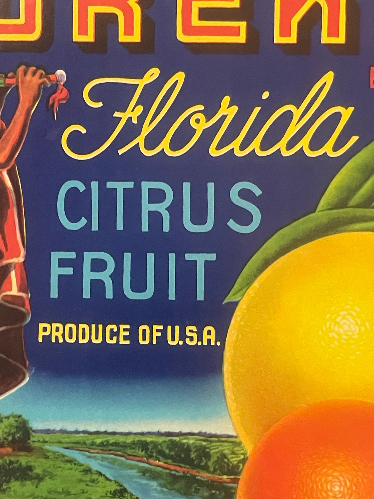
Vintage 1940s Eureka Citrus Crate Label 🍎 Native American Flute Player Art, Turner Fruit Ocala FL, Unused Kitchen Wall Decor

Vintage 1940s Eureka Citrus Crate Label 🍎 Native American Flute Player Art, Turner Fruit Ocala FL, Unused Kitchen Wall Decor

Regular price 8.00 USD
Regular price Sale price 8.00 USD
Sale Sold out
Shipping calculated at checkout.
Quantity

🍊 Do You Remember the Flute Player Who Sold Florida Sunshine?

Before refrigerated trucks, before supermarket branding consultants, before any of the machinery of modern advertising existed, a Florida packing house needed exactly one thing to move a boxcar of oranges: a label bold enough to catch a wholesale buyer's eye across a crowded rail yard in the half-second before he moved on to the next crate. This one did the job for Turner Fruit Co. of Ocala, Florida, for years — and it's still doing the job today, just for a different kind of buyer. This is an original 1940s Eureka citrus crate label, New Old Stock, never glued to a crate, and it's one of the more striking pieces of Florida produce art we've had come through the shop. 🌴

If you grew up anywhere near Florida citrus country, or if your grandparents kept a bowl of oranges by the door every winter, or if the words "Florida sunshine" mean something specific and warm to you, this label is going to hit somewhere familiar. Let's dig into it.

📏 THE LABEL ITSELF

🍊 Antique/vintage 1940s Florida citrus crate label, original — not a reprint, not a reproduction
🍊 Approximately 9" x 9", a true square format
🍊 New Old Stock (NOS): unused, unmounted, never applied to an actual crate
🍊 Condition remains strong with clean color and no significant wear
🍊 Printed on paper via traditional stone/plate lithography

🎨 WHAT'S ACTUALLY ON THE LABEL

The scene is unmistakable once you've seen it: a man rendered in profile, wrapped in a red-orange robe trimmed in white, a feathered headband trailing a white ribbon behind him. Both hands are raised, playing a flute skyward, standing on a stretch of green grass with a tree-lined river winding behind him and a deep navy-blue sky filling the top third of the label. Above the scene, "Eureka" is lettered in flowing gold script. Below it, bold blue block lettering spells out "Citrus Fruit — Produce Of," leaving space for the packer's information beneath.

This is what collectors call a "figure" label — rather than showing the fruit itself in a bowl or on a branch, the packing house built the entire brand identity around a single illustrated character. It's a design approach that shows up again and again across mid-century American produce branding, and it worked precisely because it gave buyers something memorable to picture and ask for by name — "get me a crate of the Eureka oranges," not just "get me some oranges."

The imagery on this particular label reflects a Native American figure, rendered in the romanticized commercial-art style that Florida citrus marketers leaned on heavily throughout the early-to-mid 20th century. It's worth sitting with that honestly: labels like this one are historical artifacts of how mid-century advertising imagined and packaged Native identity for a mostly non-Native buying public, decades before anyone in the advertising industry was asking hard questions about that kind of imagery. We think that history is worth preserving and looking at directly rather than smoothing over — it's part of what makes a piece like this a genuine primary source for anyone studying American commercial art, branding history, or the visual culture of the citrus industry, rather than just a pretty picture.

🍋 TURNER FRUIT CO. AND THE OCALA CITRUS TRADE

The label identifies its packer plainly: Turner Fruit Co., operating out of Ocala, Florida. Ocala sits in Marion County, in the heart of what was, for most of the 20th century, some of the most productive citrus ground in the entire state — rolling hills and sandy, well-drained soil that citrus trees took to extremely well, right up until a series of hard freezes in the 1980s and 1990s pushed much of Florida's commercial citrus belt further south. In the 1940s, though, Marion County groves were shipping fruit by the boxcar load, and packing houses like Turner Fruit needed labels exactly like this one to move product through the wholesale distribution chain.

The system worked like this: fruit was picked, sorted, and packed into wooden crates right at the packing house. Each crate got a label glued to one end, identifying the brand, the packer, and the origin. Crates were then loaded onto refrigerated rail cars — "reefers" — and shipped north to terminal markets in cities like New York, Chicago, and Boston, where wholesale buyers examined the labels on stacked crates and made split-second purchasing decisions based largely on brand recognition and visual appeal. A packing house that invested in a genuinely eye-catching label, like this one, was making a real competitive bet on getting noticed in that split second.

📦 WHY SO FEW OF THESE SURVIVED

Here's the detail that turns an old label into a genuine rarity: these were never meant to last. A label's entire working life was the length of one shipment — glued to a crate, shipped, unloaded, and then the crate itself was broken down or reused and the label was gone, soaked off or torn away or simply discarded with the packing debris. Nobody at Turner Fruit Co. in the 1940s was thinking about future collectors. They were thinking about the next boxcar.

The labels that exist today in clean, unused condition — like this one — almost universally come from a packing house's leftover printed stock, not from an actual crate. When a brand changed, retired, or a packing house closed, cases of extra pre-printed labels sometimes sat untouched in a warehouse for decades rather than being thrown away immediately. That's the improbable chain of events that had to happen for a piece like this to survive into the present in NOS condition: printed, boxed, forgotten, rediscovered. The overwhelming majority of labels printed in this era never survived that first and only trip to the produce terminal.

🖼️ WHY COLLECTORS AND DESIGNERS SEEK THESE OUT

Crate labels occupy a genuinely interesting niche in the collectibles world, sitting at the intersection of several different collecting categories at once: American advertising art, agricultural history, regional Americana, and mid-century graphic design. Major museums and university design archives hold institutional collections of citrus crate labels specifically because they document commercial lithography techniques, regional branding strategies, and the visual language of an entire industry during its peak decades — all in a format small enough to frame and hang.

The lithographic printing process itself is part of the appeal. Multi-color stone or metal-plate lithography was a genuinely skilled trade, requiring a separate pass for each color and painstaking registration to keep the image crisp. The saturated navy sky, the gold script, and the clean line work on this label are all the product of that process working at a high level — commercial art made fast, made cheap per unit, but made by people who knew exactly what they were doing.

For today's collectors, a label like this slots naturally into a few different collections: Florida citrus industry ephemera, Native American-themed American advertising art (viewed with the appropriate historical context), mid-century commercial lithography, or simply a striking, colorful piece of framed wall art with genuine age and a real backstory behind it.

💎 CONDITION AND WHY UNUSED EXAMPLES MATTER

This label is NOS — New Old Stock — meaning it was printed, never applied to a crate, and has spent its entire existence since the 1940s as flat, protected stock rather than working packaging material. That distinction matters enormously to condition. A label that actually traveled on a crate typically shows staining, creasing from the wooden slats, adhesive residue, and sun fading from its shipping journey. This one shows none of that. The navy sky is still deep and saturated, the gold script still catches the light, and the paper itself remains flat and clean.

✨ A REAL PIECE OF FLORIDA'S CITRUS HERITAGE

Whether you collect Florida ephemera specifically, mid-century American advertising art broadly, or you're simply drawn to a bold, well-designed, colorful piece of paper history with a real story behind it, this Eureka label rewards a closer look. It's a small, physical connection to a Florida industry that shaped the state's economy and identity for the better part of a century — printed by a real Ocala packing house, designed to catch a buyer's eye for one crucial second, and preserved, against real odds, in the exact condition it left the print shop in more than eighty years ago. 🍊🌴

Shipping

🚚 Shipping & Handling

  • Shipping costs and timing are calculated at checkout.
  • Items curated and shipped directly by me include U.S. shipping at no additional cost, professionally packed to ensure safe arrival of your artifact.

Items from Vetted Pro Collectors
Shipping for items offered by vetted Pro Collectors is determined at checkout. All Pro Collector listings are reviewed to ensure fair, reasonable shipping practices.

For full details, please refer to our Shipping Policy.

Returns & Exchange

Take your time — you've got a full six months. If a piece isn't right for you, send it back the way it reached you and we're good.

In the first 30 days your money goes straight back the way you paid. After that it's store credit, so you can put it toward something you'd rather have.

Return shipping we sort out between us, case by case. I don't make this difficult.

If something arrives damaged, or it isn't what I said it was, send me a photo within 48 hours and I'll make it right.

Email info@vintageantiquesgifts.com or call 802-356-9872 — that's me answering, not a call center.

The only things I can't take back are custom or special-order pieces and gift cards.

View full details
