Skip to product information
1 of 5

Vintage and Antique Gifts

Antique Artesian Sarsaparilla Bottle Label 🥤 1930s M.T. Dwyer Co Clinton MA NOS Paper Well Girl Illustration

Antique Artesian Sarsaparilla Bottle Label 🥤 1930s M.T. Dwyer Co Clinton MA NOS Paper Well Girl Illustration

Regular price $10.00 USD
Regular price Sale price $10.00 USD
Sale Sold out
Shipping calculated at checkout.

Size: 3 1/2" x 3 1/4"

🚚 Free US Shipping — ships within one business day. International shipping calculated at checkout.

Quantity

Who Bottled Artesian Sarsaparilla? 🌿 A Small Label That Held the Last of an Old American Thirst

Size: 3 1/2" x 3 1/4"

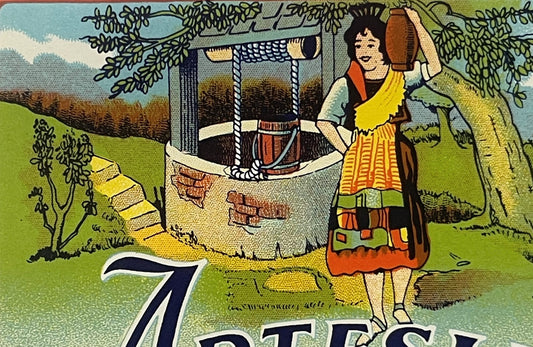
This is a vintage New Old Stock (NOS) paper bottle label for Artesian Sarsaparilla, produced by the M.T. Dwyer Co. of Clinton, Massachusetts, dating to the 1930s — the company's final operating decade before it closed in 1943. The label measures 3.5 x 3.25 inches and was printed for 8-fluid-ounce bottles sold across the Worcester County region of Massachusetts. It is original, unused stock, never applied to a bottle, surviving in the clean, vivid condition it carried out of the print shop. The M.T. Dwyer Co. was a meaningful employer in Clinton and one of the last regional bottlers in New England still producing sarsaparilla at a time when the flavor had already fallen badly out of fashion across the American soda market.

There is a particular kind of quiet that settles around objects that were made to be used and never were. This label was printed, stacked, warehoused — and then the company that made it was gone, and the bottles it was meant to dress were never filled, and the label sat undisturbed for the better part of a century. That is what New Old Stock actually means, not as a marketing phrase but as a fact of survival. 🍶


🎨 The Well Girl and Her Water

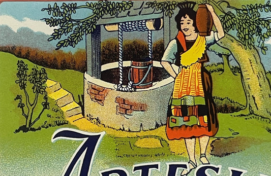
The illustration at the top of this label is the thing that makes it genuinely special as a piece of commercial art. A young woman stands beside a traditional stone well — the old hand-crank type, with a timber frame overhead and a rope-wound bucket dropping into the dark below. She holds a ceramic jug raised at her side with one hand, the other resting at her hip. Her clothing is warm and folk-traditional: a layered skirt in orange, gold, and brown tones, an apron, a yellow sash across one shoulder. She is smiling. The countryside behind her is rendered in soft greens and blues — rolling hills, a large tree spreading over the well, white clouds in a pale sky. It is a pastoral scene pulled straight from the commercial illustration playbook of the late 1920s and 1930s, when bottling companies across the Northeast were competing on the freshness and purity of their water source, and a woman drawing from a wholesome country well was one of the era's most legible visual arguments for that claim.

The name Artesian was doing the same work in words that the illustration was doing in images. An artesian well — one where underground pressure pushes water naturally upward without pumping — carried genuine connotations of purity in that era. Spring water. Deep water. Water untouched by the surface world. For a regional bottler in mill-town Massachusetts in the 1930s, putting the word Artesian on your label and backing it with a pastoral well scene was the equivalent of today's mountain-spring imagery on a water bottle. It was an argument about quality dressed as a picture. 🌊

The typography is bold and confident. Artesian sweeps across the label in a large, expressive dark script — the kind of letterform that felt both authoritative and a little romantic. Directly below it, SARSAPARILLA runs in a strong brick-red serif face. Below that, in clean, modest type: Sugar color added, Contents 8 Fl. Oz., M. T. Dwyer Co., and Clinton, Mass. The color palette across the label runs from the sky blues and landscape greens of the illustration through warm cream and gold in the lower half, with the red-orange border framing the whole composition. It is a well-made label — not the most elaborate chromolithography of its era, but clean, well-registered, and vivid in the way that NOS paper stock can be after decades of proper storage.


🏭 Clinton, Massachusetts and the Dwyer Company

Clinton is a Worcester County mill town that was separately incorporated in 1850, and for most of its history it was defined by the industries that ran along its waterways — textiles, wire manufacturing, and the full supporting ecosystem of small manufacturers and distributors that kept a mill economy running. The M.T. Dwyer Co. fit that profile precisely: a regional producer of bottled sodas serving the immediate geography, employing local workers, and building a local identity around products that the big national brands weren't yet bothering to reach.

The company's two signature products were Sarsaparilla and Birch Beer — both of them beverages with deep roots in New England's regional soda culture, and both of them, by the 1930s, fighting a rearguard action against cola, orange soda, and the streamlined flavor marketing of the national chains. 🌿 Sarsaparilla in particular had been America's beloved tonic drink through much of the nineteenth century, sold first as a patent medicine with extravagant health claims and later as a soda fountain staple when those claims were quietly dropped. By the time Dwyer was printing labels like this one, sarsaparilla had already been declining for a generation. The big cities had moved on. The younger drinkers were reaching for cola. Sarsaparilla had become, in the cultural geography of the 1930s, a regional holdout — something your grandmother still asked for, something the corner soda fountain still stocked if they knew their local clientele, something a Worcester County bottler could still sell because Worcester County had its own pace and its own tastes.

M.T. Dwyer Co. closed in 1943. No corporate successor appears in the record. No parent company absorbed its brands. The closure came in the middle of the Second World War, when rationing and material constraints were reshaping every sector of American food and beverage production, and small regional bottlers were among the most vulnerable operations in that economy. When Dwyer closed, it left behind its equipment, its recipes, its building, and — somewhere in a warehouse or a storeroom — its unused label stock. That stock is where labels like this one come from. 🏛️


🍵 The Sarsaparilla Question and the "Sugar Color" Curiosity

Among collectors of vintage beverage labels, the notation Sugar color added on Dwyer's Artesian Sarsaparilla labels has become one of the small conversation-starters that makes this label particularly fun in a collection. Sugar color is simply caramel coloring — a darkening agent derived from cooked sugar that gave sarsaparilla its characteristic deep brown tone. The fact that Dwyer listed it explicitly on the label places this in the era before modern ingredient disclosure requirements had fully standardized how such additives were named. A label from a company confident enough to simply say sugar color added in plain English is a small window into a regulatory moment — the moment just before the FDA's food labeling frameworks of the mid-twentieth century tightened the language and formalized the vocabulary.

Sarsaparilla itself was flavored traditionally with the root of the sarsaparilla vine — a climbing plant native to tropical America — along with wintergreen, anise, licorice root, and in some regional recipes, birch bark oil, which is why sarsaparilla and birch beer often came from the same bottler. Dwyer made both. The flavors share a genetic ancestry in the old patent medicine tradition, where roots, barks, and botanical extracts were the building blocks of every health tonic that came through a general store in the 1840s through the 1890s. By the time the M.T. Dwyer Co. was bottling sarsaparilla in 1930s Clinton, the patent medicine era was fully over — the Pure Food and Drug Act of 1906 had closed that chapter — but the flavors it left behind persisted as soda flavors, memory flavors, the tastes that felt old-fashioned even when they were still being made. 🌱

Old-timers in New England soda collecting circles tell of regional bottlers like Dwyer as the keepers of a flavor tradition that the national brands considered too niche and too old-fashioned to bother with. The story passed down holds that sarsaparilla survived longest in mill towns and rural communities where the old-stock Yankee palate still ran the household grocery decisions — and that Dwyer's operation in Clinton, sitting squarely in that geography, was exactly the kind of company that could outlast the national soda wave long enough to make it to 1943 before finally giving way.


📜 New Old Stock and the Paper That Survives

New Old Stock (NOS) condition in vintage paper labels means something specific and worth understanding: this label was printed, never applied to a bottle, and stored — surviving the decades in the condition it left the printer rather than the condition of a label that lived on glass through refrigeration cycles, handling, moisture, and eventual disposal. The difference is visible and meaningful. NOS paper carries the full presence of its original printing. The colors read as they were intended to read. The paper stock holds its weight and body. The ink sits on the surface the way it did the day it was pressed.

Paper from the 1930s is not getting any younger, and NOS label stock from companies that closed before the postwar era is a genuinely diminishing resource — not because of any artificially manufactured scarcity, but because every year that passes is another year of estate sales, warehouse clearances, and the quiet casualties of time and moisture. The labels that survive in NOS condition do so because someone, somewhere, stored them correctly for decades without knowing or caring what they had. When that stock surfaces, it carries a freshness that used labels simply cannot. ✨

This label measures 3.5 x 3.25 inches — a format scaled precisely for the 8-fluid-ounce bottle it was designed to dress. It is printed in full color, with the pastoral well scene at the top, the bold product name typography dominating the center, and the company attribution across the lower portion. The red-orange border runs the full perimeter, giving the label its contained, finished quality. The condition is clean, with little to no wear — NOS stock as it was kept.


🖼️ Collecting and Displaying This Label

Vintage soda and beverage labels from regional New England bottlers occupy a specific and well-loved corner of American paper ephemera collecting. The combination of factors this label carries — a defunct company, a genuinely regional product, a charming pastoral illustration with an identifiable figure, pre-FDA ingredient language, and the specificity of Clinton, Massachusetts as the origin point — makes it a natural fit for several collecting contexts simultaneously. 🗺️

It works as a piece of New England local history, representing a Worcester County manufacturer that was a real employer and a real community presence before 1943. It works as beverage history — one of the last surviving printed artifacts of an era when sarsaparilla was still a going commercial proposition rather than a nostalgia flavor. It works as commercial illustration, with the Well Girl figure belonging to a tradition of pastoral purity imagery in early twentieth-century food and drink advertising that has become genuinely collectible on its own terms. And it works, simply and quietly, as a beautiful small object from the American 1930s — the kind of thing that looks extraordinary framed, matted against a dark ground, lit properly, and hung where it can be seen.

Collectors of Massachusetts local history, regional bottling ephemera, vintage soda advertising, American chromolithography, and 1930s commercial art will all find something genuine here. The Well Girl has been drawing from her stone well on this label for nearly a century. She has not aged a day. 🌿


❓ Questions Collectors Ask

What exactly is the Artesian Sarsaparilla label from M.T. Dwyer Co.?

This is a vintage paper bottle label produced in the 1930s by the M.T. Dwyer Co. of Clinton, Massachusetts, for their Artesian Sarsaparilla product — an 8-fluid-ounce regional soda sold in Worcester County, New England. The label features a pastoral chromolithographic illustration of a young woman at a stone well, bold product typography in dark navy and brick red, and ingredient disclosure including the notation "Sugar color added." M.T. Dwyer Co. operated until 1943, making this label a direct survivor of their final production decade.

How do collectors date this label to the 1930s?

Several factors converge on a 1930s date. The M.T. Dwyer Co. closed in 1943, so any unused NOS label stock logically dates from the company's active years. The illustration style — full-color pastoral scene with folk-dressed figure, bold hand-lettered typography, warm chromolithographic color palette — is consistent with regional bottler label design from the late 1920s through early 1940s. The "Sugar color added" language also reflects pre-mid-century FDA labeling conventions before ingredient terminology was more formally standardized.

Why do collectors specifically seek out M.T. Dwyer Co. labels?

M.T. Dwyer Co. closed in 1943 with no corporate successor and no parent company absorbing its brand or archives. That closure makes surviving printed artifacts — particularly NOS label stock that was never applied to bottles — the primary documentary record of the company's existence. For collectors of Worcester County and Massachusetts local history, Dwyer labels are among the few surviving commercial artifacts of a company that was a meaningful regional employer. For beverage history collectors, Dwyer represents one of the last New England bottlers still commercially producing sarsaparilla, a flavor already in long cultural decline by the 1930s.

What does "Sugar color added" mean on a 1930s soda label?

Sugar color is an older commercial name for caramel coloring — a darkening agent made from cooked sugar that gave sarsaparilla and similar root-flavored sodas their characteristic deep brown appearance. Listing it explicitly as "sugar color" on the label reflects pre-standardization ingredient disclosure language, before the FDA's mid-twentieth century frameworks formalized how food colorings and additives were named on packaging. The specific phrasing "sugar color added" is considered by collectors a useful dating marker and a small piece of regulatory history in its own right.

What is the "Well Girl" illustration, and why does it matter to collectors?

The Well Girl is the folk-dressed young woman depicted at the stone hand-crank well in the label's upper illustration. She is a piece of commercial art in the pastoral purity tradition — a visual argument, common in 1920s and 1930s regional food and beverage advertising, that the product's water source was clean, deep, and untouched by industrial processes. The figure belongs to a broader category of "purity illustration" in American commercial chromolithography that collectors of vintage food and beverage ephemera actively seek. The Well Girl on this label is identifiable, charming, and well-executed — a genuine example of regional commercial illustration from its era.

How should this label be stored and displayed?

Vintage paper labels from the 1930s are best stored flat in acid-free sleeves or archival polyester holders, away from direct light and humidity. For display, framing behind UV-protective glass with archival matting is the standard collector approach — a dark mat ground (navy, deep green, or black) brings out the warm colors in the label's illustration and typography effectively. Avoid adhesive mounting directly to backing boards, which can damage paper fibers over time. At 3.5 x 3.25 inches, this label fits standard small frame formats easily and presents beautifully when matted with a border that lets it breathe.

What makes NOS condition significant for a label this old?

New Old Stock (NOS) means this label was printed, never applied to a bottle, and stored rather than used — surviving in the condition it left the printer rather than the condition of a label that lived on glass through refrigeration, handling, moisture, and wear. For a paper item from the 1930s, that distinction is meaningful: NOS stock carries the full original printing presence — color saturation, ink surface, paper body — that used labels lose through the practical life of a commercial product. Labels from companies that closed before the postwar era, like M.T. Dwyer Co., surface as NOS stock when old warehouse inventory is eventually discovered, and that is the surviving condition that makes them worth collecting as genuine artifacts of American commercial printing history.


✨ Keywords for fellow collectors: vintage sarsaparilla label, M.T. Dwyer Co., Clinton Massachusetts, Worcester County MA, New England bottler, 1930s beverage label, artesian well soda, vintage soda ephemera, regional bottler label, NOS paper label, Well Girl illustration, pastoral beverage advertising, vintage New England Americana, sarsaparilla history, pre-war soda label, Massachusetts local history, chromolithography label, vintage root beer ephemera, 1930s commercial illustration, American beverage collectible, vintage food label, Worcester County antique, Depression era soda, birch beer sarsaparilla, antique bottler label, vintage paper ephemera, Clinton MA history, regional soda label, NOS bottle label, American soda history

Shipping

🚚 Shipping & Handling

  • Shipping costs and timing are calculated at checkout.
  • Items curated and shipped directly by me include U.S. shipping at no additional cost, professionally packed to ensure safe arrival of your artifact.

Items from Vetted Pro Collectors
Shipping for items offered by vetted Pro Collectors is determined at checkout. All Pro Collector listings are reviewed to ensure fair, reasonable shipping practices.

For full details, please refer to our Shipping Policy.

Returns & Exchange

Take your time — you've got a full six months. If a piece isn't right for you, send it back the way it reached you and we're good.

In the first 30 days your money goes straight back the way you paid. After that it's store credit, so you can put it toward something you'd rather have.

Return shipping we sort out between us, case by case. I don't make this difficult.

If something arrives damaged, or it isn't what I said it was, send me a photo within 48 hours and I'll make it right.

Email info@vintageantiquesgifts.com or call 802-356-9872 — that's me answering, not a call center.

The only things I can't take back are custom or special-order pieces and gift cards.

View full details

Preserving History: Authentic Objects Across Eras

— Curated by Travis Weigel