
Skip to product information
1 of 4

Vintage and Antique Gifts

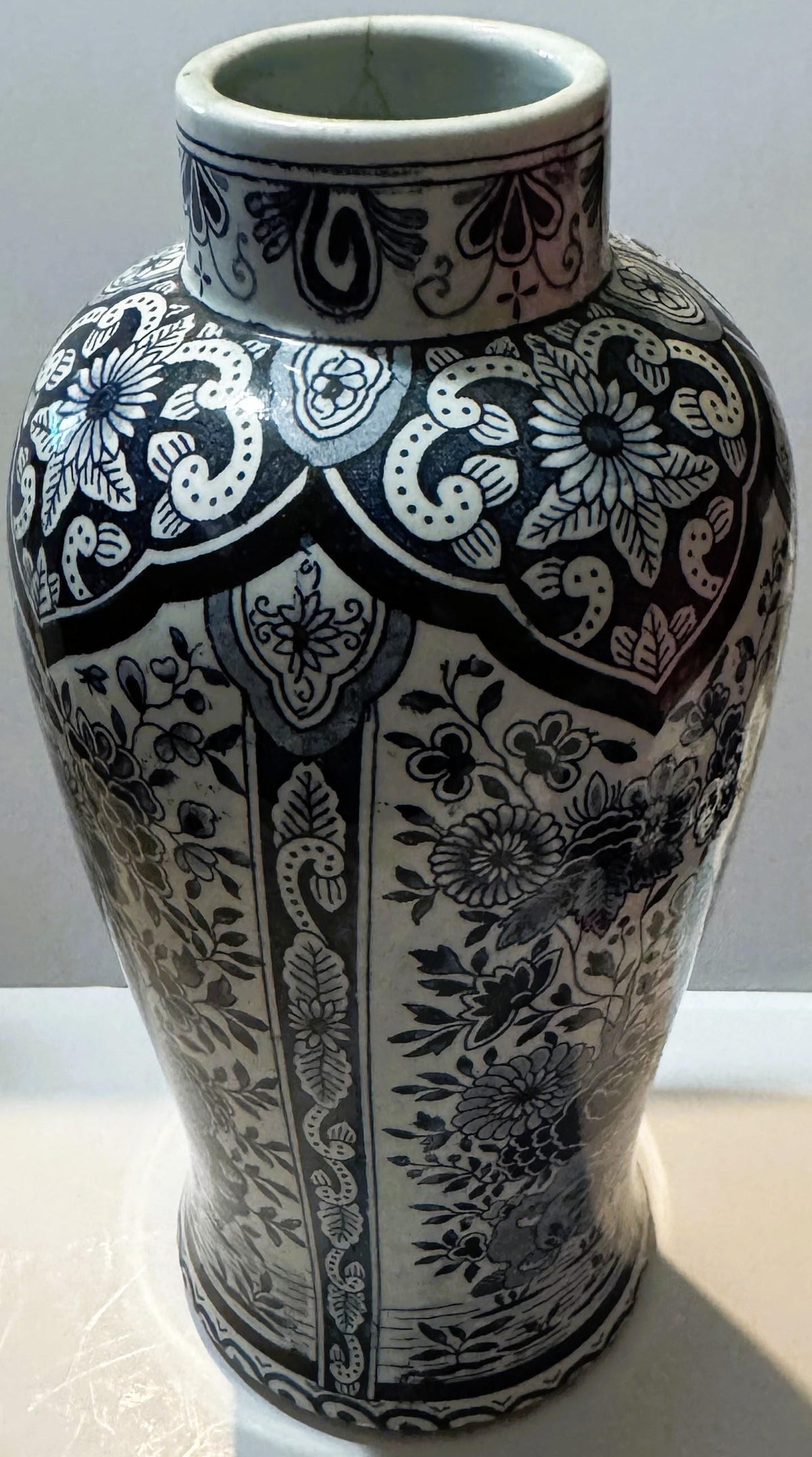
Antique Delft Style Blue and White Vase ✨ 19th Century Continental Transferware, Hand Scripted Delft Mark, Baluster Form

Antique Delft Style Blue and White Vase ✨ 19th Century Continental Transferware, Hand Scripted Delft Mark, Baluster Form

Regular price 60.00 USD
Regular price Sale price 60.00 USD
Sale Sold out
Shipping calculated at checkout.
Quantity

Size: 8.5 inches

🏺 What Happens When You Turn This Vase Over?

On the shelf, this vase is pure romance: a tall, blue-and-white baluster of about eleven inches, dressed head to foot in the Delft manner that has meant "old, blue, and beautiful" to Western eyes for the better part of four centuries. It reads, at first glance, like a fragment of the Dutch Golden Age set down in a modern room. Then you lift it, tip it toward the light, and read the base — and a far more honest and interesting story begins, one written by a human hand more than a hundred years ago and waiting all this time for someone to notice it.

📐 The Object Itself

This is a genuine antique vase of the late nineteenth century, made on the European continent during the great age of blue-and-white revival. The form is the classic baluster: a swelling body that draws in toward a waisted neck and opens again at the rim, the profile potters have loved since they first tried to echo the porcelain of China. The decoration is not painted by hand but transfer-printed — the industrial marvel of the Victorian era — and it is carried out in two distinct blues: a deep midnight navy for the drawing and outlines, filled and shaded with a softer steel-blue, all of it floating on a bright white ground. One example only is offered here; it is the single piece in our care, and there is no second waiting behind it.

Around the shoulder runs a scalloped lappet crown, its points enclosing sunflowers set in reserve against the blue. Below that, the body is divided into four vertical panels, each holding a spray of flowering chrysanthemum and peony branches rising from stylized rockwork in the Chinese-inspired taste. Bands of leaf-scroll separate the registers, and a final scroll band circles the foot. It is a dense, confident, thoroughly Victorian interpretation of a very old idea — the kind of pattern designed to fill a room with pattern.


🌏 Where the Blue and White Was Born

To understand this vase you have to begin with something it is not, but honors. In the seventeenth century, ships of the Dutch trading empire were bringing home Chinese porcelain by the ton — hard, white, translucent, painted in cobalt blue — and Europe fell in love. True porcelain was a secret the West had not yet learned to keep, its recipe still decades from being cracked, so demand ran far ahead of any hope of supply. The potters of the town of Delft did the next best thing they could: they answered with an earthenware of their own, painted by hand in cobalt on a lustrous white ground and fired to a bright, glassy finish. This was Delftware, and in its Golden Age it clothed the tables and mantels of a rising merchant nation. The blue-and-white palette they perfected became one of the most beloved and imitated looks in the entire history of Western decoration.

That is the tradition this vase salutes. It is not itself a piece of that seventeenth-century world — and one of the pleasures of owning it is knowing exactly what it is instead.


⏳ The Century the Old Workshops Nearly Vanished

Fashion is merciless, and by the closing decades of the nineteenth century the original Delft workshops had almost entirely disappeared. The taste that had made them had moved on; the kilns went cold one after another until, of the great old houses, only De Porceleyne Fles — "The Porcelain Bottle" — truly survived, and even it had to be deliberately revived in the 1870s to carry the tradition forward into the modern age. That revival is a real historical moment: a conscious decision that the Delft look was too good to lose, that a nation's most famous ceramic voice deserved to keep speaking. This vase is a child of exactly that mood — the moment when Europe decided, all at once and on an industrial scale, that it wanted its blue and white back.


🏭 The Factories That Answered the Longing

The demand of the Victorian middle class was enormous, and it was met not by a handful of hand-painters but by the great industrial potteries of the Low Countries and the Rhineland. Maastricht grew into one of the major ceramic centers of the age, home to works such as Société Céramique. In Belgium there was Boch Frères. Across the German border stood houses whose names still ring for collectors: Villeroy & Boch, and Royal Bonn. These were not sleepy craft studios; they were modern export houses whose wares travelled across Europe and beyond, and between them they produced Delft-style lines by the countless thousand, putting the look that had once been the luxury of merchants and princes onto the shelves of ordinary Victorian homes. This vase belongs to that world of proud, ambitious, mass-produced beauty — an object made not for a palace but for a parlor, and none the less lovely for it.


🖋️ The Quiet Genius of Transfer Printing

The technology that made all of this possible is worth pausing on, because it is written into every line of this vase. Transfer printing works like this: an engraver cuts the design into a copper plate, the plate is inked, and the ink is lifted onto a sheet of thin tissue paper. That inked tissue is then laid onto the ware itself, transferring the whole design in one motion before the piece is fired. It was the printing press of the ceramic world — the invention that let a single beautifully engraved pattern be reproduced faithfully, again and again, at a price a clerk or a schoolteacher could afford. When you look closely at the crisp, even lines of the florals here, you are looking at the fingerprint of that process: a Victorian idea of how to give everyone a little of what only the wealthy once had.

There is a second beauty to the method that grows on you the longer you own a piece like this. Because the design lived on a durable engraved copper plate, one well-cut pattern could dress a whole family of shapes — vases, jars, chargers, and tableware alike — so that an entire range spoke the same decorative language. The engraving was the factory's real treasure, an asset worked for years, and the ware that wears it is in a sense a print pulled from that master plate. It is why a pattern like this one can feel machine-precise and genuinely hand-considered at the same time: a human engraver drew every line by hand, and the machine only repeated him faithfully.


🌸 Reading the Decoration

Spend a moment with the pattern and it rewards you. The two-tone scheme is doing real work: the midnight navy carries the structure — the outlines of every petal, leaf, and scroll — while the steel-blue washes in behind it to give the flowers body and depth, so that the whole surface reads as drawing and painting at once even though it is neither, strictly, but print. The sunflowers tucked into the scalloped shoulder crown are a wonderfully Victorian touch, at home among the more formal chrysanthemum and peony sprays below. The rockwork at the base of each panel is a direct nod to the Chinese garden scenes that started this entire conversation centuries earlier. Nothing about the design is accidental; it is a careful, layered quotation of a whole tradition, compressed onto a single eleven-inch body.

The flowers themselves carry old meanings from the Chinese decorative tradition this pattern ultimately descends from, where the peony has long stood for honor and abundance and the chrysanthemum for long life and the quiet endurance of autumn. A Victorian print shop was chiefly after beauty rather than symbolism, but the vocabulary it borrowed came freighted with centuries of that older meaning, and a little of it still clings to the blossoms here — one more layer of story hiding in plain sight on the surface.


⚱️ A Word on the Shape

The baluster is one of the oldest and most satisfying silhouettes in all of ceramics, named for the swelling turned pillars — balusters — of a stone railing. Its double curve, full at the belly and drawn in at the neck, was itself borrowed by European potters from the vase forms of Chinese porcelain, which makes it the ideal body for a Delft-style pattern: the shape and the decoration are quoting the very same distant source. On a piece of this height the form earns its keep, giving the printed panels a generous, gently curving field so that the pattern seems to wrap and turn as you walk around it. It is a shape made to be seen in the round and from across a room, and it is a large part of why the vase reads as grand rather than merely decorative.


✍️ The Mark on the Base — and the Rule Every Collector Learns

Here is where this vase becomes a teacher. The base carries a period hand-scripted "Delft", written in flowing letters, with a painted number set below it. This is not a printed backstamp and it is not decoration. It is a decorator's own notation, made by hand. It is genuinely period and genuinely human — one worker's marks, surviving on the underside of one surviving vase.

And it teaches the single most useful rule in this corner of collecting. A piece marked "Delft" in script is Delft-style; it is not old Delft. The true seventeenth-century Delftware houses signed their work with factory devices — painted monograms, house marks, a maker's own emblem — never with the town's name written out longhand as a style label. When you see "Delft" hand-scripted across a base with a decor number beside it, you are looking at exactly what this is: a nineteenth-century industrial tribute, honestly labeled with the name of the look it wears. This marking habit is well documented on the continental factories' Delft-style lines — Boch Frères of Belgium is the most thoroughly recorded user of it, and the German works are known to have done the same. We do not put a maker's name on this vase, because the script "Delft" is a style designation, not a signature. What we can tell you is that the mark is real, it is old, and it says precisely what the vase is.


🔍 Condition, Exactly as Pictured

Genuine antique blue-and-white vase, offered exactly as pictured. A faint, tight line shows at the rim in our close photographs — it cannot be felt beneath a fingertip and it has not moved. We photograph it at close range precisely so you can weigh it with your own eyes rather than take our word for it. The base shows a natural wear ring where the vase has stood through its long life, along with a few kiln freckles from the firing. These are the honest signatures of a real object with a real past, documented in the images so that what you see is exactly what comes home.


🖼️ Living With It

  • 🏛️ Give it the pride of place a single strong object deserves — centered on a mantel or a sideboard, where its height and its dense blue pattern can command the room on their own.
  • 📚 Stand it against a shelf of leather-bound books or beside older ceramics; blue and white has an almost magical way of making everything around it look considered and collected.
  • 🌿 Let it hold a loose, generous spray of dried grasses, eucalyptus, or magnolia — the muted greens and soft browns of dried stems are a quiet foil to the crisp navy of the print.
  • 🍴 Set it as the anchor of a blue-and-white grouping, mixing it with ginger jars and plates of different patterns; the family resemblance of the palette pulls a mismatched collection into one harmonious voice.
  • 🏠 Place it in an entry hall where guests pass close enough to notice the detail — this is a piece that rewards a second look, and a story you can tell in a sentence.

🎁 Who Takes This One Home

This vase finds its people among several kinds of collector at once. There are the lovers of blue and white, who care less about which factory and more about the timeless look done richly and well. There are the students of the Delft revival, who prize genuine objects of that specific late-Victorian moment when Europe rebuilt its own tradition on an industrial scale. There are the mark-hunters, the ones who read the base first and the front second, who will find the hand-scripted decor notation and the collector's rule it illustrates genuinely thrilling. And there are the decorators and gift-givers who simply want one honest antique with real presence and a story attached. It is, above all, an approachable door into a great tradition — a true Victorian-era survivor wearing the most beloved ceramic look in the Western world.


❓ Questions Worth Answering

Is this genuine antique Delft?

It is a genuine antique of the late nineteenth century, made in the Delft style — which is exactly what the hand-scripted "Delft" mark tells you. True seventeenth-century Delftware carries factory devices rather than the town's name written out as a label. This is an authentic object of the Victorian Delft revival, honestly presented as such.

Was it painted by hand?

No — and that is part of its story. The decoration is transfer-printed, the great Victorian technology that carried the Delft look into ordinary homes. The crisp, repeatable line of the florals is the signature of that process.

So who made it?

We do not assign it a maker, because the script "Delft" is a style name and not a maker's signature. Several continental potteries produced Delft-style transferware marked in this hand-scripted way; the mark identifies the look and the decor range rather than a single workshop. It is photographed in close detail for anyone who wishes to research it further.

How large is it?

The baluster form stands approximately eleven inches tall — a substantial, room-commanding size rather than a small shelf ornament.

Is there only one available?

Yes. One example only is offered; it is the single piece in our care.


🎖️ Why It Matters

Some antiques are valuable because they are rare and untouchable. This one is valuable in a different and warmer way: it is a genuine, century-plus-old object that tells the truth about itself, wears the most enduring decorative palette the West has ever produced, and carries on its base a real human mark that names exactly what it is in a decorator's own hand. It is history you can set on a shelf and history you can hold — the whole four-hundred-year arc of blue and white, from Chinese porcelain to Dutch Golden Age to Victorian revival, resolved into a single vase you can actually live with.

Shipping

🚚 Shipping & Handling

  • Shipping costs and timing are calculated at checkout.
  • Items curated and shipped directly by me include U.S. shipping at no additional cost, professionally packed to ensure safe arrival of your artifact.

Items from Vetted Pro Collectors
Shipping for items offered by vetted Pro Collectors is determined at checkout. All Pro Collector listings are reviewed to ensure fair, reasonable shipping practices.

For full details, please refer to our Shipping Policy.

Returns & Exchange

Take your time — you've got a full six months. If a piece isn't right for you, send it back the way it reached you and we're good.

In the first 30 days your money goes straight back the way you paid. After that it's store credit, so you can put it toward something you'd rather have.

Return shipping we sort out between us, case by case. I don't make this difficult.

If something arrives damaged, or it isn't what I said it was, send me a photo within 48 hours and I'll make it right.

Email info@vintageantiquesgifts.com or call 802-356-9872 — that's me answering, not a call center.

The only things I can't take back are custom or special-order pieces and gift cards.

View full details