Skip to product information
1 of 1

Vintage and Antique Gifts

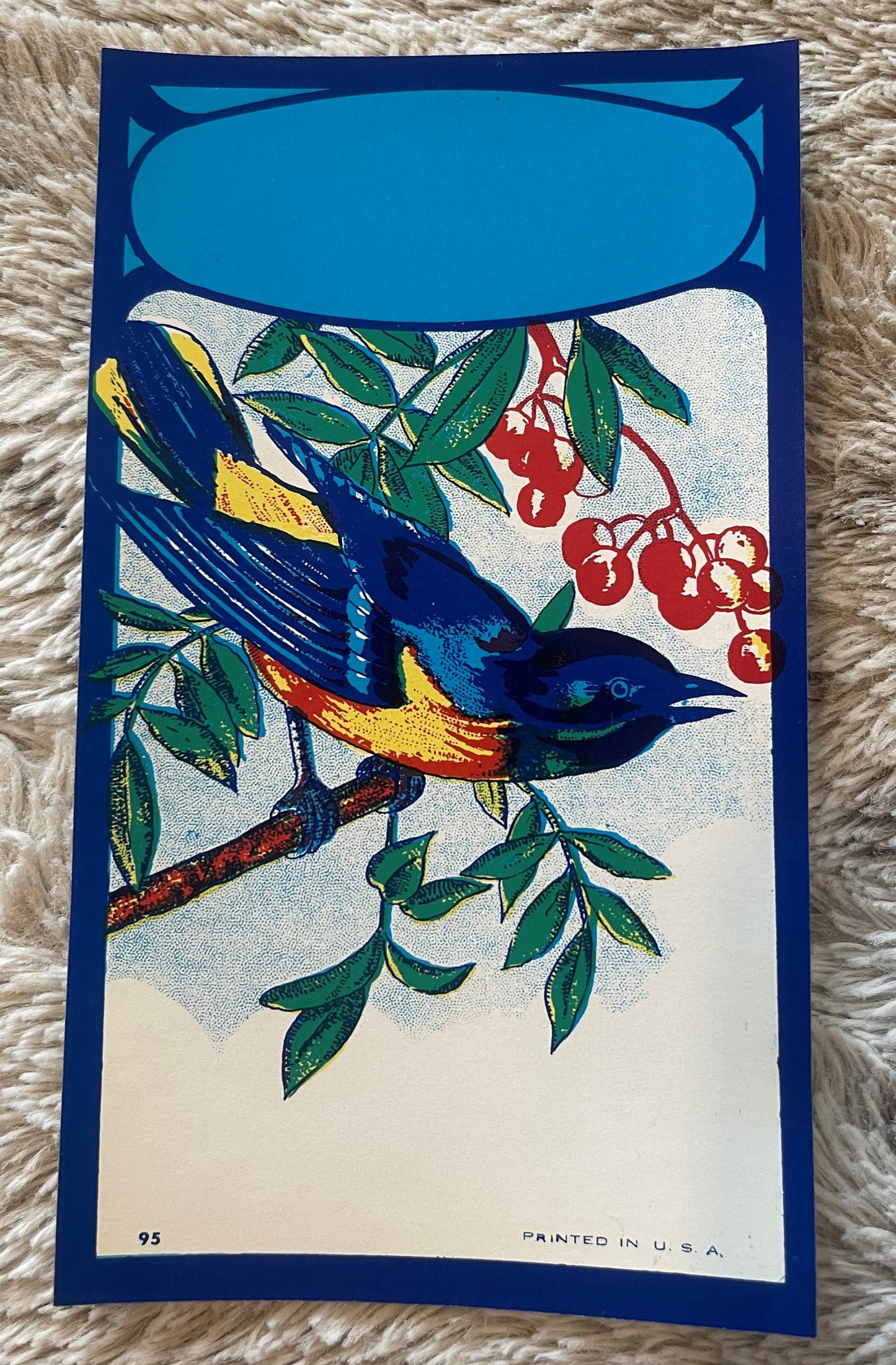
Antique Bluebird Broom Label 🐦 NOS Blank Panel Commercial Lithography Art Nouveau 1910s–40s American Made

Regular price 5.50 USD
Regular price Sale price 5.50 USD
Sale Sold out
Shipping calculated at checkout.

Description

What Happens When a Piece of Commercial Art Refuses to Be Consumed? 🐦

There is a particular kind of magic in the object that escaped its own fate. Every broom label ever printed was designed with a singular, humble destiny: to be glued to a handle, displayed for a season on a hardware store peg, purchased, and slowly worn into obscurity by the daily friction of an American household. That was the contract. That was the plan. And yet here, somehow, this one never signed it. This Bluebird broom label — crisp, vivid, structurally perfect, its colors as confident and saturated as the day it came off the lithographic stone — never touched a broom handle. Never met a hardware store. Never got swept into the ordinary. It sat in stock, waited, and outlasted almost everyone who made it. That is not a small thing. That is, in the quiet grammar of collectors, everything.

I've been handling American commercial ephemera and antique paper goods for a long time, and I'll tell you plainly: New Old Stock lithographic labels in this condition — vivid, flat, unblemished, structurally sound — are genuinely uncommon. Most survived in attics, in old store drawers, in damp corners of forgotten warehouses. They show it. This one doesn't. When something comes through my hands this clean, this immediate, I slow down. I look at it a long time. Then I write about it carefully, because it deserves that.


🐦 What This Is — The Object, the Era, the Process

This is an antique New Old Stock (NOS) Bluebird broom label, American-made, dating from the 1910s through the 1940s — a span of roughly three decades during which American commercial lithography reached its most confident and decorative peak before postwar printing economics gradually simplified everything into flat offset work. The label measures 6 x 3 inches, a standard size for the broom industry of that era, designed to wrap cleanly around the upper portion of a broom handle where it would be visible on a hardware store display rack or a general-store peg board.

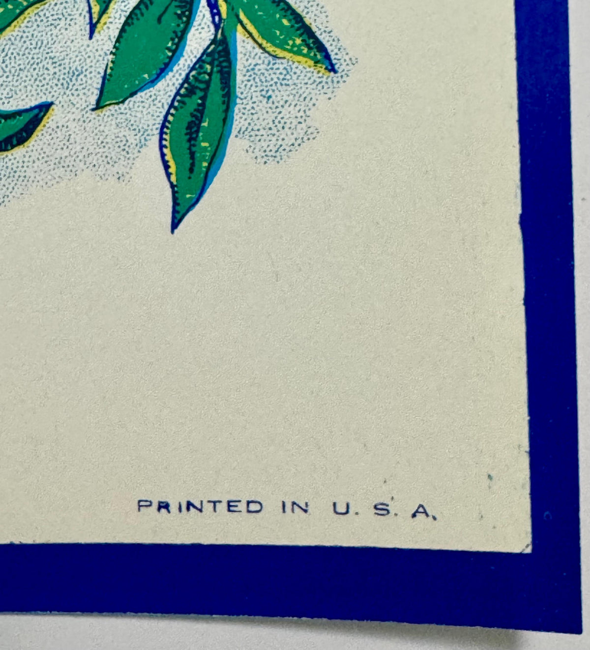
The printing process is commercial chromolithography — a multi-stone, labor-intensive technique in which each color is applied in a separate press run, each pass requiring precise registration against the last. The deep cobalt and cerulean blues of the bluebird, the pale sky-blue background, the bold navy border, the greens of the curling branch leaves — each of those tones represents its own stone, its own ink, its own pass through the press. The result is a depth and richness that later single-run offset printing simply cannot replicate in the same tactile way. You can see the layering when you hold this label at an angle. The colors have body. They sit on the paper with intention.

The central image is a bluebird — Eastern Bluebird, by the posture and coloring, the species most familiar to the American Midwest and Eastern states that dominated the broom-manufacturing corridor — rendered in deep cobalt with cerulean highlights, perched on a branch with small green leaves curling naturally on both sides. The bird faces left, beak slightly open, tail feathers fanning behind in rich blue-black tones. It is a confident, sympathetic rendering, not a cartoonish reduction but a genuinely observed bird, the kind of illustration that comes from an artist who either studied ornithological reference material or simply knew birds. The background is a pale sky blue that gives the composition air and light. The whole thing is framed in a bold navy border with Art Nouveau-inflected decorative detail — that flowing, organic, slightly asymmetrical decorative language that defined the best American commercial art of the early twentieth century and which the broom-label trade, of all places, carried forward well into the 1930s and 40s long after it had gone out of fashion in higher-profile commercial work.

And then there is the blank oval panel at the top. This is the document within the document. That space was where a regional broom manufacturer — a local operation, a family company, a cooperative, a mill-town enterprise — would have had its name stamped, printed, or rubber-blocked into the label stock before applying it to product. The brand name, the town, the identity that made this broom different from the nine others on the same rack. This example never received that identity. It came off the press, went into the printer's or distributor's stock inventory, and stayed there. The manufacturer's name was never filled in. The label was never applied. It is exactly as the lithographer produced it — and that blank panel is not an absence. It is the record of a transaction that never happened, a business relationship that never closed, a broom that never got made. In the world of paper collecting, that blank is often the most historically legible detail on the entire piece.


🏭 The American Broom Industry — A World Built on Broomcorn and Local Pride

To understand why this label exists — why it was worth commissioning from a professional lithographer, why it was rendered with this level of craft and color — you have to understand what the American broom industry actually was during the decades this label was produced. This was not a marginal trade. At its height in the early twentieth century, the American broom industry was a significant agricultural and manufacturing sector, centered in a geographic corridor that ran through Illinois, Kansas, Oklahoma, and parts of the South and Appalachia, where broomcorn — Sorghum vulgare technicum, a tall grass cultivated specifically for its stiff fibrous brush — was a reliable cash crop for small and mid-size farming operations.

The broom companies themselves ranged from large regional manufacturers shipping product by rail across multiple states, to small cooperative enterprises in single towns, to family shops that might employ a dozen people in a converted barn or small mill building. What united almost all of them was fierce local brand identity. In an era before national brand consolidation, a hardware store customer might be genuinely loyal to the broom made by the company in their county, the one whose label carried the name of a nearby town, the one whose product they associated with quality because their mother had used it and her mother before her. That local identity — that name in the oval panel — was worth paying a lithographer for. It was worth the cost of a professionally designed, multi-color printed label that would make one broom stand out from another.

The lithographic printing companies that supplied these labels were often themselves regional operations, based in printing centers like Chicago, Cincinnati, St. Louis, and the mid-Atlantic cities, producing standardized label designs — the bluebird, the sunrise, the patriotic shield, the cottage garden — that any local broom manufacturer could order in quantity, with their name and town added to the blank panel. It was an early form of what we would now call white-label branding, and it was entirely standard practice in the industry. The lithographer owned the design. The manufacturer owned the identity. The label was the meeting point.

Local legend in collecting circles holds that the bluebird motif was among the most consistently ordered designs in the broom label trade across the 1910s through 1940s — that regional manufacturers in the Midwest particularly favored it because the Eastern Bluebird was a recognized harbinger of spring, the season when households traditionally undertook the serious cleaning work that made a new broom a practical household priority. Whether the symbolism was that consciously commercial or simply that the bluebird made a beautiful label is a question the records don't fully resolve, but lore passed down among paper ephemera collectors holds that certain lithography houses in Chicago specifically marketed the bluebird design to broom manufacturers in Missouri, Illinois, and Indiana as their most popular spring-season offering. If true, this label may have been produced in very large numbers — and the survival of a NOS example in this condition is all the more remarkable for it.


🎨 Art Nouveau in the Hardware Store — The Style That Stayed

Art Nouveau as a formal design movement peaked in Europe between roughly 1890 and 1910. In American fine arts and architecture, it faded quickly. But in American commercial printing — in the labels, tins, seed catalogs, trade cards, and product packaging that ordinary people handled every day — the visual vocabulary of Art Nouveau persisted for decades longer, carried forward by lithographers who had learned its curves and its decorative organicism and found that customers responded to it warmly. The flowing border work, the natural imagery, the sense of ornamental abundance without clutter — these things read as quality to an American consumer in 1925 or 1935 in exactly the way they had in 1905, and the commercial printers knew it.

The border treatment on this Bluebird label is a perfect example of that persistence. The decorative detail at the corners and edges reflects an Art Nouveau sensibility — organic, slightly asymmetrical, using the natural curves of the design to direct the eye toward the central image rather than boxing it in. It is not high Art Nouveau in the Alphonse Mucha sense. It is American commercial Art Nouveau, practical and confident, produced by working lithographers who understood both the aesthetic and its effect on a buyer standing in a hardware store deciding which broom to take down from the rack. That is its own kind of mastery.


🖼️ Display Ideas

  • 🪟 Frame it simply in a narrow wooden frame — the 6 x 3 inch format fits beautifully in a standard 4 x 6 opening with a clean mat, letting the lithography breathe without competition from elaborate framing.
  • 🏡 Group it in a vintage laundry or mudroom display — alongside antique scrub boards, wooden clothespins, or other household trade ephemera for a collected, layered aesthetic that reads as genuinely curated rather than assembled.
  • 🐦 Feature it in a bluebird or songbird-themed nature collection — the ornithological rendering is specific enough that it holds its own among botanical and natural history prints, adding a commercial-art counterpoint to more formal pieces.
  • 🖼️ Display it unframed in a shallow shadow box with a small card noting its NOS status and approximate date — the blank oval panel becomes part of the story when viewers understand what it represents.
  • 🎨 Use it as a centerpiece in an Art Nouveau or early American graphic design display — alongside trade cards, seed packet labels, or tin lithography pieces from the same era for a study in the period's commercial visual language.
  • 📚 Preserve it archivally in a rigid sleeve in a flat file or print portfolio — if display isn't the immediate goal, this piece warrants proper archival storage that maintains its current NOS condition for future display or collection.

🎁 Who Collects These

Antique broom labels occupy a genuinely interesting position in the broader world of American paper ephemera collecting, because they attract several distinct communities who come to them from completely different directions and find different things to value.

The commercial lithography and graphic design collectors come for the printing itself — the chromolithographic technique, the color registration, the Art Nouveau border work, the confident bird rendering. For this group, the Bluebird label is a document of American printing history and a piece of genuine decorative art that happened to be produced for a utilitarian purpose. The NOS condition matters enormously to these collectors because it means the label reads exactly as the lithographer intended — no fading, no adhesive staining, no broom-handle wear obscuring the ink.

The Americana and country store collectors come for the cultural context — the hardware store, the broomcorn farms, the local brand identity, the household economy of the early twentieth century. For this community, the blank oval panel is a particularly evocative detail: it represents every small American manufacturing company whose name might have gone in that space, every town that had its own broom works, every family that bought local because local was what there was.

Bird and nature art collectors — particularly those focused on American songbird imagery — find the bluebird rendering itself sufficient reason to collect this piece. The Eastern Bluebird is a beloved subject in American folk art and natural history illustration, and this commercial rendering, while not a scientific illustration, is specific and affectionate enough to hold real appeal for that collecting community.

And then there are the collectors who simply respond to the beauty and completeness of the object — vivid, flat, unblemished, exactly as made — and who understand instinctively that a NOS piece of commercial ephemera in this condition, from this era, is not something you pass up. These are often the most experienced collectors in the room, and they are usually right.


❓ Frequently Asked Questions

What does NOS mean, and why does it matter for this label?

NOS stands for New Old Stock — a term used across antique and vintage collecting to describe items that were manufactured during their original period of production but were never used, sold at retail, or put into service. They went from production into storage inventory and stayed there, sometimes for decades, emerging later in the same condition as the day they were made. For a paper item like this broom label, NOS status is genuinely significant. A NOS label avoided all of that. It never went through the use cycle that consumed virtually every other example of its kind. The colors you see here are not restored, not touched up, not artificially brightened — they are the colors the lithographer put on this paper, preserved by the simple accident of never having been used. That is why NOS matters, and why it commands attention from serious paper collectors.

The oval panel at the top is blank — is this a misprint or a flaw?

Not at all — and this is one of the most important things to understand about how commercial broom labels were produced and distributed in this era. Standard practice in the American broom label trade was for lithography companies to produce a base label design — the bird, the border, the decorative elements, the background color — with a designated blank space, typically an oval or rectangular panel, where the regional manufacturer's name and location would be added. This addition was done separately, either by the manufacturer stamping or printing into the blank before applying labels to product, or by the lithographer running a second pass for clients who had placed a specific brand-name order. NOS examples like this one — where the base label came off the press and went into stock before any manufacturer's name was ever added — are the most complete record of how the original design looked as the lithographer produced it. The blank panel is the document of that unfinished transaction. It is not a defect. For collectors interested in the printing history and design process, it is frequently the most interesting detail on the label.

How do I know this is genuinely from the 1910s–1940s and not a later reproduction?

Several physical characteristics of this label confirm its period authenticity. The chromolithographic printing technique — multi-stone, multi-pass, with the characteristic ink layering and slight texture that results from that process — is not replicated in later offset printing, and is immediately distinguishable to anyone familiar with period commercial printing. The paper stock is consistent with commercial label paper of the early-to-mid twentieth century: the weight, the texture, the aging characteristics of the paper fibers themselves. The ink chemistry produces the specific color palette and saturation characteristic of pre-war American lithography. The Art Nouveau decorative border treatment reflects a visual vocabulary actively used in American commercial printing from the 1910s through the 1940s. Taken together, these characteristics are consistent and mutually reinforcing. This is not a reproduction. It is a period piece.

Is the color really this vivid, or is that a photography effect?

The color is genuinely this vivid. NOS paper ephemera that has been stored properly — away from light, away from moisture, away from the adhesive and friction of actual use — preserves its original chromolithographic ink color with remarkable fidelity. The deep cobalt and cerulean blues of the bluebird, the pale sky-blue background, the bold navy of the border: these are the colors the lithographer put on this paper, and because this label never went through the use cycle that fades and damages printed paper, they remain exactly as produced. This is one of the defining characteristics of genuine NOS commercial ephemera and one of the primary reasons serious collectors seek it out. The color is not a camera or editing artifact. It is simply what this piece looks like.

How should I store or display this label to preserve it?

For long-term preservation, the most important factors are consistent low light, stable humidity, and acid-free storage materials. UV-filtering glazing (glass or acrylic) is strongly recommended for any framed display, as the lithographic inks in period commercial printing are sensitive to prolonged UV exposure. Acid-free matting and backing materials prevent the slow chemical damage that standard mat board causes to paper over decades. If you are storing rather than displaying, a rigid archival sleeve in a flat file or print box, away from fluctuating temperature and humidity, is ideal. The bluebird image is immediately appealing: vivid, well-rendered, warm in its subject matter. The Art Nouveau decorative border has broad design appeal. The story of a piece of commercial art that escaped its own fate — that came off the press and somehow survived a century in pristine condition — is the kind of story that resonates with anyone who has a feeling for old things and the accidents of history that preserve them. Framed simply and presented with a brief note about what it is and where it came from, this makes a genuinely thoughtful gift for anyone who appreciates vintage American design, bird imagery, early twentieth-century decorative arts, or simply beautiful objects with good stories attached to them.

Can this label be used in a craft project or altered art piece?

This is a genuine collector's piece — a NOS antique commercial lithograph in exceptional original condition — and I'd gently encourage you to consider its preservation value before incorporating it into any irreversible project. An item in this condition is genuinely uncommon, and its value as a historical document and collector's object is tied to its integrity as an original piece. That said, the decision is entirely yours, and there is a long tradition of incorporating antique ephemera into framed art, decoupage, collage, and altered book projects. If that is your intention, you are acquiring a genuinely beautiful piece of source material. If preservation and display are your goals, this label rewards straightforward framing and archival care more than almost anything else I could suggest for it.

Shipping

🚚 Shipping & Handling

  • Shipping costs and timing are calculated at checkout.
  • Items curated and shipped directly by me include U.S. shipping at no additional cost, professionally packed to ensure safe arrival of your artifact.

Items from Vetted Pro Collectors
Shipping for items offered by vetted Pro Collectors is determined at checkout. All Pro Collector listings are reviewed to ensure fair, reasonable shipping practices.

For full details, please refer to our Shipping Policy.

Returns & Exchange

Product Page Return Policy

  • 60-Day Returns – Items must be in original condition.
  • Refunds – Issued after inspection (excluding shipping costs).
  • Return Shipping – Customer is responsible unless item is damaged or incorrect.
  • Damaged/Incorrect Items – Contact us within 48 hours for a replacement or refund.
  • Easy Returns – Email [email protected] or call 802-356-9872 to initiate a return.

For full details, visit our Refund Policy.

View full details