Skip to product information
1 of 4

Vintage and Antique Gifts

Antique NOS Wissahickon Tomato Pulp Can Label ✨ H.G. Longaker Co Federalsburg MD, Native American Chief Litho Advertising

Antique NOS Wissahickon Tomato Pulp Can Label ✨ H.G. Longaker Co Federalsburg MD, Native American Chief Litho Advertising

Regular price 9.00 USD
Regular price Sale price 9.00 USD
Sale Sold out
Shipping calculated at checkout.
Quantity

What Was Tomato Pulp, and Why Did a Kneeling Chief Stand Guard Over the Label? 🏹

Long before a can of tomatoes ever reached a farmhouse pantry or a corner grocer's shelf, it passed through the hands of a small-town cannery, a traveling label salesman, and a chromolithographer's stone somewhere in Philadelphia or Baltimore. This one carries a scene worthy of a dime novel: a Native American chief in a full feathered headdress, kneeling low behind a fallen log in a dense forest, rifle steadied and eyes fixed on something just out of frame, a spaniel-type hunting dog crouched tense beside him. It's a small piece of paper that was never meant to last — printed by the thousands to be pasted onto tin, stacked in a warehouse, and thrown away with the empty can. That this one survived, crisp and unused, is the whole reason we still get to hold it today.

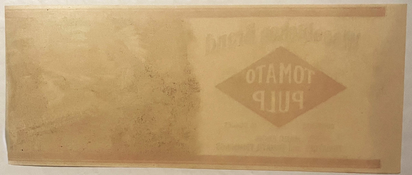
This is an original Wissahickon Brand Tomato Pulp can label, packed by H.G. Longaker Co. of Federalsburg, Maryland, dating on stylistic grounds to the 1900s–1920s era of American commercial label design. It is New Old Stock — printed for use, never applied to a can, and preserved flat ever since.

The label measures approximately 9 by 3.5 inches, the long, narrow wraparound shape built to circle a small can body, and every inch of it is put to work. On the left, in a cream field bordered by twin bands of deep maroon, the brand name arches in shadowed serif lettering above a bold red diamond announcing "Tomato Pulp," with the contents ("10 Ounces"), the ingredient statement ("Made from Tomatoes and Tomato Trimmings"), and the packer's name and town set below in plain black type.

The right half of the label is where the artistry lives: a full chromolithographed forest scene in forest green, brown, tan, and black, with the kneeling chief rendered in raised, embossed detail so his headdress feathers, fringed sleeve, and beaded collar carry real texture under the fingertip rather than sitting flat on the paper.

The lettering itself is worked into the illustration — "Wissahickon Brand Tomato Pulp" appears carved into the bark of a standing tree trunk in the background, and "Packed by H.G. Longaker Co., Federalsburg, MD" is lettered as if gouged into the fallen log the chief kneels behind. It's a clever bit of commercial art: the advertising copy and the picture are made to look like the same object, as though the forest itself were doing the selling.


🌲 The Wissahickon Name — Borrowed From a Legendary Creek

"Wissahickon" wasn't a name a canning company invented out of thin air — it's a real place, and one that carried a century of romance behind it by the time this label was printed. Wissahickon Creek runs through what is now Philadelphia's Fairmount Park, and by the late 1800s it had become one of the most storied stretches of wilderness in the eastern United States, a gorge of hemlocks and schist cliffs that painters, poets, and Sunday carriage-riders all came to see.

The name itself is believed to descend from a Lenape word for the stream — some accounts render it as "catfish creek," others as "yellow-colored stream" — and the valley was, before European settlement, home to Lenape villages along its banks. By the nineteenth century the Wissahickon had also picked up its own layer of American folklore: local legend holds that a mystic named Johannes Kelpius and his followers settled a cave along its banks in the 1690s to await the end of the world, and generations of Philadelphians grew up on tales of hermits, ghosts, and Lenape spirits said to still walk the ravine after dark.

For a food company reaching for a name that evoked clean water, wild woods, and old American roots, "Wissahickon" carried all of that folklore built right in — a name a shopper might not be able to place exactly, but would feel the weight of.


🏹 Why a Chief, a Rifle, and a Forest Sold Tomatoes

Turn-of-the-century American food branding leaned hard on Native American imagery, and it's worth understanding why, because this label is a textbook example of the trend. Companies packing everything from baking powder to butter to tobacco reached for a romanticized image of a Native chief, a maiden, or a woodland hunting scene as shorthand for something the label copy alone couldn't say: that the product was rooted in the American land itself, wild, pure, and untouched by the crowded factories of the big Eastern cities.

It's the same instinct behind names like Calumet or the maiden on a butter carton — a nostalgic, idealized vision of the American frontier used to sell something as ordinary as canned tomatoes. Here the chief isn't just a logo pasted beside the type, either — he's mid-hunt, rifle raised, dog alert, caught in the split second before the shot.

It's a scene built to feel alive, to catch a shopper's eye across a crowded shelf of plainer labels, and the embossed printing gives his headdress and buckskin genuine depth and shadow rather than a flat cartoon outline. Whether the H.G. Longaker Co. ever explained its choice of imagery in print, we don't know — but the pairing of a Lenape-rooted place name with a hunting scene straight out of the same wooded tradition was no accident of design.


🍅 Tomato Pulp and the Eastern Shore's Canning Boom

Federalsburg sits on the Marshyhope Creek in Caroline County, on Maryland's Eastern Shore — flat, fertile Delmarva Peninsula farmland that, by the late nineteenth century, had become one of the great vegetable-canning belts of the entire East Coast. Old-timers on the Shore still talk about canning season the way other regions talk about harvest festivals: when the tomatoes came ripe, whole towns turned their attention to the cannery, farmers hauled wagonloads in from the fields on contract, and the smell of stewing tomatoes hung over Main Street for weeks at a stretch. Small independent packers like H.G. Longaker Co. were common across these Shore towns — family-run operations that packed under their own proprietary brand names for regional grocers rather than shipping under a single national label, which is exactly why so many of these old can labels carry names, like Wissahickon, that never made it into a history book but were once perfectly familiar on a local shelf.

Tomato pulp itself tells its own story about how a cannery ran. This label is plain about it — "Made from Tomatoes and Tomato Trimmings" — meaning the trim, the culled fruit, and the pieces too irregular to pack whole as tomatoes were never thrown out. They were cooked down into pulp and sold in smaller tins, a smart, thrifty use of every tomato that came off the wagon, destined for a kitchen pot of soup or sauce rather than a dinner table straight from the can. A 10-ounce size like this one was built for exactly that: a small household portion, not a bulk restaurant tin, meant to sit in a farmhouse pantry cupboard next to the flour and the coffee.


🖨️ Chromolithography — The Art Behind the Can

Labels like this one were the product of chromolithography, the multi-stone color printing process that dominated American commercial art from the 1870s through the 1920s. Each color in a design like this — the maroon diamond, the forest green canopy, the tan of the chief's buckskin, the black shadow detailing — required its own separately hand-drawn printing stone, laid down in careful register, one pass at a time, until the full-color image emerged. It was slow, skilled work, done by artists and technicians who trained for years to get flesh tones, foliage, and fine linework to hold up at production scale, and the embossing seen here — the raised texture in the chief's headdress and the carved-look lettering in the tree bark and log — was an extra mechanical step layered on top of the printing, meant to make a cheap tin can look like it deserved a second glance on a crowded grocer's shelf. It's a printing craft that essentially vanished with the rise of faster photolithographic methods, which is part of why surviving examples from small regional packers like this one are valued today as genuine artifacts of American commercial art, not just old grocery ephemera.


🗃️ From Pantry Shelf to Paper Americana

A can label was never built to survive. It did its one job — catching an eye, naming a product, listing its contents — and then it went into the trash with the empty tin, which is exactly why unused, uncirculated sheets like this one have become so sought after among collectors of what's often called paper Americana. Labels that never made it onto a can, printed and stored but never put to use, skip that entire disposable life cycle. What's left is the artwork exactly as the printer intended it, full color, full detail, no can-shaped curve or handling ever having touched it. Collectors of advertising art, Americana, food and grocery history, and Native American imagery in American commercial design all converge on pieces like this one, because it sits at the crossroads of several collecting fields at once — a regional business history, a printing-craft showcase, and a snapshot of how early twentieth-century America liked to picture itself, all in one small sheet of paper.


🖼️ Display Ideas

  • 🖼️ Frame it under glass exactly as printed, letting the embossed detail in the chief's headdress catch the light from an angle
  • 🍅 Pair it with other vintage food and grocery ephemera for a kitchen or pantry wall grouping
  • 🏹 Set it alongside other Native American–themed advertising art for a themed Americana collection
  • 📐 Display it in a shadow box that keeps its full 9 by 3.5 inch wraparound shape intact and uncropped
  • 🏛️ Add it to a Maryland or Eastern Shore regional history collection alongside other local ephemera
  • 🖨️ Show it as a standalone example of chromolithographic printing craft in a collection of vintage advertising art

🎁 Who Collects These

This label draws in several distinct kinds of collectors at once. There are the can label and advertising ephemera collectors, chasing surviving examples of a printing craft that's long gone. There are Maryland and Eastern Shore regional history buffs, always hunting for a trace of a small local business like H.G. Longaker Co. that never made it into a national brand. There are Americana and folk-art collectors drawn to the romanticized frontier imagery so common in early twentieth-century branding. And there are kitchen and grocery history enthusiasts, building out a picture of what a working American pantry actually looked like a century ago. It also makes a genuinely thoughtful gift for anyone with roots on Maryland's Eastern Shore, or anyone who appreciates a well-drawn piece of old American commercial art with a story built right into the picture.


❓ FAQ

What exactly is this piece?

It's an original, unused can label for Wissahickon Brand Tomato Pulp, packed by H.G. Longaker Co. of Federalsburg, Maryland, printed by chromolithography with embossed detail on the illustration and lettering.

Was this label ever used on a can?

No — it's New Old Stock, printed for commercial use but never applied, which is why the artwork survives in its original printed state rather than shaped around a can and handled through use.

How old is this label?

The design style — the chromolithographic illustration, the embossed detail, the romanticized frontier imagery, and the shadowed serif lettering — places it in the 1900s–1920s era of American commercial can label design.

What does "Made from Tomatoes and Tomato Trimmings" mean?

Tomato pulp was a secondary cannery product made from tomato trim and imperfect fruit not suited to packing whole, cooked down and canned for use in home cooking rather than sold as whole tomatoes.

How big is the label?

It measures approximately 9 by 3.5 inches (about 23 by 9 centimeters), the long wraparound shape sized to circle a small can.

Who was H.G. Longaker Co.?

They were a regional food packer based in Federalsburg, Maryland, on the Eastern Shore, part of a once-thriving local canning industry where small independent companies packed produce under their own proprietary brand names for regional grocers.

Why does it show a Native American chief hunting in a forest?

Romanticized Native American imagery was a common device in early twentieth-century American food and grocery branding, meant to evoke an idealized image of the American wilderness and frontier — a visual tradition this label's scene, and its Lenape-rooted brand name, both draw directly from.

Shipping

🚚 Shipping & Handling

  • Shipping costs and timing are calculated at checkout.
  • Items curated and shipped directly by me include U.S. shipping at no additional cost, professionally packed to ensure safe arrival of your artifact.

Items from Vetted Pro Collectors
Shipping for items offered by vetted Pro Collectors is determined at checkout. All Pro Collector listings are reviewed to ensure fair, reasonable shipping practices.

For full details, please refer to our Shipping Policy.

Returns & Exchange

Take your time — you've got a full six months. If a piece isn't right for you, send it back the way it reached you and we're good.

In the first 30 days your money goes straight back the way you paid. After that it's store credit, so you can put it toward something you'd rather have.

Return shipping we sort out between us, case by case. I don't make this difficult.

If something arrives damaged, or it isn't what I said it was, send me a photo within 48 hours and I'll make it right.

Email info@vintageantiquesgifts.com or call 802-356-9872 — that's me answering, not a call center.

The only things I can't take back are custom or special-order pieces and gift cards.

View full details