Skip to product information
1 of 4

Vintage and Antique Gifts

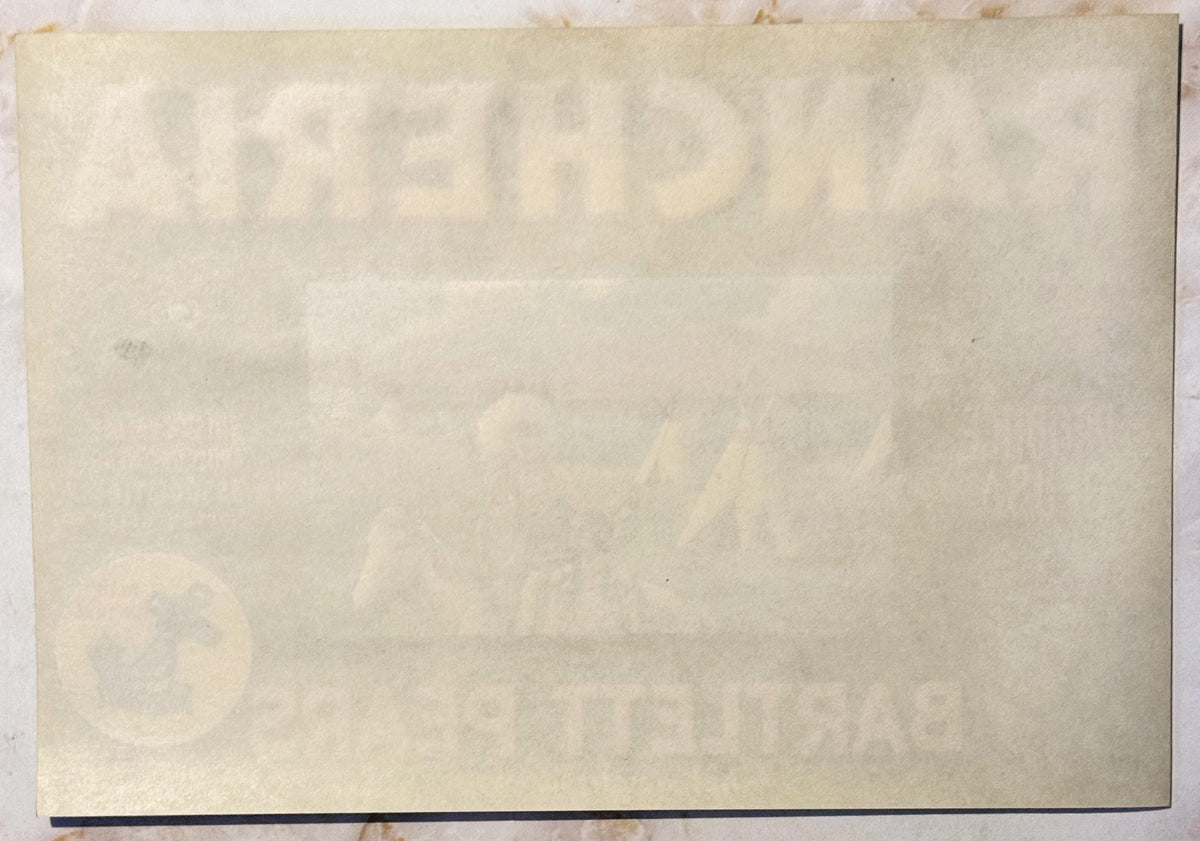
Vintage 1950s Rancheria Bartlett Pears Crate Label Native American Teepee Scene Suisun Valley Blue Anchor California Fruit Exchange 🍎

Vintage 1950s Rancheria Bartlett Pears Crate Label Native American Teepee Scene Suisun Valley Blue Anchor California Fruit Exchange 🍎

Regular price 9.00 USD
Regular price Sale price 9.00 USD
Sale Sold out
Shipping calculated at checkout.
Quantity

🪶 What Stories Still Hang On to a Wooden Fruit Crate, Long After the Fruit Is Gone?

There's a particular kind of magic in a piece of paper that was never meant to last. Crate labels were glued onto wooden shipping boxes, stacked in a rail car or a produce market stall, and left to take whatever bumps and weather came their way — nobody expected them to survive past the last pear inside. And yet here one is: bright, bold, and telling its whole story just as clearly as the day it rolled off the press. Pull one of these out of a stack of old growers' ephemera and you're not just holding advertising art — you're holding a little window into a California valley's working life, its pride in its fruit, and the imagery it chose to put its best foot forward with.

This is a Rancheria Brand Bartlett Pears crate label, produced for the Suisun Valley Fruit Growers Association of Suisun, California, marked "Produce of U.S.A." and carrying the Blue Anchor / California Fruit Exchange seal in the lower corner — the mark of one of California's great grower cooperatives.

Stylistically, with its gradient-shaded bold display lettering dropped over a black ground and its richly detailed chromolithographic pastoral scene, this label sits squarely in the 1940s–1950s era of California produce crate label design, the same period when the Blue Anchor mark was in wide, familiar use across the state's orchards.

The label measures 11 x 7.5 inches, printed in bold black, warm yellow and orange, green, blue, white and tan, and it comes to you as New Old Stock (NOS) — never used on a shipping crate, never applied, held back from a printer's or grower's own stock all these decades. At its center sits a detailed illustrated scene: a man in a full feathered warbonnet and a woman ride together on a white or gray horse in front of a lakeside encampment of teepees, mountains rising in the distance, with a seated figure resting near one of the teepees.

It's a striking, carefully rendered piece of mid-century commercial art, printed with the flat color fields and fine dot pattern typical of offset chromolithography — the kind of printing craft that once turned a simple fruit box into a tiny traveling billboard.


⚓ The Blue Anchor and the California Fruit Exchange

That little blue anchor tucked into the corner of this label carries more history than its size lets on. As the story is told, the anchor as a symbol was first suggested as early as 1903 by George Cutter, a Newcastle, California orchardist and one of the founding figures behind the California Fruit Exchange. He wanted a mark that spoke to stability and quality — an anchor, something growers and buyers alike could trust. The symbol was put into use the following year, in 1904, and it slowly worked its way into common acceptance as the Exchange's identifying mark. By 1923 it had been formally registered as a trademark, standing thereafter for the Exchange's highest grade of fruit.

The California Fruit Exchange itself was a grower cooperative — an organization built by farmers, for farmers, so that no single orchardist had to face the railroads, the packing houses, and the East Coast markets alone. Local associations like the Suisun Valley Fruit Growers Association were the building blocks of that system: growers in a single valley banding together, pooling their pears, and shipping them out under a shared brand name and a shared seal of quality. When you see the Blue Anchor mark on a label like this one, you're looking at the signature of that whole cooperative structure — thousands of individual growers standing behind a single promise stamped in blue and gold.


🏞️ Suisun Valley and the Name Behind the Brand

Suisun Valley sits in Solano County, tucked between the Sacramento River delta and the coastal hills, and it has been pear country for a very long time — one of the older continuously farmed fruit-growing regions in the state, with orchards that predate much of California's more famous produce belts. The valley's name itself comes from the Suisun people, a Patwin-speaking Native American group whose villages once occupied this exact stretch of land long before a single pear tree was planted here. The town of Suisun City, and the valley and bay that share its name, all carry that original word forward into the present day.

Which makes the brand name on this very label — Rancheria — worth pausing over. In California, "rancheria" is not a generic word; it's the specific historic and legal term used for small Native American settlements and reservations across the state, a term that survives today in the official names of dozens of federally recognized California tribes. For a Suisun Valley grower cooperative to name its pears "Rancheria" and illustrate the label with a Native encampment scene was, whether intentionally or not, drawing a direct line back to the valley's own namesake people and to the very land the orchards themselves were planted on. It's a striking bit of naming history hiding in plain sight on a fruit crate label — the kind of detail that turns a simple piece of packaging art into a genuine artifact of place.


🎨 The Art and Craft of the Crate Label

For the better part of a century, wooden shipping crates were how California's fruit traveled the world — packed tight, stacked high in rail cars, and sent east and overseas long before refrigerated trucking and cardboard boxes changed the business for good. Every one of those crates needed a label, both to identify the grower and brand at a glance in a crowded market and to give the fruit a little visual sales pitch before a single pear was ever tasted. That need turned into an entire art form. Growers' associations up and down the state commissioned lithography houses — California had several major ones, San Francisco chief among them — to design and print these labels in bulk, and the artists working on them poured real craft into the job: sweeping Western landscapes, blossoming orchards, mission bells, and, as here, romanticized frontier and Native American imagery, all rendered in rich, saturated color.

This label is a fine example of that chromolithographic offset process at its most confident — flat, bold color fields for the type and background, careful gradient shading built into the lettering itself to give it dimension and a drop-shadow pop against the black ground, and a fine dot and grain pattern in the pastoral scene that becomes visible under close inspection, the signature of true lithographic printing rather than a later, flatter reproduction technique. It's a snapshot of a printing craft that required real skill on a stone or metal plate to achieve — color separated, registered, and layered by hand-guided machinery, one careful pass at a time.

As cardboard cartons gradually took over the produce trade through the middle of the twentieth century, the need for these separately printed, individually applied paper labels faded away along with the wooden crates they were made for. What's left behind from that era is a finite, non-renewable body of work — every surviving label is a direct piece of a printing tradition and a produce industry that has moved on to entirely different packaging altogether.


🐎 Reading the Scene

Look closely at the artwork itself and there's a real story being told in miniature. A man in a towering, full-length feathered warbonnet sits astride a pale horse, a woman beside him on the same mount, her long dark hair loose over her shoulder. Behind them, a cluster of teepees rises along the shore of a still blue lake, thin trails of smoke drifting up from a couple of the lodges, distant mountains layered in soft violet and rose fading into a bright, cloud-scattered sky. Off to one side, near one of the teepees, a lone seated figure rests quietly on the green grass — a small human detail that gives the whole encampment a lived-in, peaceful stillness rather than a staged tableau. It's a warm, pastoral vision, painted with real attention to light and distance, and it sits at the center of the label like a little framed painting all its own, bordered in blue.


📦 Why Labels Like This Still Matter Today

Crate labels have become one of the quieter, more accessible corners of American paper collecting, and pieces like this one are a big part of why. They're small enough to frame and hang anywhere, colorful enough to hold a wall on their own, and they carry genuine regional history — a specific valley, a specific grower cooperative, a specific brand name — in a way that mass-produced decor never can. Interest in this kind of commercial art has only grown over the years; what was once considered simple packaging ephemera is now sought after by folk art and Americana collectors alike, and pieces from California's produce cooperatives turn up in gallery and museum collections dedicated to vintage advertising art. A label like this one lets you bring a genuine slice of that mid-century California orchard economy — the cooperative system, the lithographer's craft, and a valley's own layered history — into a home today, in a way that a reproduction print or a modern poster simply can't match.


🖼️ Display Ideas

  • 🖼️ Frame it behind UV-protective glass as a standalone piece of mid-century commercial folk art in a kitchen, dining room, or breakfast nook
  • 🍐 Pair it with other California fruit crate labels for a themed wall grouping celebrating orchard country and cooperative brands
  • 🏡 Set it in a farmhouse-style kitchen alongside vintage produce scales, baskets, or wooden crate fragments for a lived-in country market look
  • 📚 Slip it into an archival sleeve and store it in a collector's portfolio or binder alongside other vintage advertising ephemera
  • 🎨 Use it as a conversation piece in a home office or study devoted to Americana, regional history, or vintage graphic design
  • 🎁 Gift it to a collector of California history, produce label ephemera, or Native American imagery in vintage advertising

🎁 Who Collects These

Crate label collectors come from a few different directions, and this one has appeal across all of them. There are the dedicated Californiana and produce label collectors, chasing down specific growers' associations, regions, or exchange brands like Blue Anchor. There are folk art and vintage advertising enthusiasts drawn purely to the graphic design — the bold lettering, the saturated color, the confident mid-century commercial art style. There are collectors of Native American imagery in American advertising and packaging, a category that's become its own specialty niche given how much of it has simply vanished from circulation over the decades. And there are local and regional history buffs with a soft spot for Solano County, Suisun Valley, or the Suisun name itself, who'll appreciate the deeper layer this particular label carries in its own brand name. Whichever direction draws you in, a piece like this rewards a closer look.


❓ FAQ

What exactly is a fruit crate label?
It's a printed paper label made to be applied to the end of a wooden shipping crate, identifying the grower, the brand, and the fruit inside for buyers and shippers handling stacked produce in transit and at market.

Who made this label?
It was produced for the Suisun Valley Fruit Growers Association of Suisun, California, and carries the Blue Anchor seal of the California Fruit Exchange, marking it as part of that grower cooperative's branded output.

What does "Rancheria" mean as a brand name?
In California, "rancheria" is the historic term for a small Native American settlement or reservation, a designation still used in the official names of a number of California tribes today — a detail that gives real weight to a brand name chosen for a valley itself named after its original Native inhabitants.

What era is this label from?
Its bold gradient-shaded lettering, drop-shadow display type on a black ground, and detailed chromolithographic scene are consistent with mid-20th-century California produce crate label design, placing it in the 1940s–1950s era of Blue Anchor and California Fruit Exchange branding.

Is this a New Old Stock piece?
Yes — this is New Old Stock (NOS), meaning it was never applied to a shipping crate and comes from unused stock rather than a label that saw actual produce transit.

What size is the label?
It measures 11 x 7.5 inches (roughly 28 x 19 cm).

Why does it feature a Native American village scene?
Many mid-century California produce brands used romanticized Western and Native American imagery in their label art; here it pairs directly with the "Rancheria" brand name and with the valley's own name, drawn from the Suisun people who originally inhabited the region.

Shipping

🚚 Shipping & Handling

  • Shipping costs and timing are calculated at checkout.
  • Items curated and shipped directly by me include U.S. shipping at no additional cost, professionally packed to ensure safe arrival of your artifact.

Items from Vetted Pro Collectors
Shipping for items offered by vetted Pro Collectors is determined at checkout. All Pro Collector listings are reviewed to ensure fair, reasonable shipping practices.

For full details, please refer to our Shipping Policy.

Returns & Exchange

Take your time — you've got a full six months. If a piece isn't right for you, send it back the way it reached you and we're good.

In the first 30 days your money goes straight back the way you paid. After that it's store credit, so you can put it toward something you'd rather have.

Return shipping we sort out between us, case by case. I don't make this difficult.

If something arrives damaged, or it isn't what I said it was, send me a photo within 48 hours and I'll make it right.

Email info@vintageantiquesgifts.com or call 802-356-9872 — that's me answering, not a call center.

The only things I can't take back are custom or special-order pieces and gift cards.

View full details
  • 5 stars: 1 (100%)
  • 4 stars: 0 (0%)
  • 3 stars: 0 (0%)
  • 2 stars: 0 (0%)
  • 1 star: 0 (0%)
7
7***b (514)

Perfect! Thank you
