Skip to product information
1 of 2

Vintage and Antique Gifts

Vintage Santa Fe Brand Brooms Label 🪶 NOS Native American Southwestern Desert Art | Arkansas City, Kansas 1960s American Made

Regular price 8.00 USD
Regular price Sale price 8.00 USD
Sale Sold out
Shipping calculated at checkout.

Description

What Do a Prairie Broom, a Mesa Horizon, and a Kansas Wholesale Empire Have in Common? 🪶

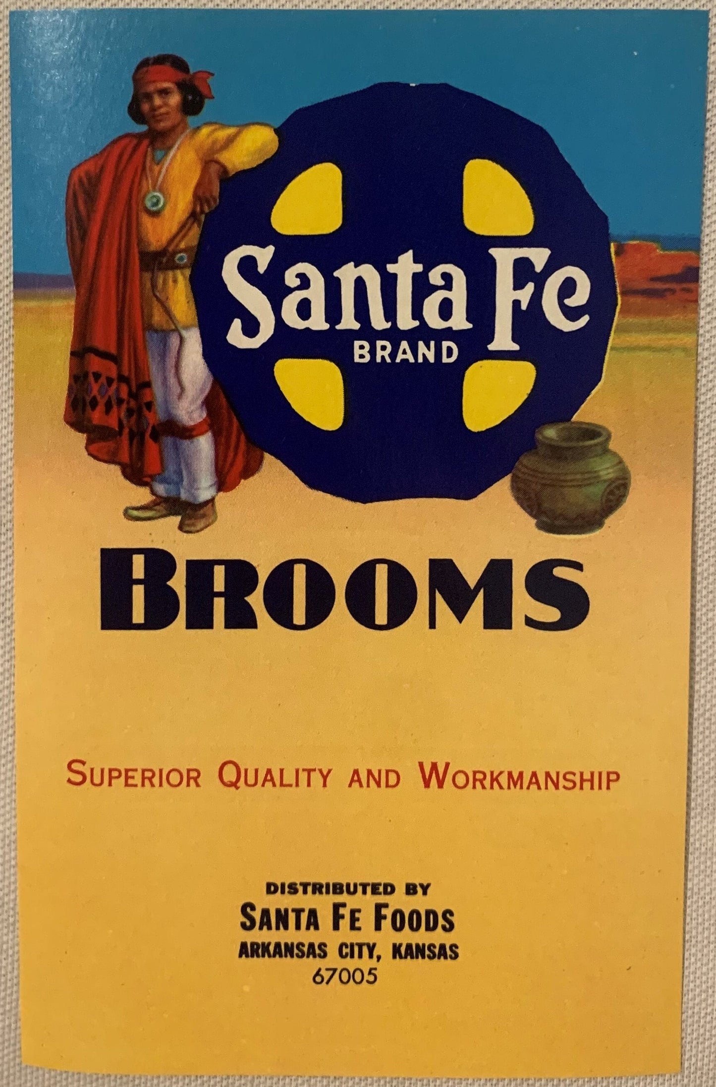
There is a particular kind of magic that lives inside a piece of paper that has survived sixty years untouched. That is exactly what you are looking at here. A broom label that never met a broom. A piece of mid-century commercial art that went straight from the press into storage, and from storage into your hands, colors burning as bright as a Kansas afternoon in July. The desert sky still glows. The wool blanket still blazes red. The figure still stands easy against that mesa horizon, one arm resting on the logo like a man who has all the time in the world. And the word BROOMS still reads across the bottom like the world's most charming punchline — bold, proud, utterly unapologetic about the humble thing it was designed to sell.

This is what genuine New Old Stock does to you. It closes the gap between then and now, and for a moment you are standing in a Kansas warehouse in 1963, and the light is the same light, and the ink is the same ink, and nothing has faded at all.

---

What Exactly Is This Piece?

This is a vintage New Old Stock (NOS) broom label produced for Santa Fe Brand, distributed by Santa Fe Foods of Arkansas City, Kansas, dating to the 1960s. It measures 6 inches by 3.5 inches — a compact, frameable rectangle that was designed to wrap around the handle or neck of a household broom at the point of retail sale. It was printed in the mid-century commercial lithography tradition, the kind of crisp, saturated color work that required skilled press operators, quality inks, and genuine craft at every stage. The colors tell the story of the process: deep navy blue, burning yellow, the warm gold of late-afternoon desert light, and the red that only comes from a pressman who cared. The label was part of a bundled stock that never made it to the hardware store floor. It was stored, untouched, for over half a century — which is precisely why it looks the way it does today. No fading. No handling wear. No store grime. Just the label as it was meant to be seen: alive, vivid, and completely itself. The central image is a Native American man in traditional dress standing against a Southwestern desert landscape — mesas on the horizon, a blue-green sky overhead, a pottery vessel sitting quietly in the sand beside him. He rests one arm on a bold circular logo. The whole composition is confident, romantic, and unmistakably mid-century American in its embrace of the Southwest as a place of beauty, dignity, and enduring cultural power.


🏛️ The Company Behind the Label — A Kansas Wholesale Empire That Started in 1879

The story of this label does not begin in the 1960s. It begins in 1879, when a Michigan grocer named Joseph Addison Ranney — J.A. to everyone who knew him — followed the westward current of American commerce and arrived in Wellington, Kansas, going into business alongside his brother Albert. By 1884, J.A. had moved his operations to Arkansas City, Kansas, a town sitting right at the edge of the Cherokee Strip, a community built on the energy of cattle drives, land rushes, and the constant, restless commerce of the southern Kansas plains. From that base, Ranney built what would become one of the most significant wholesale grocery and distribution operations in the region. The company that eventually distributed the Santa Fe Brand — Santa Fe Foods — was the institutional descendant of that original Ranney enterprise, carrying forward decades of operational knowledge, regional relationships, and the particular confidence of a business that had survived hard decades and come out knowing exactly who it was and what it sold.

The Santa Fe Brand name itself was a deliberate piece of geographic and cultural branding. Arkansas City sits close enough to the old Santa Fe Trail corridor that the name carried genuine regional resonance — it wasn't an affectation imported from somewhere else. It was a Kansas company reaching toward the romance of the Southwest that its own history touched, and using that romance to sell household goods to Kansas families who understood, at some level, exactly what that horizon meant. The broom label is the most vivid surviving expression of that branding instinct: a Southwestern landscape, a figure of dignity and presence, a pottery vessel, a mesa sky — all in the service of selling a product you swept your kitchen floor with. That tension, between the mundane and the magnificent, is precisely what makes this label so arresting today.


🏜️ Arkansas City, Kansas — A Town at the Edge of Everything

Arkansas City — "Ark City" to the people who called it home — occupies a particular place in the geography of American ambition. Situated in Cowley County at the confluence of the Arkansas and Walnut rivers, right on the Kansas-Oklahoma border, it was a town that watched history happen at its front door. The great Oklahoma Land Rush of 1889 launched partly from its streets — an estimated one hundred thousand people staged along the border nearby, waiting for the pistol shot that would open the Unassigned Lands. Arkansas City had hotels, saloons, supply merchants, and the particular electric energy of a place that knows it is at the center of something enormous. That energy never entirely left. The town built itself into a genuine commercial hub for southern Kansas, supporting grain elevators, rail connections, a strong retail core, and exactly the kind of wholesale distribution infrastructure that a company like Ranney — and later Santa Fe Foods — needed to thrive.

Local legend has it that the Santa Fe Brand labels were designed by a commercial artist working out of Wichita who was commissioned specifically because of his experience illustrating railroad promotional materials — the kind of vivid, romantic Southwestern imagery that the Atchison, Topeka and Santa Fe Railway had been deploying for decades to sell the American West to Eastern travelers. Whether or not that specific lineage is documented, the visual DNA is unmistakable: this label belongs to the same artistic tradition as the railway posters and Fred Harvey promotional art that made the Southwest into a national romance. Lore passed down among regional ephemera collectors holds that the Santa Fe Foods warehouse in Arkansas City sat just blocks from the rail depot, and that the labels were stored in conditions so stable — cool, dry, undisturbed — that the NOS stock survived in extraordinary condition precisely because of the building's original construction. The brick warehouse, built for grain and flour storage, kept temperature and humidity steady in ways that modern storage rarely matches without mechanical help.


🪶 The Art Itself — Native American Imagery in Mid-Century Commercial Design

It is worth sitting with what this label actually does artistically, because it does it well. The figure at the center is rendered with genuine attention — not a cartoon, not a caricature, but a composed, dignified representation of a man in traditional dress, placed in a landscape that is specific and considered. The pottery vessel beside him is not a generic prop; it is the kind of detail that suggests the artist either researched Southwestern ceramics or worked from reference material that someone took seriously. The color palette — navy, gold, red, desert tan, blue-green sky — is the Southwest as it exists in actual experience: high contrast, clean light, colors that feel saturated because the air is dry and the sky is vast.

Mid-century American commercial art of this type was produced by skilled craftsmen working in a tradition that valued clarity, color impact, and narrative legibility at a glance. A broom label had perhaps two seconds to communicate brand identity, quality, and romance to a shopper moving past a hardware store display. This one communicates all three. The circular logo, the bold typography, the landscape composition — these are the choices of someone who understood the grammar of commercial lithography and deployed it with confidence. NOS survival means we get to see those choices in their original state, without the softening that time and handling usually impose. The colors here are the press colors. The lines are the press lines. Nothing has been filtered by sixty years of light exposure or handling.


🧺 The Broom Industry and the Art of the Label

The American broom industry in the mid-twentieth century was a surprisingly robust corner of domestic manufacturing, with regional producers, branded product lines, and genuine competition for shelf space in hardware stores and general merchandise retailers across the country. Broom labels were a real investment — companies commissioned original artwork, paid for quality printing, and understood that the label was the face of the brand in an era before television advertising reached every household. The label was what a shopper saw. It was what created the impression of quality, origin, and character that made one broom feel different from another broom made of essentially the same broomcorn and twine.

The Santa Fe Brand label is a premium example of what that investment looked like when a company got it right. The size — 6 by 3.5 inches — gave the artist enough real estate to build a genuine scene rather than just a logo. The four-color printing (at minimum) required multiple press passes and careful registration to achieve the depth of color visible in this NOS example. This was not a cut-rate production decision. Someone at Santa Fe Foods believed in this label enough to spend real money on it, and the result is a piece of commercial art that has outlasted the brooms it was meant to dress by half a century, and shows no signs of losing the argument.


🖼️ Display Ideas

  • 🪵 Float-mounted in a shadow box — A simple natural wood or painted shadow box with a mat in navy or deep gold pulls the label's palette forward and gives it the museum-quality presentation it deserves. The 6 x 3.5 inch format fits neatly inside standard small frame sizes.
  • 🏡 Grouped with other Southwestern ephemera — This label holds its own in a gallery wall alongside vintage Fred Harvey postcards, old Route 66 maps, or other mid-century Southwest promotional art. The color palette connects naturally across pieces from this era and region.
  • 🛋️ Displayed in a kitchen or mudroom — The subject matter gives this piece an organic home in a working kitchen or entryway. There is something genuinely pleasing about hanging a broom label in the room where brooms actually live — it closes a loop the label never got to close on its own.
  • 🧳 In a collector's ephemera portfolio or archival sleeve — For the collector who keeps things flat and protected, this label presents beautifully in an archival display sleeve, readable without handling, stored without risk.
  • 🎨 As a centerpiece in a Kansas or Oklahoma regional history display — Paired with Ark City or Cowley County historical materials, this label becomes a primary-source artifact in a story about commerce, branding, and regional identity in the mid-century Plains.
  • 🪴 In a vintage Americana or Southwestern-themed room vignette — Propped on a small easel atop a reclaimed wood shelf alongside pottery, woven textiles, and other desert-inspired objects, this label functions as a miniature painting — which is, in every meaningful sense, exactly what it is.

🎁 Who Collects These

The collectors drawn to a piece like this are a wonderfully specific tribe, and if you are reading this far, you almost certainly belong to at least one of these communities. Ephemera collectors — those dedicated souls who understand that paper is among the most fragile and therefore most precious of all historical artifacts — prize NOS commercial labels for exactly the reasons this one earns attention: perfect survival, vivid color, original condition. Advertising art collectors recognize the Santa Fe Brand label as a high-quality example of mid-century commercial lithography, the kind of piece that holds its own alongside tin signs and trade cards in a serious collection. Kansas and Arkansas City regional historians and memory-keepers find in this label a primary-source artifact from a specific commercial world that is otherwise largely undocumented at this scale of detail.

Southwestern Americana collectors — people who love the visual language of the desert Southwest as it was interpreted and romanticized by mid-century American commerce — will immediately recognize the label's relationship to the broader tradition of Santa Fe Railway art, Harvey House aesthetics, and the whole romantic apparatus that turned the American Southwest into a national cultural destination. Native American art and imagery collectors are drawn to the dignity and craft of the central figure and its relationship to the pottery tradition the label quietly references. And then there are the general vintage kitchen and home collectors, the people who love the idea of a household object elevated by genuine art — who understand that a broom label this beautiful says something true and interesting about the culture that made it.


❓ Frequently Asked Questions

What does "New Old Stock" (NOS) mean for this label, and why does it matter?

New Old Stock means this label was produced in the 1960s, bundled for distribution, and then stored without ever being applied to a product or put into retail circulation. It has never been used. It has never been handled by shoppers, warehouse workers moving product, or store clerks stocking shelves. For collectors of paper ephemera, NOS is the gold standard of condition because it means you are seeing the piece exactly as the press operator intended it to be seen. The difference between NOS and a used label in circulation is, in many cases, the difference between a collectible and a curiosity.

How should I store or display this label to protect it going forward?

For display, UV-filtering glass or acrylic in a sealed frame will protect the colors from light degradation over time — the same principle that museum conservators apply to works on paper. If you choose to keep it flat rather than framed, acid-free archival sleeves and storage in a cool, stable environment away from direct light will preserve the condition you are receiving. The piece has already demonstrated extraordinary resilience over sixty-plus years of good storage — proper archival treatment will carry it forward for another sixty without loss.

Is the Native American imagery on this label considered problematic by today's standards, and how do collectors approach it?

This is a question serious collectors engage with honestly and thoughtfully. The figure on this label is rendered with genuine compositional dignity — this is not a caricature or a mascot, but a considered artistic representation in the tradition of Southwestern romantic imagery that companies like the Santa Fe Railway spent enormous resources cultivating through artists of real skill. The broader conversation about how mid-century American commercial art depicted Native peoples is legitimate and ongoing, and collectors of conscience engage with it rather than avoiding it. Collecting and preserving pieces like this as historical artifacts — understanding them in the context of their era, their commercial purpose, and the artistic traditions they drew on — is considered by most serious ephemera collectors to be an act of preservation and honest historical record-keeping, not endorsement of every assumption embedded in the original design choices.

What is the significance of Arkansas City, Kansas as the origin point for this label?

Arkansas City is not a random dot on the map — it is a town with a genuinely significant place in American frontier and commercial history. Its position at the Kansas-Oklahoma border made it a staging ground for the 1889 Oklahoma Land Rush, one of the most dramatic single days in American settlement history. Its commercial infrastructure — wholesale grocers, rail connections, regional distribution networks — made it a real center of economic life for southern Kansas well into the twentieth century. The Ranney enterprise that evolved into Santa Fe Foods was part of that infrastructure from 1879 onward, which means this label is a product of a continuous, deep-rooted commercial tradition. For Kansas regional collectors especially, the Arkansas City origin adds a specific layer of local historical significance that a label from a generic national brand simply cannot carry.

Is this label suitable for framing at home, or is it primarily a collector's piece?

Both, genuinely. The 6 x 3.5 inch format is one of the most frameable sizes in paper ephemera — it fits standard small mat openings, works beautifully in shadow boxes, and at that scale carries enough visual information to read clearly from across a room. The color palette — navy, gold, red, desert tan — is a versatile combination that works in kitchens, living rooms, offices, and Southwestern-themed spaces. Collectors who keep things flat and protected will find it equally satisfying in an archival sleeve in a display portfolio. This is a piece that holds its own in either context because the underlying art is strong enough to carry the label beyond its original commercial purpose into something closer to a small painting.

How rare is this label, and what makes it collectible beyond its age?

NOS broom labels from regional Kansas distributors with this level of artistic quality are genuinely uncommon in the collector market. Most commercial labels from this era either went through their intended life cycle — applied to products, discarded — or survived in ones and twos rather than as intact NOS stock. The combination of factors here is what elevates this beyond simple age: NOS condition, strong visual subject matter (Southwestern Native American imagery in a dignified composition), specific regional provenance (Arkansas City, Kansas), identifiable company history dating to 1879, and mid-century commercial lithography quality that holds up as art independent of its original function. Any one of those factors would make a label interesting to collectors. All of them together make it exceptional.

Can you tell me more about the pottery vessel depicted in the label's scene?

The pottery vessel sitting in the sand beside the central figure is one of the label's most quietly considered details. Southwestern ceramics — particularly the traditions associated with Pueblo peoples of the Rio Grande valley and the greater Southwest — were among the most recognized and respected Native American art forms in mid-century American popular culture, elevated by the Fred Harvey Company, the Santa Fe Railway's arts and crafts programs, and a generation of collectors and scholars who understood their aesthetic and cultural significance. The vessel's presence in this composition is not incidental; it is a deliberate signal of cultural specificity and artistic seriousness. Whether the artist worked from a specific reference or drew from a general familiarity with the Pueblo ceramic tradition, its inclusion tells you something about the level of care that went into this label's design — it is the detail that separates a considered piece of commercial art from a generic evocation of "the West."

Shipping

🚚 Shipping & Handling

  • Shipping costs and timing are calculated at checkout.
  • Items curated and shipped directly by me include U.S. shipping at no additional cost, professionally packed to ensure safe arrival of your artifact.

Items from Vetted Pro Collectors
Shipping for items offered by vetted Pro Collectors is determined at checkout. All Pro Collector listings are reviewed to ensure fair, reasonable shipping practices.

For full details, please refer to our Shipping Policy.

Returns & Exchange

Product Page Return Policy

  • 60-Day Returns – Items must be in original condition.
  • Refunds – Issued after inspection (excluding shipping costs).
  • Return Shipping – Customer is responsible unless item is damaged or incorrect.
  • Damaged/Incorrect Items – Contact us within 48 hours for a replacement or refund.
  • Easy Returns – Email [email protected] or call 802-356-9872 to initiate a return.

For full details, visit our Refund Policy.

View full details